Karin Wanderer Learns

colorfull

Hello & Hello Again! We are talking about paints today. I usually avoid mentioning brands, because no one is paying me. Today I need to specify that I use Daniel Smith watercolors. Every brand has their own unique spin on a color- it may be a little cooler, or more transparent, etc, compared to other brands. If you love a shade you see from a specific brand, buy that color in that brand! If you really like a shade but think it could be better, check out that color in different brands! #NotSponsored

Welcome back to our ColorFull series!

Colors have great names. Paint colors doubly so.

Alizarin Crimson. Quinacridone Pink. Isoindoline Yellow. Some paint names make immediate sense, like Sap Green. Some make no sense whatsoever, like Elephant’s Breath. One color I have always wondered about is…

Payne’s Gray

Payne’s Gray is one of my most frequently-used colors. It is an absolutely lovely shade of blue-gray. At its most concentrated it is almost black, which shows more & more blue as you dilute it. It makes for lovely shadows, & nothing matches that blue-black you find in cats’ fur better. I use just a touch of it mixed with other colors all the time. I blend it with other colors so often, in fact, that I had a hard time finding paintings that actually show off the color itself.
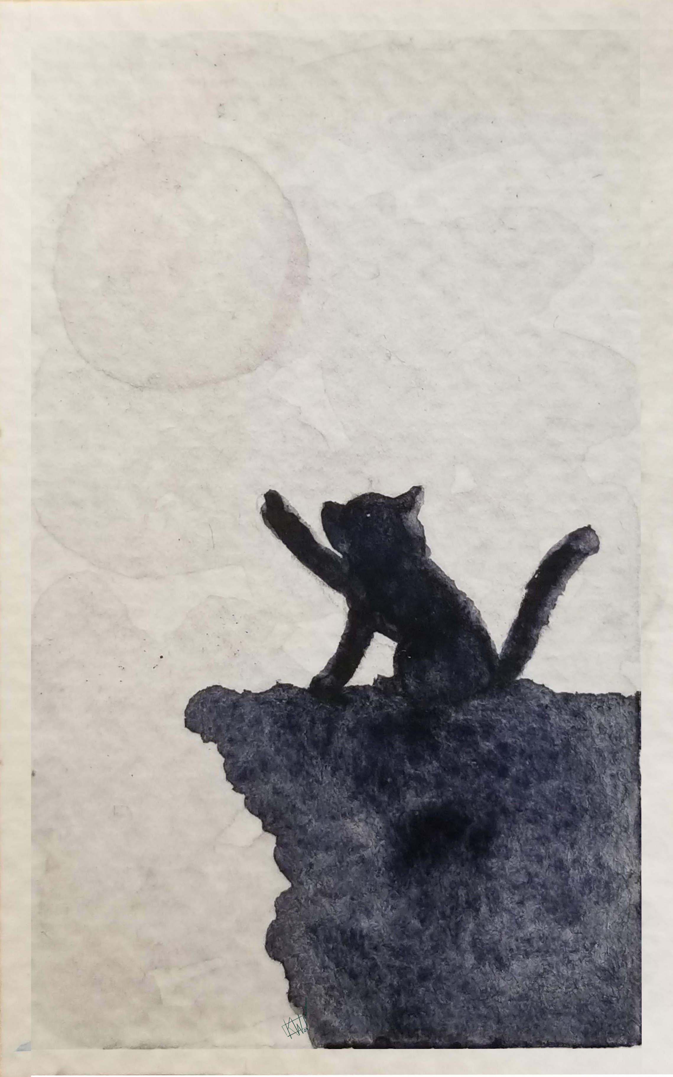
A kitten sits on a cliff & reaches for the moon Good thing one of the past #KWPrompts was #Monochrome!

Payne’s Gray was named after William Payne. Although he sounds like an old-timey vampire in a YA novel, William Payne was a watercolor artist. He supported himself by tutoring other watercolorists, & eventually gained a measure of renown. Landscapes were his specialty.
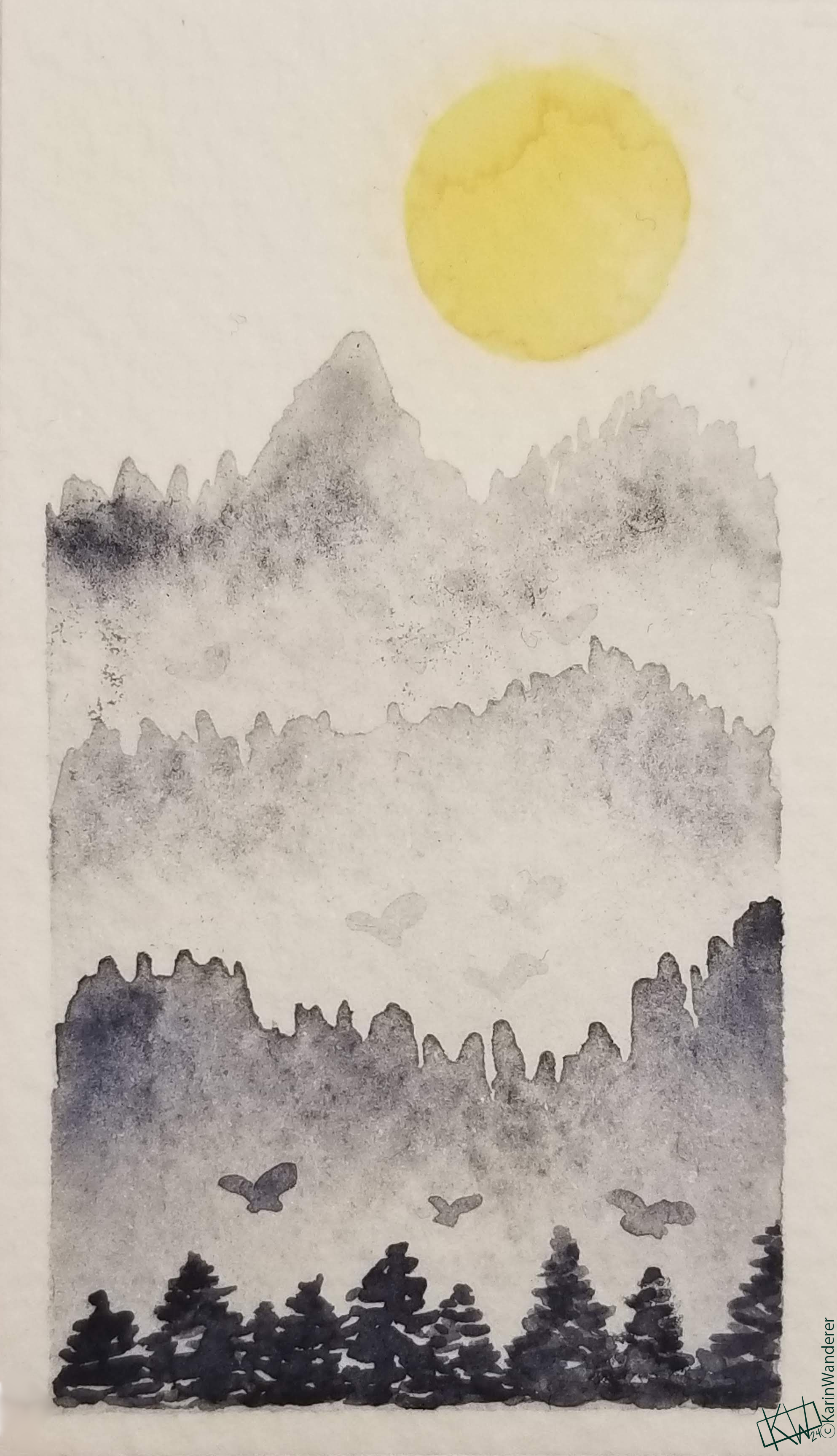
https://cdn.masto.host/mastodonart/media_attachments/files/111/727/285/980/111/415/original/70a15c74c0f2f506.png An alien mountain range full of giant butterflies, as Payne intended.

There are a lot of stories about why, exactly, Payne made his Gray. The most popular one is that he was trying to make a mixer that had a lot of the qualities of black, but was less overpowering. If that was the reason, he certainly succeeded. As I mentioned, I mix & blend with this color all the time! My favorite story is a bit different. It is said that Payne, in his work as a watercolor tutor who specialized in landscapes, got absolutely fed up with having to mix the perfect shade of blue-gray to portray mountains off in the distance. He solved this problem by inventing the perfect color for it! As a teacher, I empathize- anything to cut down on lesson prep.

Payne was a good artist. By all accounts he loved art & he enjoyed teaching others. His paintings are on display in many private & public collections. But his biggest contribution to art was definitely the Gray. Payne’s Gray plays beautiful games with the atmosphere & depth of a painting. It is important to remember that Payne’s Gray loses some of its cool as it ages & becomes a more neutral gray. If you look at his surviving original works, you may not see Payne’s Gray! While Payne’s Gray initially came out for Winsor & Newton watercolors, it is now available in just about every brand & type of paint I could think of to check. I love this color!
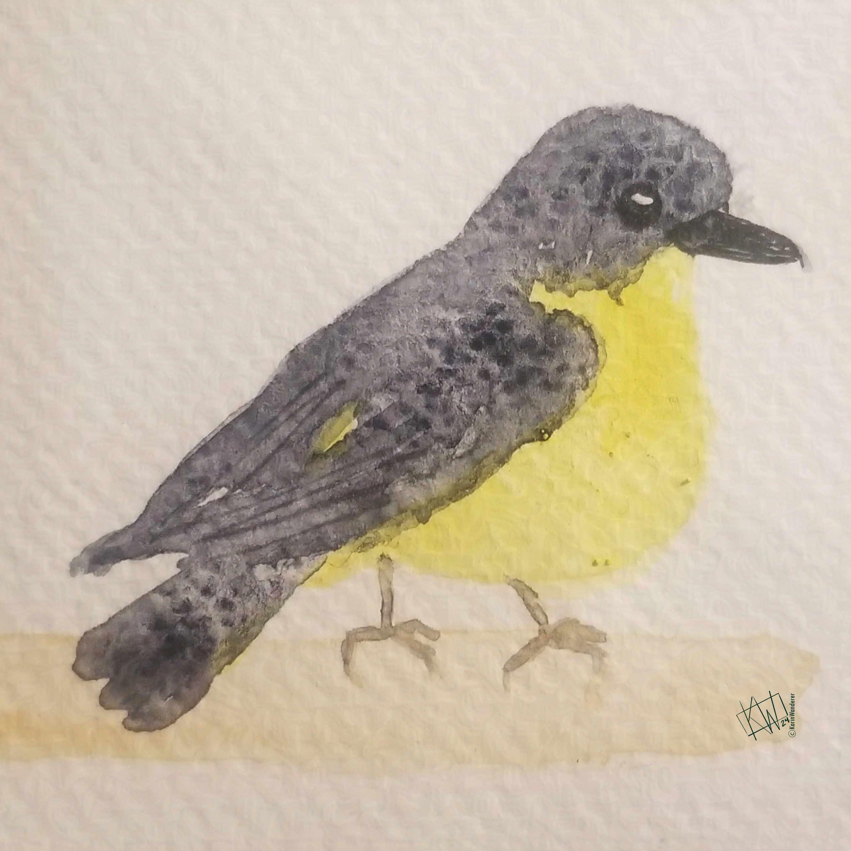
This Yellow Robin has Payne’s Gray in its feathers

What’s your favorite color name? Is it the same as your favorite color? Let me know! You can find me everywhere

Tune in on future #ColorFull Tuesdays to learn more!

We’ll be talking about how our ancestors made pigments & what they used them for. We’ll be talking about how we currently make pigments & what we use them for. We’ll be talking about how we physically see color, how we categorize it, & how we organize it. We’ll be getting down to brass tacks & talking about specific colors! It’s going to be a wild ride.

My 2-week #KWPrompts art challenge is ongoing!

We still have another week of the #Sky prompt Check out the #KWPrompts list for more info!

Get my art on mugs & vinyl stickers in my Shop!

Join us for #KWPrompts, a biweekly art challenge!

Find me on Linktree

  • All pictures posted are my own work.
  • All reviews are my own unpaid & unsolicited opinions.
Welcome to #ColorFull part 3!

Logos are a bit of visual shorthand; a symbol used as an identifier for an organization in place of (or supplementary to) their name. They have been around a long time, in one form or another. Nobility had seals, signets, & coats of arms. Expert crafters, such as jewelers or blacksmiths, often stamped their works with their ‘maker's mark.’ Today, logos are a pervasive part of our culture. Even science gets logos: NASA’s logo is just as recognizable as their stellar photography

Take a moment to look around you. The odds are good that, wherever you are, you are surrounded by logos right now. There may even be one on the screen you’re using to read this very article!

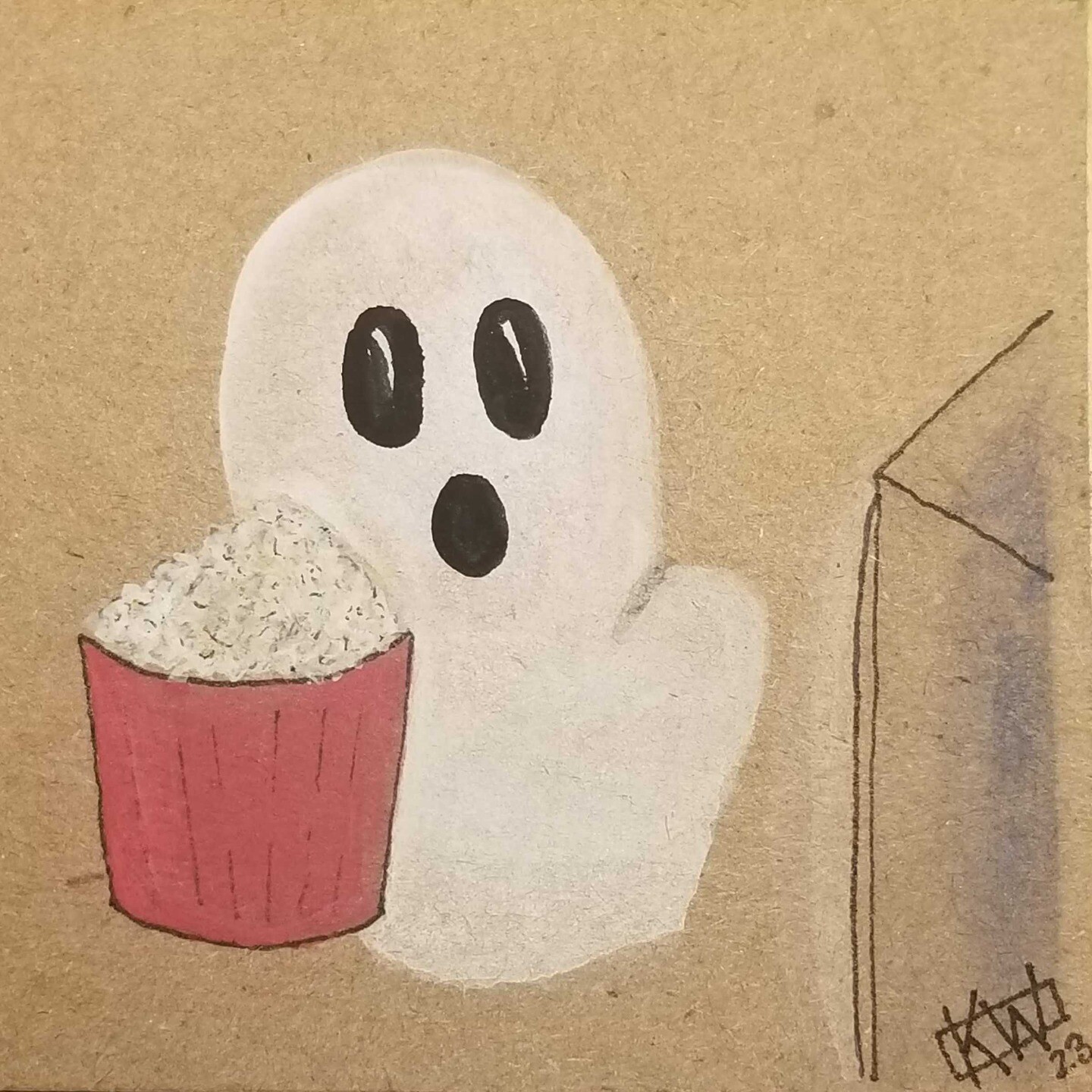
Watercolor & ink on brown cardboard. A ghost sits, transfixed, in front of a TV. A tub of popcorn sits next to the ghost. This picture has a notable lack of branding on the electronics & food.
A lot goes into designing logos. There is so much variety! Anyone trying to come up with a new logo is truly spoiled for choice. Is your logo going to use symbols? Letters? A mix of both? Will it be colorful or monochromatic? Is it intended to be used alongside a slogan, or to stand on its own? Will there be different versions for different uses, or are you looking for a one-size-fits-all type of logo? The questions go on & on. Lucky for me- this is a #ColorFull series, so I don’t have to go on & on.

Color is Crucial

Color is an absolutely essential aspect to consider when designing a logo. To understand why, look no further than classic rivals Pepsi & Coca-Cola. I didn’t link to their logos there, but did I need to? When you read their names you were probably able to picture each soda’s distinctive logo. Just in case you can’t: Coca-Cola has a red can with white script reading ‘Coca-Cola’. Pepsi has a blue can with the Pepsi Globe on it- a circle with red, white, & blue lines swooshing across it with black or dark blue print reading ‘Pepsi’. These competing brands have such incredibly different logos that you could never mistake one for the other.

Color plays an enormous part in making sure you can discern which brand is which, even at a distance. Way back when Pepsi was still Pepsi-Cola its label looked quite different: red script on a white background. If I walked into a supermarket aisle these days & saw red cans with white script & white cans with red script, I might just think all of it was regular & diet Coca-Cola. Pepsi-Cola must have had the same thought, because as competition between themselves & Coca-Cola ramped up they dropped the “-Cola” from their name & changed their logo to the now-famous Pepsi Globe. The logo has been presented with more & more blue, until the most recent version is the Pepsi Globe on a can that is not only blue, but electric blue. Coca-Cola has responded by leaning heavily on the red/white logos. Recently when Disney Parks opened Star War attractions their Coca-Cola sodas had labels in Aubresh, but they are still perfectly recognizable.

Color is so powerful it can sometimes represent the company even better than the logo. Google’s capital G logo is just an unremarkable letter- until you add the rainbow coloring, at which point it is recognizably the Google logo. Do you know offhand what the UPS logo looks like? I don’t. I had to look it up. But I could tell you without looking that UPS colors are brown & yellow. If I see a person in a brown uniform getting out of a brown & yellow truck I will immediately assume they are delivering something. Once in Italy I saw a person in a brown uniform getting out of a brown & yellow truck & I was genuinely surprised to find out it was a moving company!

Of course, not all logos depend so heavily on color. The logo on your iPhone can be just about any color, but it is still the same recognizable apple. The same goes for Android’s logo; although the Robot is usually green, that is not a hard & fast rule. Do you even know what the “official” color of the Nike Swoosh or the Disney Castle are? Such ‘color-flexible’ logos can shift & change with the times or situation, but the color is still an important element that is carefully considered before such changes are made. You’re probably not going to see a pukey brown Nike Swoosh, unless that color somehow becomes trendy. It has happened before.

Now that you’ve read this, spend some more time paying attention to the logos that surround you day after day. Are the logos reliant on color, or are they color flexible? What colors did the organization choose? How does the color choice make you feel? What message is the organization trying to convey with their color choice? What if the colors were wildly different, e.g. a blue logo was orange, or a dark logo was neon? Would that change what you feel when you see the logo? How? Color psychology is its own whole can of worms, & so we will have to give it its own article in the future!

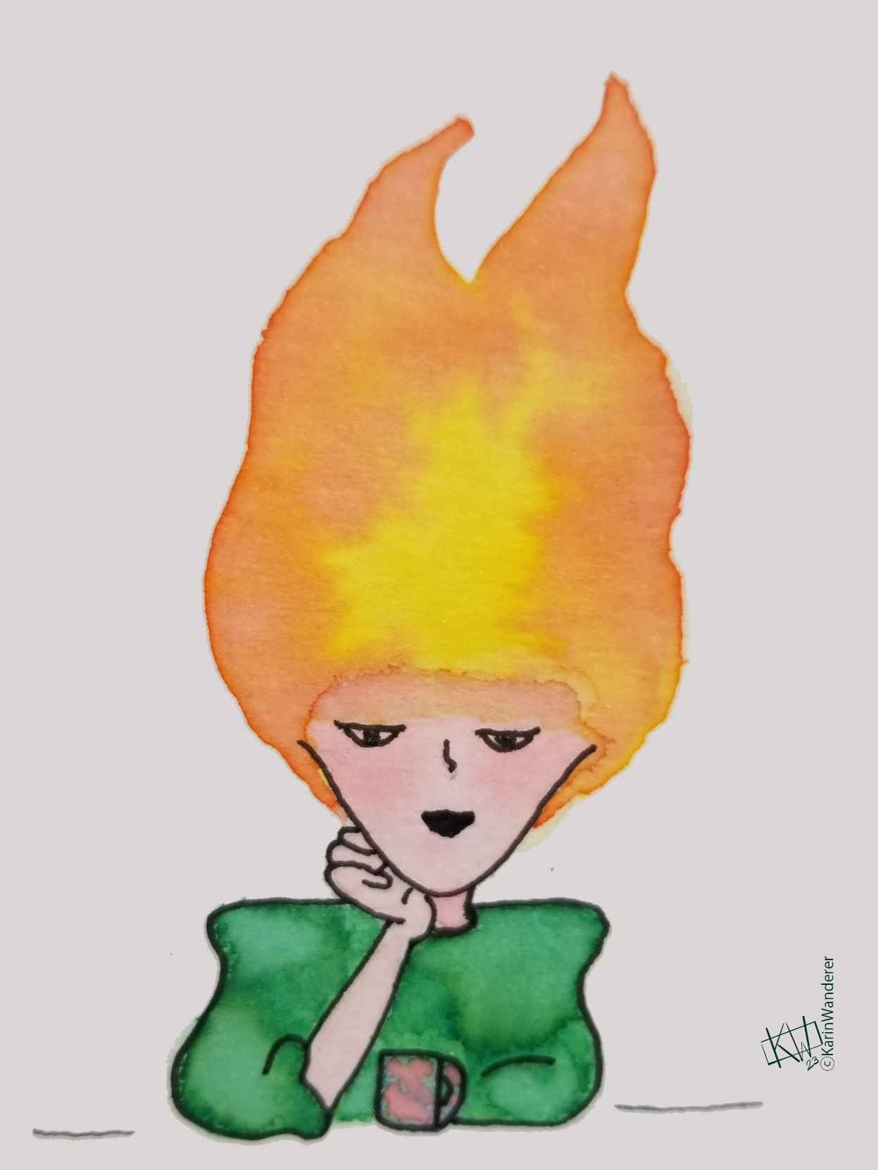
Watercolor of a woman. Her clothes are bright green & her skin is peachy-pink. She sits resting her chin on one hand while looking out at the viewer. Her head is on fire, the flames are vibrant orange & yellow. I don’t have a logo, but I do have an avatar. Do you think that counts? Last time in the #ColorFull series, we talked about how different people see color. Did you figure out your CPT? How do you think that affects the way you feel about different logos? Let me know! Mastodon BlueSky
Tune in on future Tuesdays to learn more about color!

We’ll be talking about how our ancestors made pigments & what they used them for. We’ll be talking about how we currently make pigments & what we use them for. We’ll be talking about how we physically see color, how we categorize it, & how we organize it. Additionally, we’ll be getting down to brass tacks & talking about specific colors! It’s going to be a wild ride.

My 2-week #KWPrompts art challenge is ongoing!

We still have another week of the #Animals prompt Check out the #KWPrompts list for more information!

Get my art on mugs & vinyl stickers in my Shop!

Join us for #KWPrompts, a biweekly art challenge!

Find me on Linktree

  • All pictures posted are my own work.
  • All reviews are my own unpaid & unsolicited opinions.

Welcome to #ColorFull part 2!

What is Your Personality Type?

Forget Myers-Briggs, HEXACO, & whatever else is trending right now- the only personality type that matters is your Color Personality Type! I found this breakdown in “Color Theory For Dummies” by Eric Hibit, & I absolutely love it. I think this is something he came up with for the book, but I genuinely could not tell you if it exists in other places as well. This is because “color-based personality tests” are so popular on the internet that it is impossible to find a specific one! All of them want to know if you are a “red” personality type, or a “blue-orange” one, but Hibit’s test is different. These CPTs are much more revelatory; people are categorized according to how they view color & think it should be used. Doesn’t that make more sense?

What Are the Different Color Personality Types?

Color Conformists

Color conformists – you guessed it! – comply with the color stereotypes associated with the time, place, & culture they live in. They may, for example, have specific ideas about which babies should wear which colors or when to stop wearing white clothing. If society’s opinion of a color shifts, then a color conformist may begin to follow the new standard (e.g- the “white after Labor Day” rule is pretty outdated) but they will never be an early adopter.

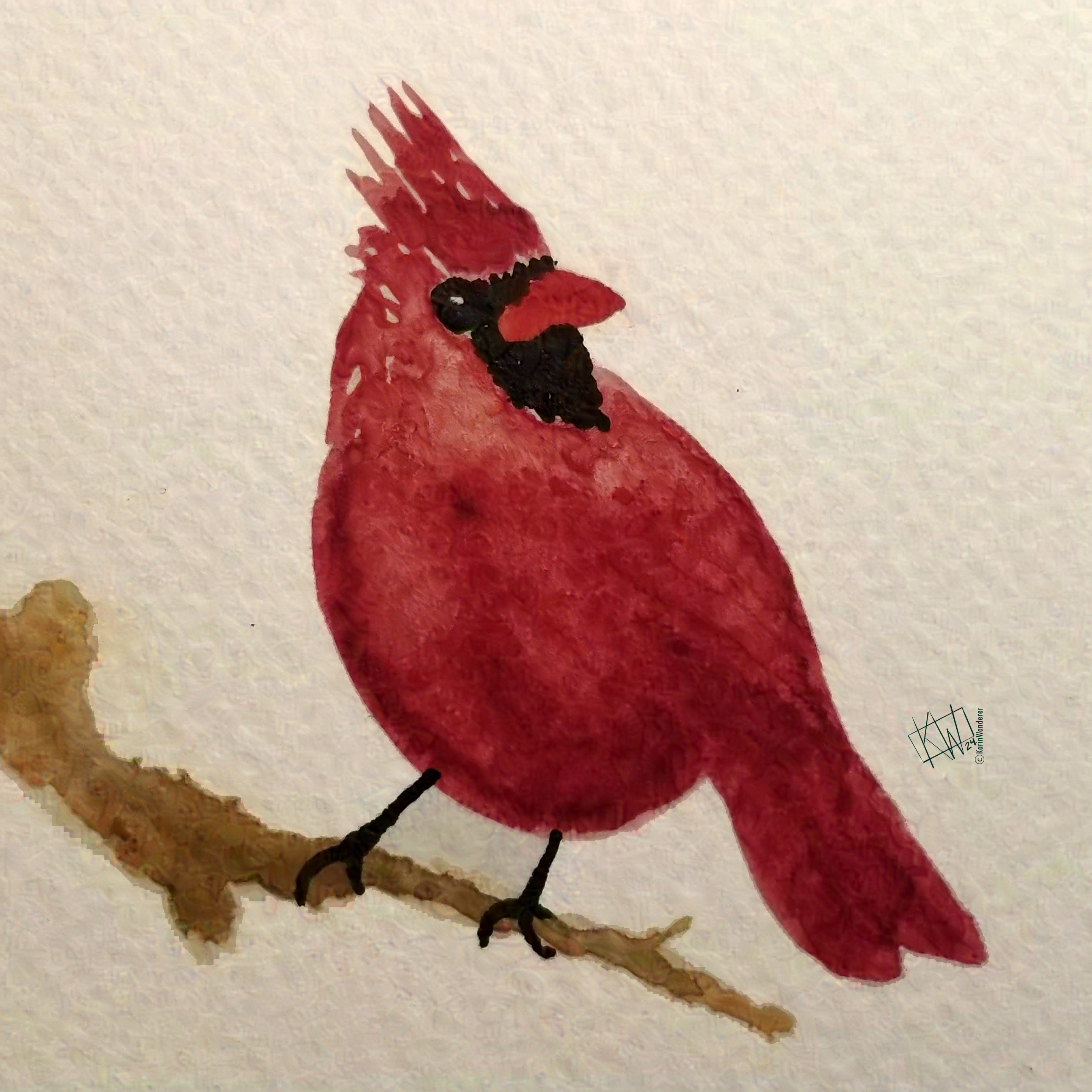
Watercolor of a plump, happy cardinal perched on a bare branch. Red cardinal, brown branch; all is right in the Color Conformists’ world.
Color Outliers

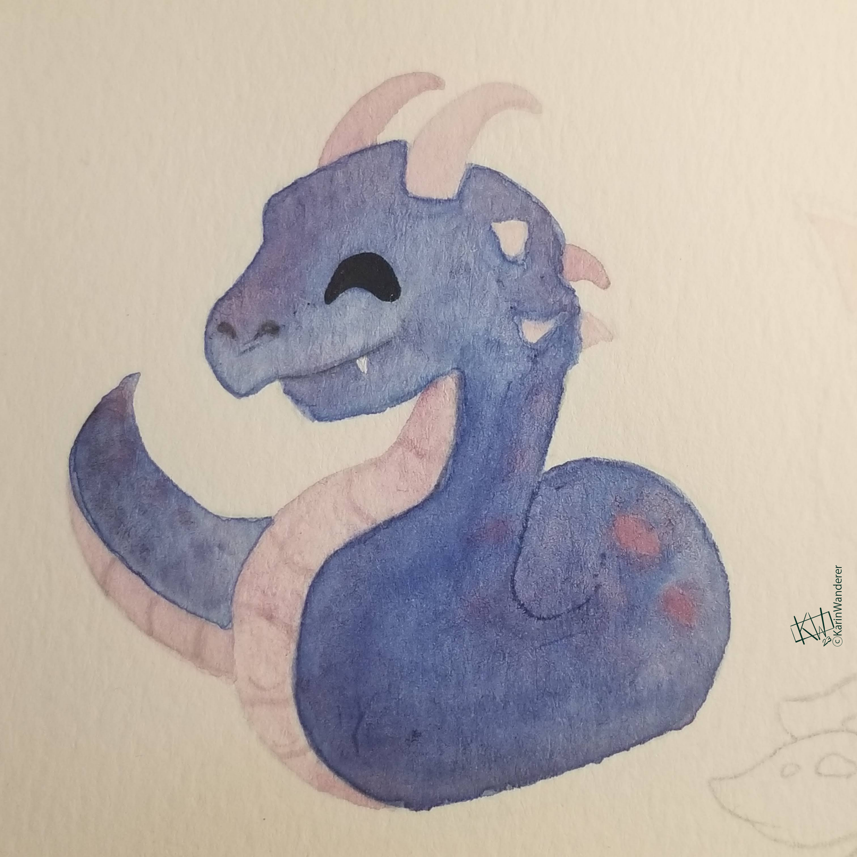
Color outliers recognize the color stereotypes that exist in the time, place, & culture they live in. Unlike color conformists, they enjoy defying those stereotypes. Think Pierce Brosnan & Dwayne Johnson wearing pink to their movie premier, or all the lovely games people play with bridal gowns these days. Watercolor of an adorable blue-purple-pink basilisk, smiling contentedly This basilisk is a terrifying monster in a friendly color palette.
Color Iconoclasts

Color iconoclasts are the exact opposite of color conformists. Color iconoclasts recognize the color stereotypes that exist in the time, place, & culture they live in, & they want to burn it all down! They are radical in the truest sense of the word- they want to challenge color traditions at the root. They defy traditions that insist they must wear a particular color for a vaguely cultural reason. Child Me was certainly a color iconoclast; frequently being forced to wear pink made me question the veracity of any & all color traditions from a very early age!

Color Expressives

Color expressives use color to proclaim something about themselves. Such a person may wear their favorite color all the time, or red when they need to be assertive, or funeral colors to weddings. They may dye their hair a color that they feel suits them better. They may be very specific about how they paint/decorate their homes- relaxing colors in the bedroom, fun ones in the den, somber ones in a workroom… For color expressives, colors are never just a nice thing to look at, but a conscious choice made after deliberate thought.

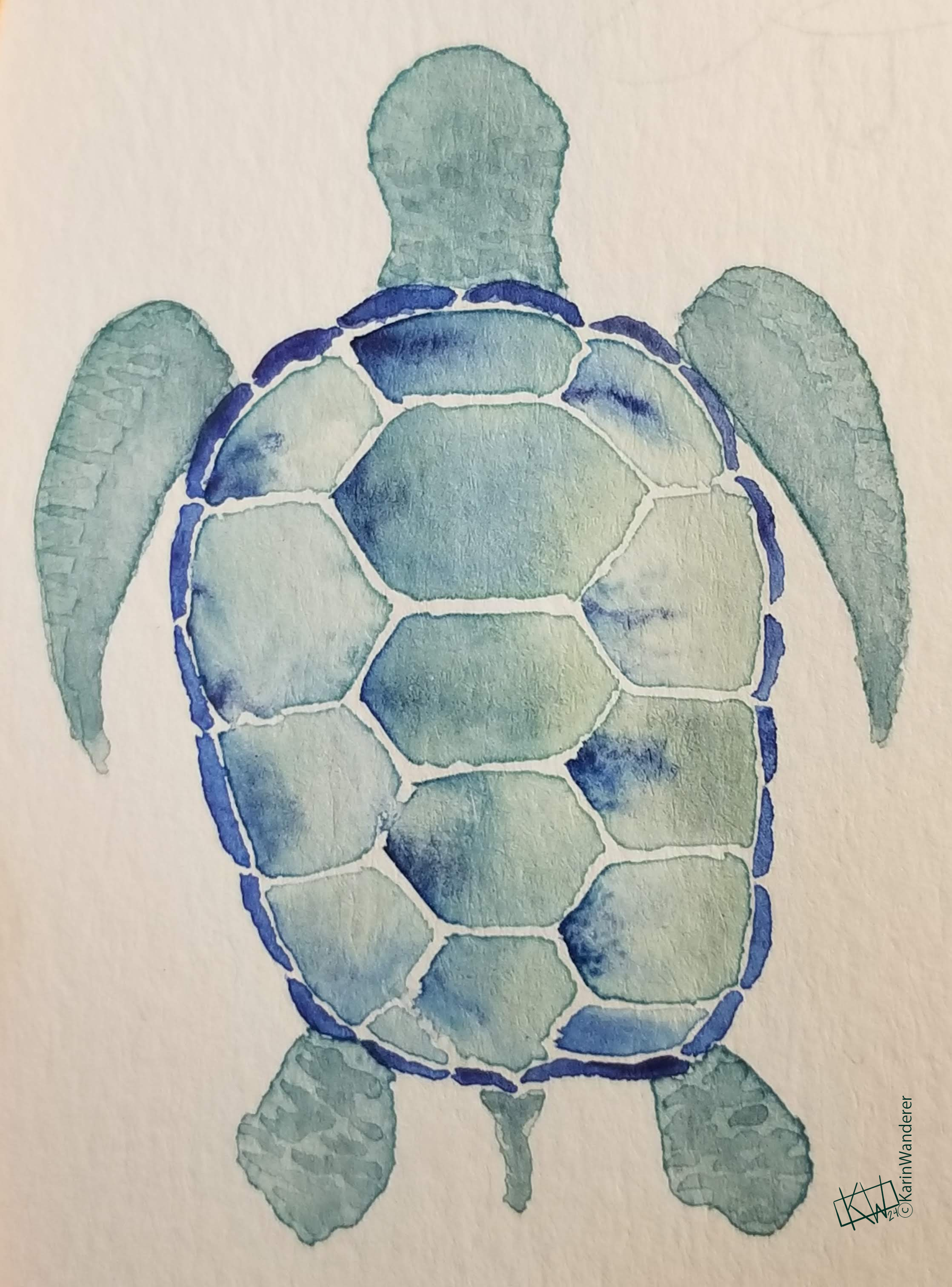
Stylized watercolor turtle seen from the top down, all in soft greens with indigo on the shell. I want a turtle in my favorite colors & I will not let reality get in my way!
Color Fluid

Color fluid people are neither one thing nor the other—neither fish nor fowl nor good red herring! They combine any/all of the color personality types described above. They also are very flexible; they are more likely to shift & change which aspects of what Color Personality Types they ascribe to over time than anyone who identifies with one single type.

What Is Your Color Personality Type

So, what do you think? Are you an Outlier? An Iconoclast? A more Fluid combination? Have you always felt that way, or has your type shifted over time? I’ve been reading a lot about color theory over the last few months, & I have to say this style of categorization really appeals to me. I’m mostly a Color Expressive, but occasionally a knee jerk Iconoclast. I guess that makes me Color Fluid! What are you?

Let me know! [Mastodon]() [BlueSky]() [IG]()

Tune in on future Tuesdays to learn more about color!

We’ll be talking about how our ancestors made pigments & what they used them for. We’ll be talking about how we currently make pigments & what we use them for. We’ll be talking about how we physically see color, how we categorize it, & how we organize it. Finally, we’ll be getting down to brass tacks & talking about specific colors! It’s going to be a wild ride.

My 2-week #KWPrompts art challenge is ongoing!

We still have another week of the #IdleHues prompt Check out the #KWPrompts list for more information!

Get my art on mugs & vinyl stickers in my Shop!

Join us for #KWPrompts, a biweekly art challenge!

Find me on Linktree

  • All pictures posted are my own work.
  • All reviews are my own unpaid & unsolicited opinions.

Welcome to #ColorFull part 1!

Color is light alone, but it is experienced so directly & powerfully that we think of it as a physical entity. ~Linda Holtzschue

Do you remember learning your colors? I don’t. I can remember learning fancy color words like “camel” or “periwinkle,” but broad categories like “brown” & “purple” feel like they have always been in my vocabulary! How old were you when you learned that color is perceived a little bit differently from person to person? How old were you when you learned that you see color a little bit differently from moment to moment?

Color perception depends on many things. It depends on who is looking at the color- as we’ve mentioned before, everyone is the same in that everyone is different! That extends to colors as well. A small percentage of the population has Color Vision Deficiency (CVD – sometimes referred to as being ‘color blind’) but people with typical color vision will each see colors differently, too. Color perception also depends on what other colors are around it- yellow will look brighter against a dull gray background than it will against a hot pink one. It depends on the medium the color is made of- the same soft blue will look different in colored pencil than it will in acrylic paint, or cake frosting, or on a computer screen. It depends on the light you are using to look at the color- a red couch can seem brown or even black in dim light.

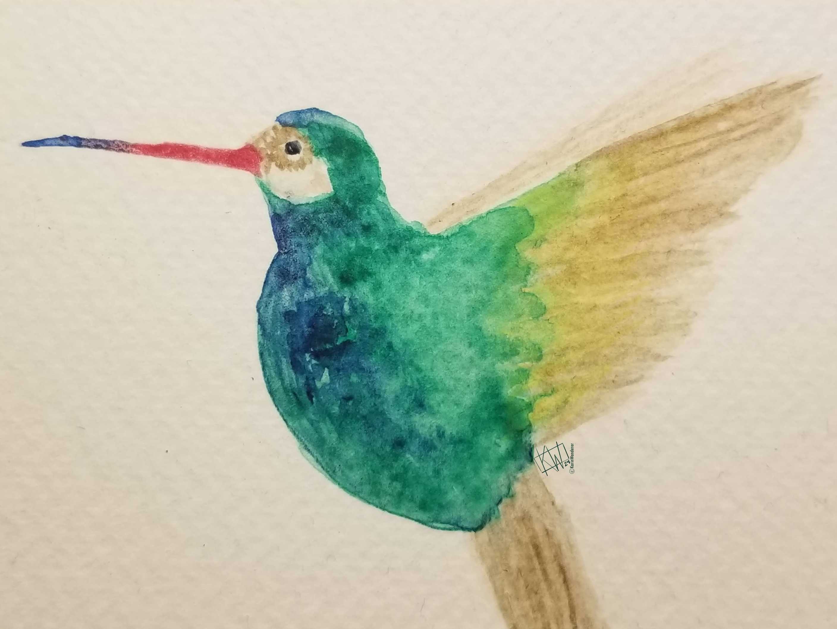
Watercolor hummingbird with green & blue body & beige wing/tail feathers. This hummingbird’s bright green feathers look even brighter against beige
At the same time, your own knowledge can change how you perceive color. Most people could tell you that a couch is red. An interior decorator might specify that the couch is crimson, or alizarin, or cadmium. And if you know the couch is red, then see it in the dark, you won’t find yourself wondering “OMG who painted my couch black!!!???” This is because of a little thing called “color constancy,” where your brain will still be telling you that the couch is red.

‘Color constancy’ is a nice little shortcut for your brain to take, handily remembering what color things should be & filling that information in for you. This means your brain doesn’t have to note the hue of every single thing you see every single time you see it. Considering all the other things your brain is keeping track of all the time, this is very convenient! Maybe a little too convenient…

Once you “know” what color something is going to be, that ‘memory color’ can get you into trouble. Memory color is why people often paint the ocean blue, even if the water in front of them is gray or green or clear. They “know” it’s blue, so they don’t really look at their reference.

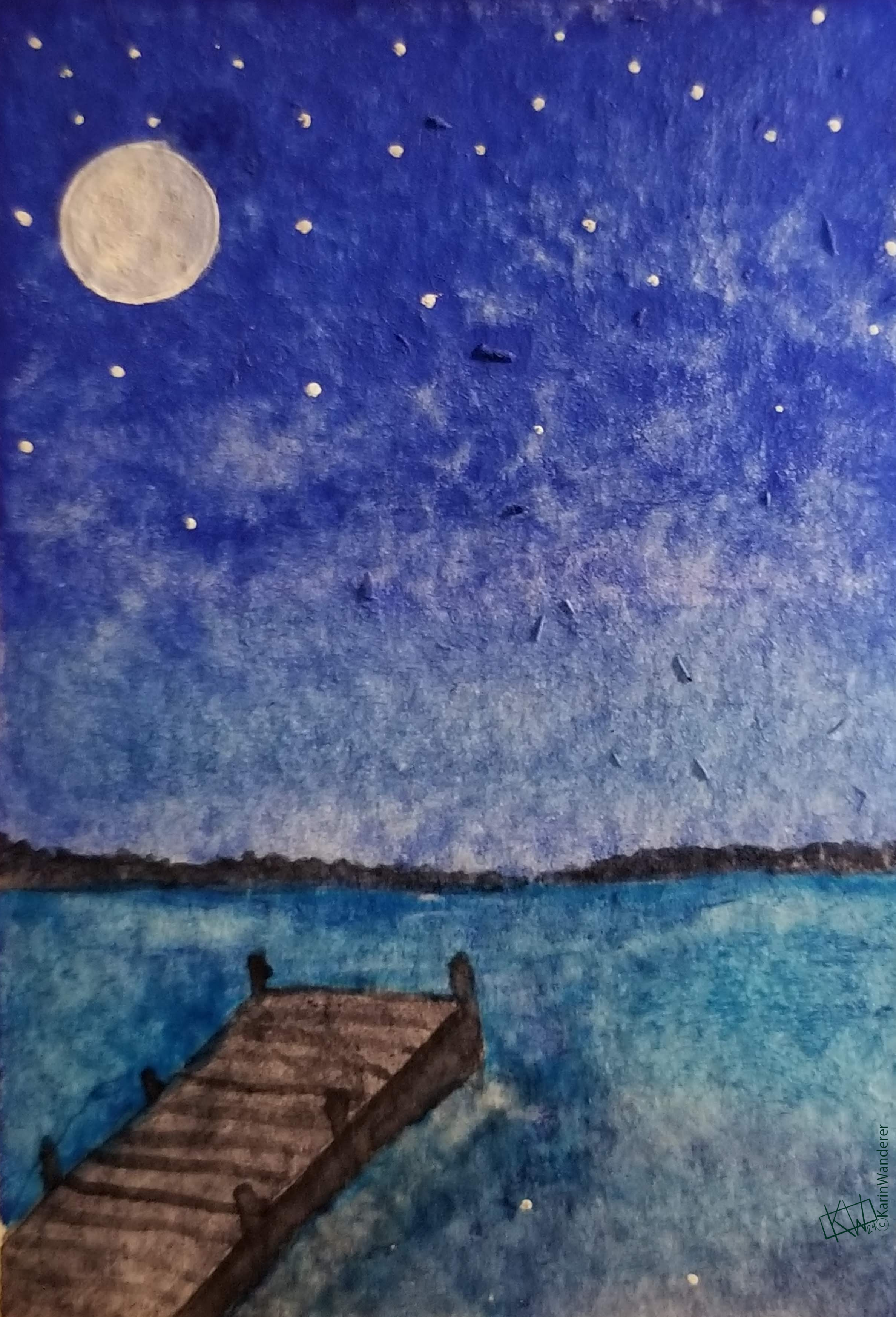
Watercolor of a quiet dock looking out on a wide bay under a full moon.

Your brain plays a lot with color, actually. Most people these days report that their memory, dreams, & daydreams are typically in color. In the 1940s, when television was still black & white, a much higher percentage of people reported that their dreams were “rarely” or “never” in color! Headaches & head trauma can make you see color, or even feel it. For example, when I get a particularly bad headache everything ‘feels’ red, even though I don’t actually see anything as red.

This series of articles about color will be focused mainly on the visible spectrum (or as we tend to call it, “light”), as humans typically perceive it. I have to limit the focus to humans, or this series would never end as I talked about all the animals who see differently than we do! But you all know me, I can’t just not talk about animals. As such I’m going to take a paragraph now to infodump talk about how other animals see color. Many insects & birds see in ultraviolet light, which completely changes how plants look. Some snakes see infrared light, aiding their heat detection even in pitch black environments. Nocturnal animals often, but not always, see almost entirely in achromatic tones- also known as grayscale. Insectivorous bats see in grayscale, & fruit bats see colors, which helps them spot the ripest fruit! Animals also use color in the wild, most notably the bowerbirds and their famous nests. Zoos use color as enrichment activities for the animals they care for, so I will end this digression with a lovely video from the Smithsonian that shows lots of different animals painting!.

Tune in on future Tuesdays to learn more about color!

We’ll be talking about how our ancestors made pigments & what they used them for. We’ll be talking about how we currently make pigments & what we use them for. We’ll be talking about how we physically see color, how we categorize it, & how we organize it. Finally, we’ll be getting down to brass tacks & talking about specific colors! It’s going to be a wild ride. I can't wait!

In the meantime – in between times – my #KWPrompts art challenge is ongoing!

We still have another week of the #LimitedPalette prompt Check out this link for more information!

Get my art on mugs & vinyl stickers in my Shop!

Join us for #KWPrompts, a biweekly art challenge!

Find me on Linktree

  • All pictures posted are my own work.
  • All reviews are my own unpaid & unsolicited opinions.

A How-To Guide on Alt Text This Book is a Movie

Art Challenges – new #KWPrompts every other Tuesday

Current & Past Prompts listed here Do My Art Challenges, I Dare You

#ColorFull

Games Your Brain Plays With Color in The Colors, Duke! The Colors! Games Your Brain Plays With Color Preference in Your True Colors Games People Play With Your Brain Using Color in The Color of Money How Did Payne's Gray Get Its Name? in The Forecast (Calls For Payne)

Fidelia Bridges It's a Still Life Watercolor of a Now-Late Afternoon Bev Bos Like A Bos Andy Warhol Andy Warhol Was Right Kazuo Oga See Into The Trees Isabella Kung It's Your Kind Of Kitten Nie Jun Comic Books Are Coming True Alina Chau There Is Fiction In The Space Between

KidLit

Children's Book Week, w/ book list Read Books. Spark Change. Children's Books Inspired by Folklore Even Rarer Than a Unicorn Watercolors in Comic Books Wrapped Up In Books

#WatercolorScience

Painting in High Heat & Low Humidity We're Having a Heat Wave Painting in High Heat & Low Humidity (cont.) I Started This Heat Wave Painting in the Cold When Winter Comes Howling In Painting in High Humidity Lost in a Fog

Art Styles & How-Tos

Line Art (This) This Time I'm Drawing the Line Paper Cut It's Only A Paper Moon Kawaii To Be Constantly Cute En Plein Aire Saturday in the Park PICO8 Put Your Hand On The Computer Painting People As The Headless Horseman Said To His Associate… Drawing Faces There Go I But For My Face Face to Face Drawing & Painting Trees In The Pines

#Ink

History of Ink King Ink Sumi (traditional Japanese ink) Found In Ink Sumi-e (ink paintings) The Contents of an Ink-bottle More specific types of Sumi-e I Think In Ink

Recipes

A very flexible cake recipe Cups & Cakes (vegan) Iced tea with a plum simple syrup Have a Cuppa Tea (vegan) The best pizza dough Pizza Time! Non-pizza foods made with pizza dough Pizza Time! Part Deux Super easy brownies Sweets For My Sweet Lemon Bars on Olive Oil Shortbread Texture Like Sun Peanut Butter Bread I Looked In & I Saw Bread Bulle Never A Frown With Golden Brown Bread Art You Need Bread (vegan) You Need More Bread (vegan) Jam Tarts She Made Some Tarts

DIY

Reference Photos (general) It's In The Photograph Reference Photos (nature) There's Lots Of Room To Roam Travel Watercolor Paint Palette 1, 2, 3, 4 Can I Have A Little More?

Troubleshooting

IDing Problems & Solutions What Can I Make From This Mistake? Getting Out of Your Own Way Breaking the Rules Time Management Who Knows Where the Time Goes? Tiny Workspace Organization Oh, Don’t You Hand Me None Of Your Lines

The Only One, So Far, With A Content Warning for Nudity

La Fontana del Nettuno The Statue Got Me High

About Me

Intro pt 1 Hello, World! Intro pt 2 Here Comes Your Girl Intro pt 3 Here Comes Your Girl Intro pt 4 Here Comes Your Brand New Day Intro pt 5 It Was Not Not Not So Great #AuGHOST review I Was Walking With AuGHOST 2024 Resolutions Harder Better Faster Stronger 2024 Resolutions: 6 Month Update! I Fold In Half So Easily KWL's 1 Year Blogiversary! Everything Must Change

And The Rest

Wake Me When It's Over I Have A Secret To Tell

Buy my artwork, available in my SPRING SHOP!

Wish I talked about food more? I do! Epicures, assemble!

See everything else I do over on Mastodon.Art