C is for Comics
Comic & picture book artists use a wide variety of physical & digital media for their work. My favorites have always been the ones made with watercolor- even if I did not realize it at the time!
 Watterson used India ink & watercolors. I used watercolors & micron pens.
Why Watercolors?
Using watercolors to make a picture book or comic is very different from using watercolors to paint more traditional forms of art, such as a still life. While the supplies may be similar – or even the same – the techniques employed by a comic illustrator like Bill Watterson are very different from a fine artists such as Fidelia Bridges.
Comic & picture book illustrators are making lots of pictures, as opposed to a fine artists’ one (or relatively few, if they are working on a series.) This is where a lot of the biggest differences lie. Comics & picture book illustrators are also expected to put out more pictures in a shorter amount of time. The pictures all have to be very consistent- if a character is wearing a red shirt on one page & a pink shirt on the next, the reader might think it is an entirely different character! Comics & picture books also tend to show less detail overall, to allow for the small time frame & aid in consistency. The manga series Sand Land, written & illustrated by Akira Toriyama, is a great example of the importance of simplifying your work. The series features a tank that is practically a main character, appearing in some form in most of the manga’s panels. Toriyama had a terribly hard time hitting deadlines for this series, largely because the detailed tank took up so much of his drawing time!
Of course, it isn’t all bad. Most comics are assembled panel by panel, not a whole page at a time. This means that panels with small mistakes can be fixed- physically or digitally. If a mistake ruins a whole panel it can be swapped out easily instead of starting the whole page over again. Many comic & picture book illustrators buy “convenience colors”- premixed shades they use a lot – to aid in consistency. Making comics also means that artists can often use cheaper materials. After all, the lightfast rating of the paint hardly matters when the picture is meant to be reproduced in print or on a computer screen, rather than having to stand the test of time hanging on a wall.
… But Why Watercolors?
The transparency of watercolor allows for dramatic layering. The dreaminess inherent in the medium lends itself nicely to the fanciful stories that picture & comic books most often contain. From a financial standpoint, you tend to get more pigment for your dollar with paint than with markers. (I would make comics with my dollar-store paints any day, but never with my dollar-store markers!) Additionally, the workflow is entirely different, in a way I find oddly fascinating.
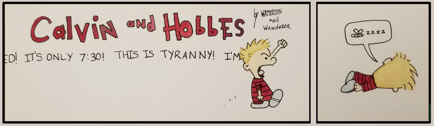
For example, we'll compare my workflow painting individual pictures versus the Calvin & Hobbes comic at the top of this article.
Typically when I am painting I am working on multiple pictures at once. This helps me to avoid sitting around & literally watching paint dry. I fill the time while painting A dries by drawing & starting to paint Painting B, then maybe starting to draw & paint C before going back & doing more work on A, etc. My palette is covered in small amounts of paint, with a different color scheme for each picture. When it comes to comics, a major concern is consistency. I rarely paint series of pictures, with the notable exception of Milly, whose coloring is easy to match consistently. Working in a comic strip style changed everything for me from the ground up!
I had to draw both panels entirely…
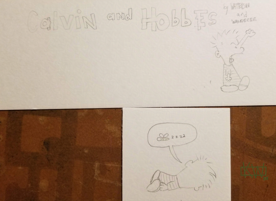 I didn’t plot out Calvin’s dialogue in the first panel- I should have.
Ink them entirely…
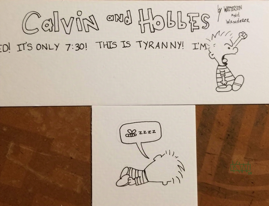 The kerning… It haunts me…
Then mix up a big batch of each paint I needed & paint all the parts that need to be consistent all in one pass. I made a rookie mistake; I did not mix up enough red to do the title & both Calvins’ shirts. This meant I had to stop after finishing the title, even though I had enough paint for one of the shirts, & mix up a new batch of red so the Calvins would match neatly from picture to picture. Matching colors closely is good for continuity, & makes it easier for your readers to know which character is which. In my example there is only 1 character, but what if there were 12? What if 3 of those 12 characters were wearing slightly different red shirts? If the 3 different shirts are 3 different & consistent shades of red your reader will not have to work very hard to tell which character is which, even if they are reading very fast! If your red shirts are inconsistent, falling all over the red spectrum, it will make it much harder for your readers. Rule 1 of making comics: Don't make things harder for your readers!
All in all, painting comics is an entirely different experience from painting more traditional pictures! I’ll be talking more about watercolor comics & picture books as well as the people who illustrate them in my future Featured Artists articles.
 So many artists, so much time!
Is there a picture book or comic book illustrator you want me to talk about? Let me know on Mastodon or Ko-Fi! Have a fantastic day, draw something for my art challenge see you next week!
Get my art on mugs & vinyl stickers in my Shop!
Donate to support my works & get cool perks on Ko-Fi
Join us for #ArtABCs, the best art challenge on the internet!
- All pictures posted are my own work.
- All reviews are my own unpaid & unsolicited opinions.