We're arting the alphabet from A-Z all year long! Each challenge lasts 2 weeks from the day this post was made. You can submit a new picture every day, work on one picture for 2 weeks, or post pics randomly. This is the most laid-back art challenge on the internet, & that means you have plenty of time to make your art however you want.
Congrats on making it this far into the year! We've reached the letter O
Any art subject starting with that letter is fair game, no matter how abstract. Letters like æ, ñ, anything with a diacritical mark, etc., can go anywhere you like.
We're arting the alphabet from A-Z all year long! Each challenge lasts 2 weeks from the day this post was made. You can submit a new picture every day, work on one picture for 2 weeks, or post pics randomly. This is the most laid-back art challenge on the internet, & that means you have plenty of time to make your art however you want.
Congrats on making it this far into the year! We've reached the letter N
Any art subject starting with that letter is fair game, no matter how abstract. Letters like æ, ñ, anything with a diacritical mark, etc., can go anywhere you like.
We're arting the alphabet from A-Z all year long! Each challenge lasts 2 weeks from the day this post was made. You can submit a new picture every day, work on one picture for 2 weeks, or post pics randomly. This is the most laid-back art challenge on the internet, & that means you have plenty of time to make your art however you want.
Congrats on making it this far into the year! We've reached the letter M
Any art subject starting with that letter is fair game, no matter how abstract. Letters like æ, ñ, anything with a diacritical mark, etc., can go anywhere you like.
We're arting the alphabet from A-Z all year long! Each challenge lasts 2 weeks from the day this post was made. You can submit a new picture every day, work on one picture for 2 weeks, or post pics randomly. This is the most laid-back art challenge on the internet, & that means you have plenty of time to make your art however you want.
Congrats on making it this far into the year! We've reached the letter L
Any art subject starting with that letter is fair game, no matter how abstract. Letters like æ, ñ, anything with a diacritical mark, etc., can go anywhere you like.
We're arting the alphabet from A-Z all year long! Each challenge lasts 2 weeks from the day this post was made. You can submit a new picture every day, work on one picture for 2 weeks, or post pics randomly. This is the most laid-back art challenge on the internet, & that means you have plenty of time to make your art however you want.
Congrats on making it this far into the year! We've reached the letter K
Any art subject starting with that letter is fair game, no matter how abstract. Letters like æ, ñ, anything with a diacritical mark, etc., can go anywhere you like.
We're arting the alphabet from A-Z all year long! Each challenge lasts 2 weeks from the day this post was made. You can submit a new picture every day, work on one picture for 2 weeks, or post pics randomly. This is the most laid-back art challenge on the internet, & that means you have plenty of time to make your art however you want.
Congrats on making it this far into the year! We've reached the letter J
Any art subject starting with that letter is fair game, no matter how abstract. Letters like æ, ñ, anything with a diacritical mark, etc., can go anywhere you like.
We're arting the alphabet from A-Z all year long! Each challenge lasts 2 weeks from the day this post was made. You can submit a new picture every day, work on one picture for 2 weeks, or post pics randomly. This is the most laid-back art challenge on the internet, & that means you have plenty of time to make your art however you want.
Congrats on making it this far into the year! We've reached the letter I
Any art subject starting with that letter is fair game, no matter how abstract. Letters like æ, ñ, anything with a diacritical mark, etc., can go anywhere you like.
We're arting the alphabet from A-Z all year long! Each challenge lasts 2 weeks from the day this post was made. You can submit a new picture every day, work on one picture for 2 weeks, or post pics randomly. This is the most laid-back art challenge on the internet, & that means you have plenty of time to make your art however you want.
Congrats on making it this far into the year! We've reached the letter H
Any art subject starting with that letter is fair game, no matter how abstract. Letters like æ, ñ, anything with a diacritical mark, etc., can go anywhere you like.
We're arting the alphabet from A-Z all year long! Each challenge lasts 2 weeks from the day this post was made. You can submit a new picture every day, work on one picture for 2 weeks, or post pics randomly. This is the most laid-back art challenge on the internet, & that means you have plenty of time to make your art however you want.
Congrats on making it this far into the year! We've reached the letter G
Any art subject starting with that letter is fair game, no matter how abstract. Letters like æ, ñ, anything with a diacritical mark, etc., can go anywhere you like.
We're arting the alphabet from A-Z all year long! Each challenge lasts 2 weeks from the day this post was made. You can submit a new picture every day, work on one picture for 2 weeks, or post pics randomly. This is the most laid-back art challenge on the internet, & that means you have plenty of time to make your art however you want.
Congrats on making it this far into the year! We've reached the letter F
Any art subject starting with that letter is fair game, no matter how abstract. Letters like æ, ñ, anything with a diacritical mark, etc., can go anywhere you like.
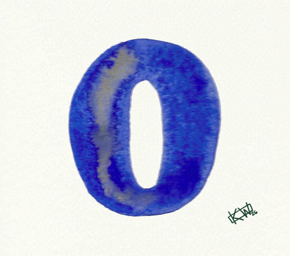
 O is for Outside
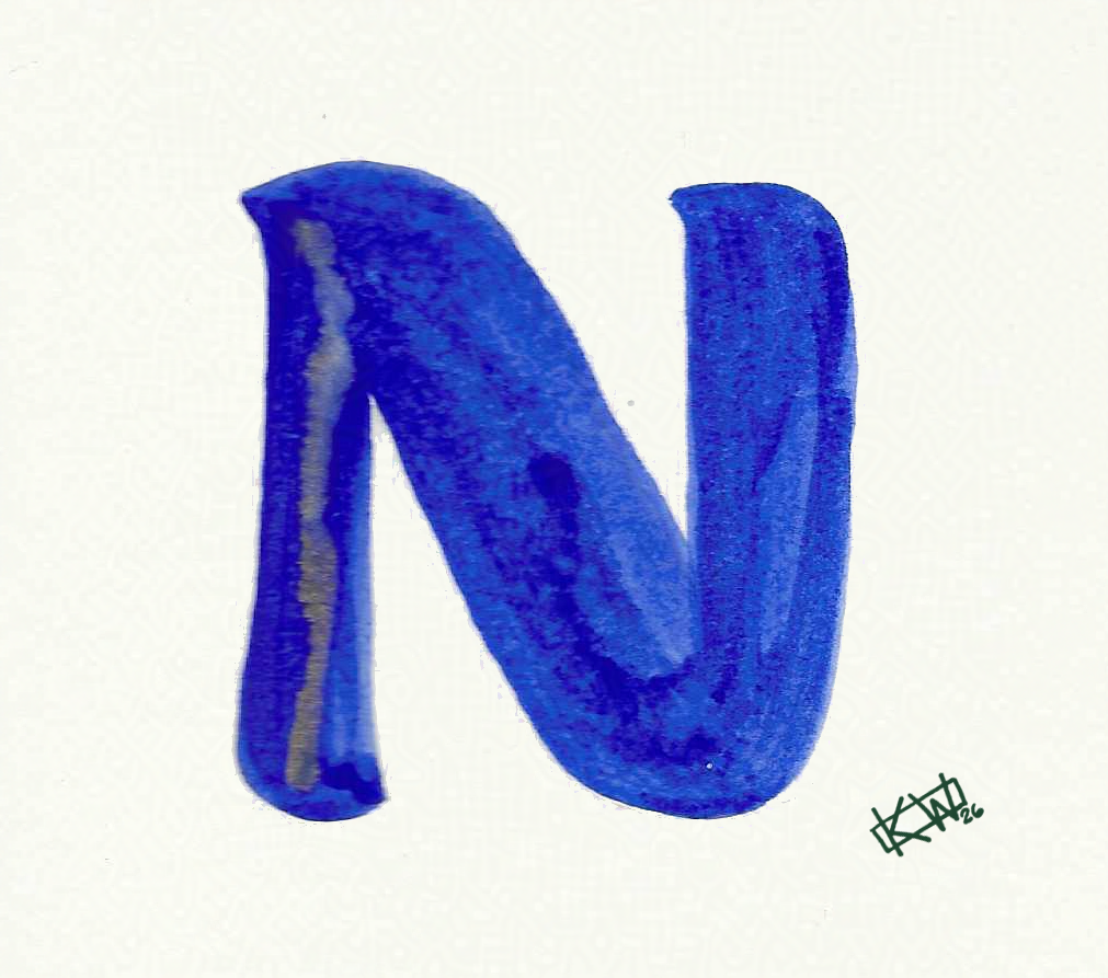
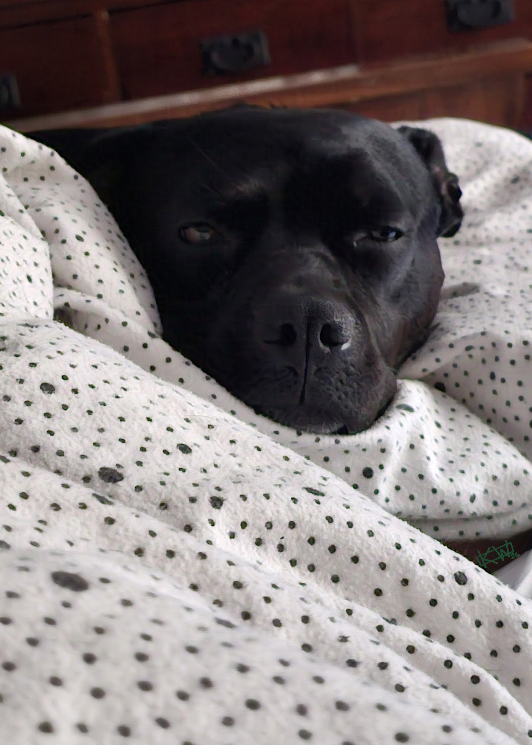 N is for Naptime
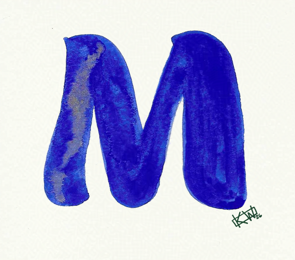
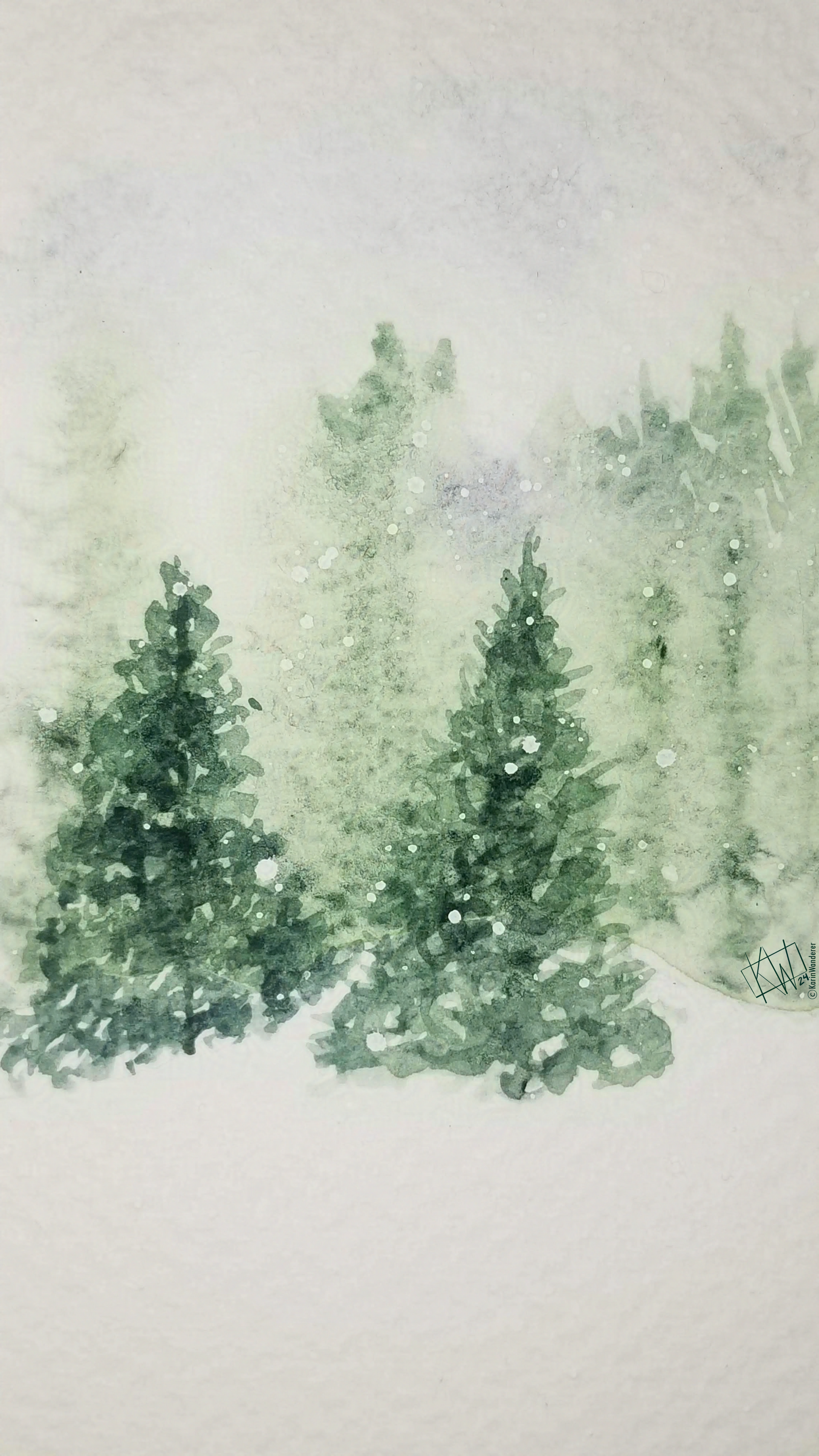
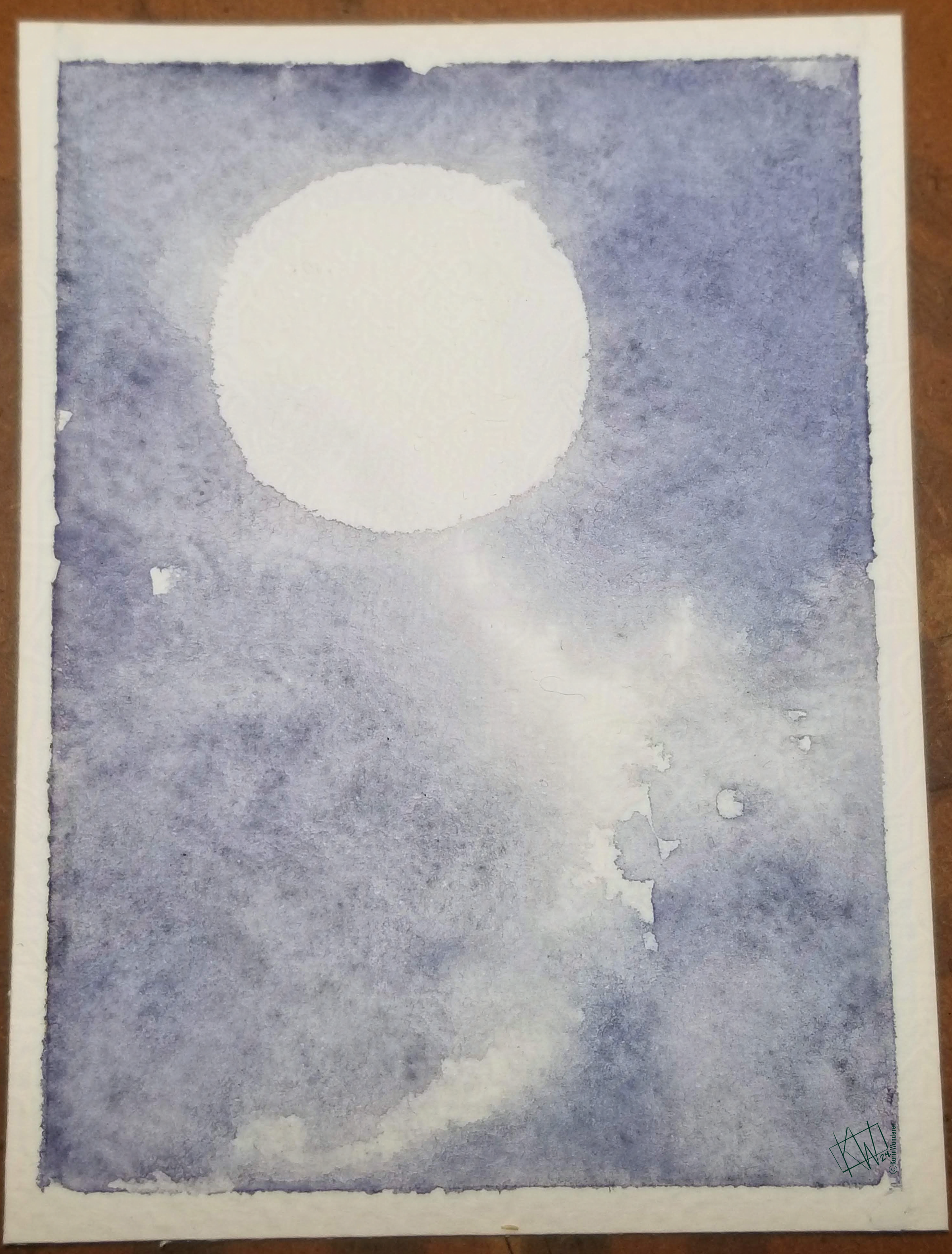 M-O-O-N, that spells 'join my art challenge'
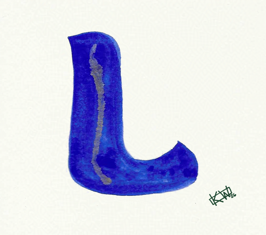
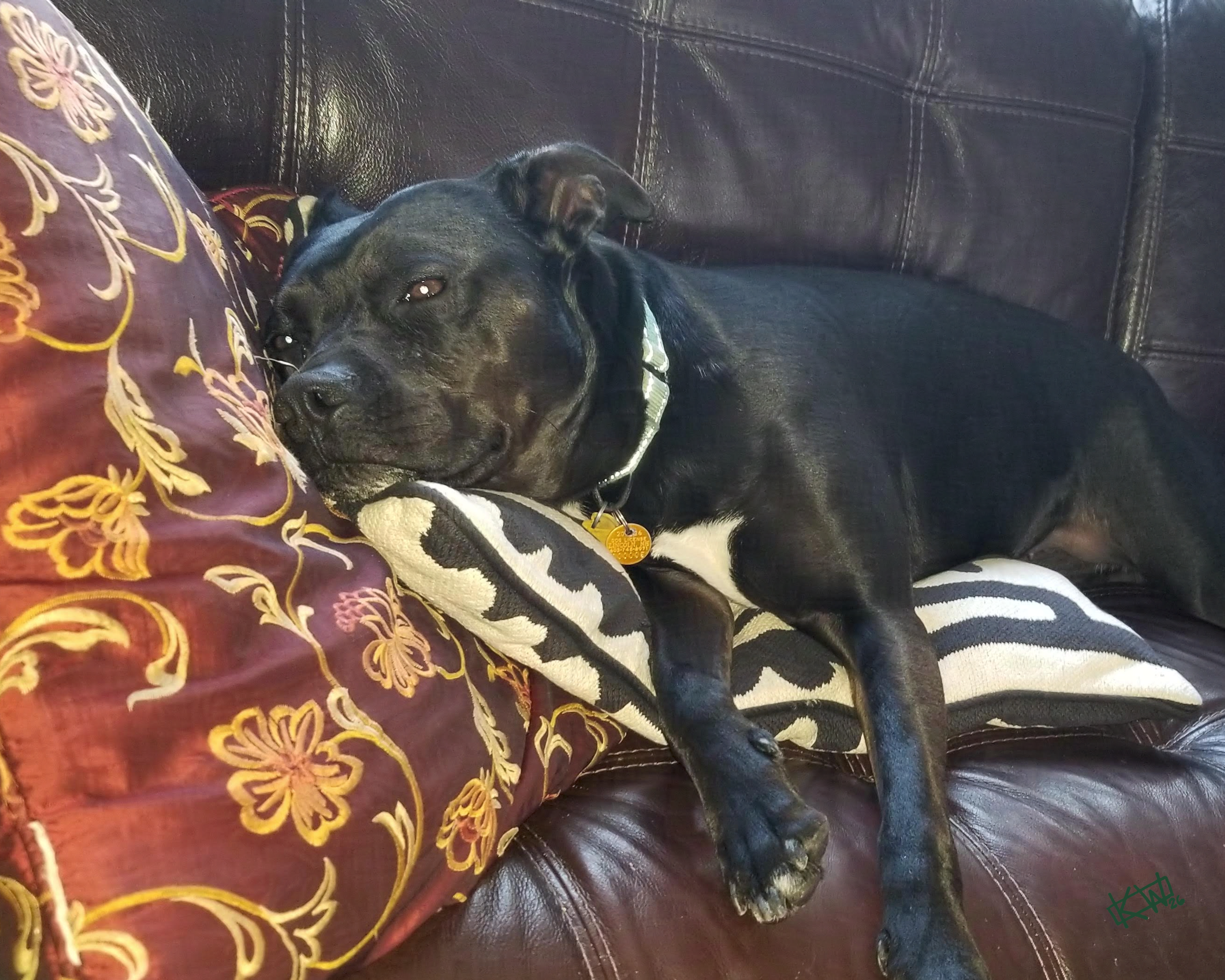 L is for Lounging, Loafing, & Lazing
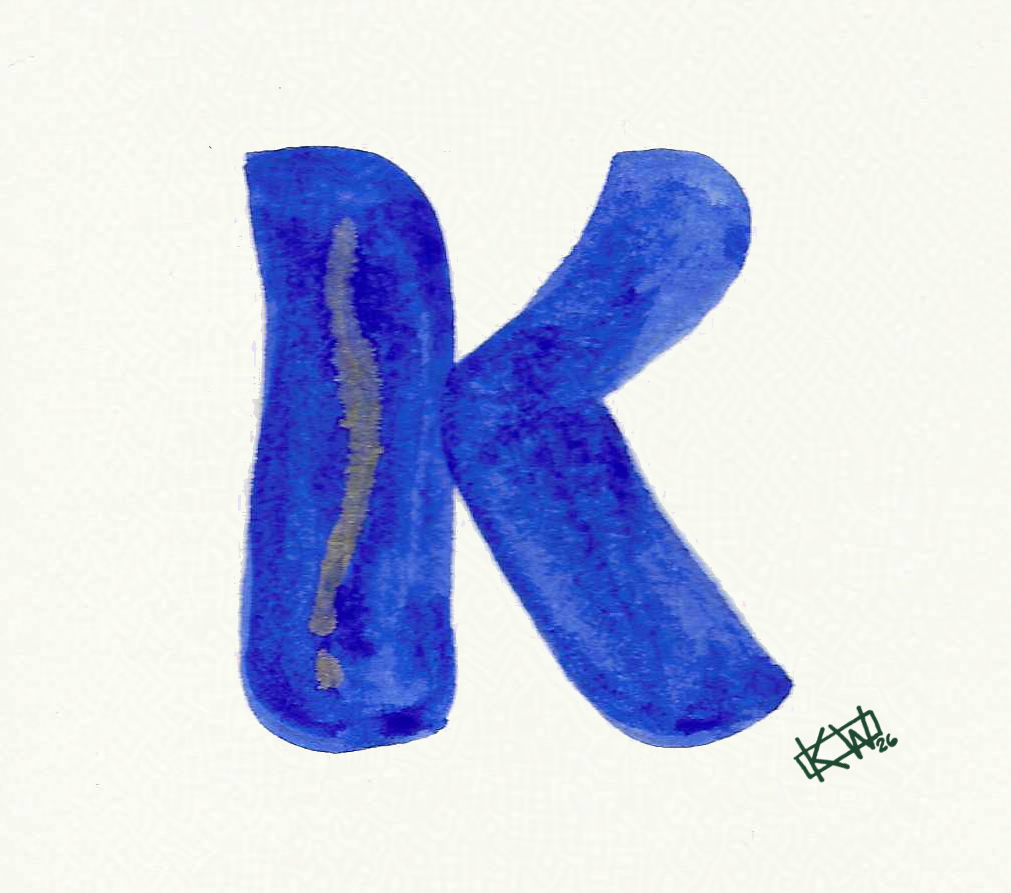
 K is for Kittens
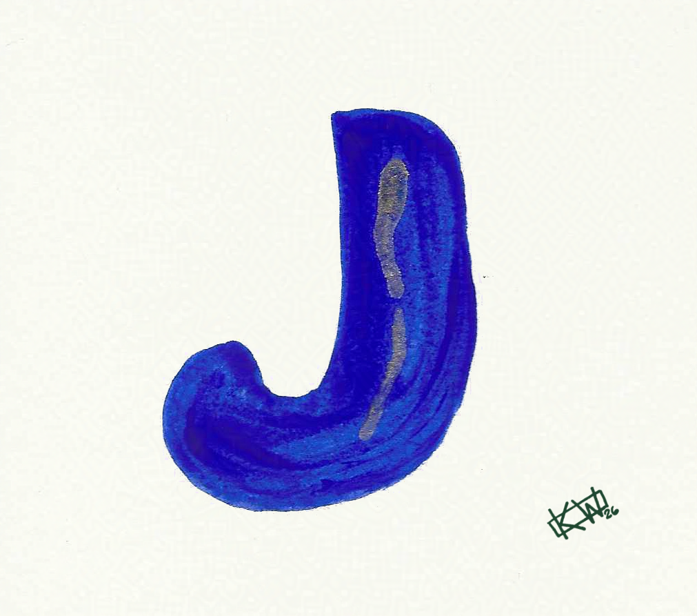
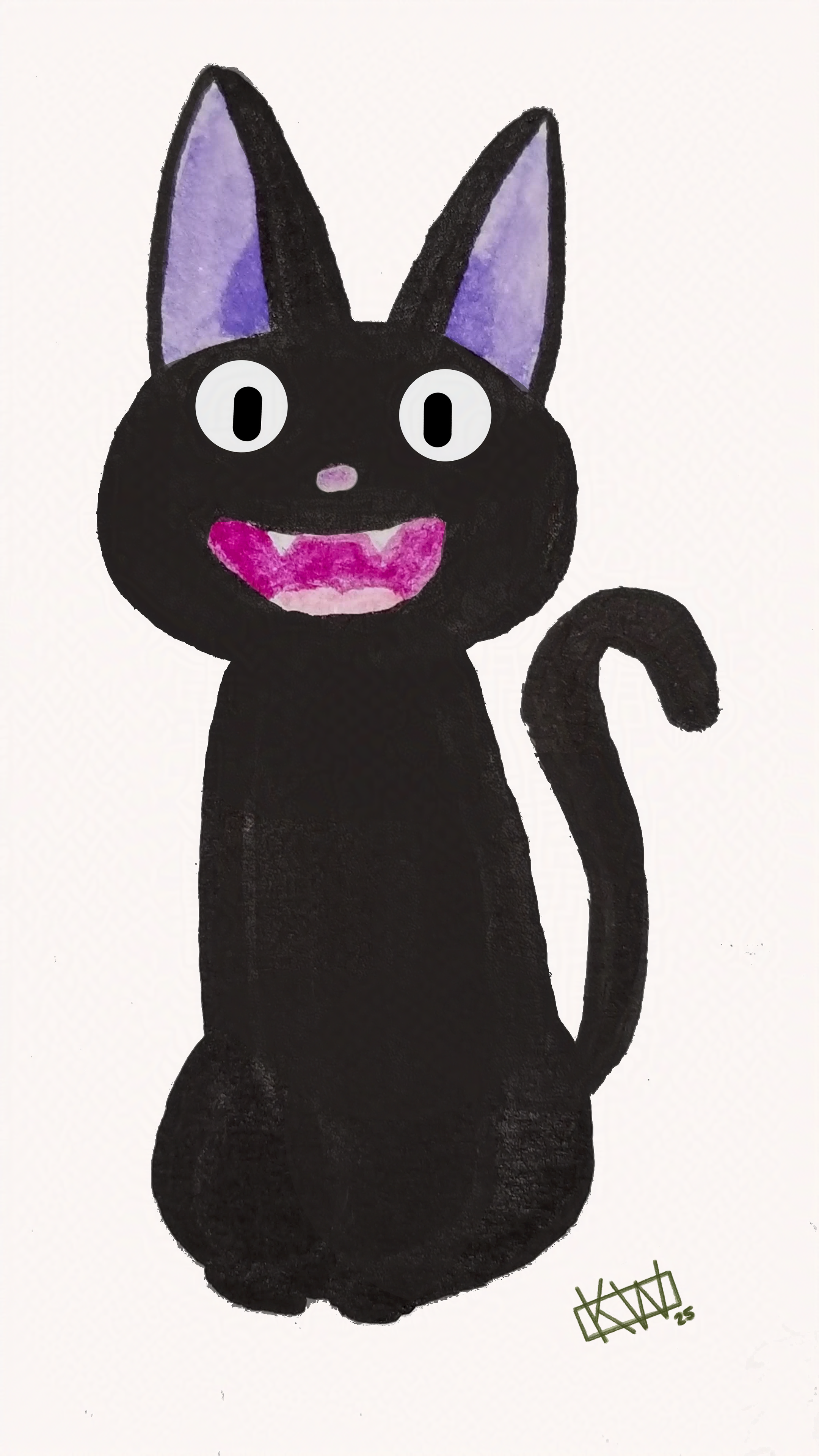 J is for Jiji
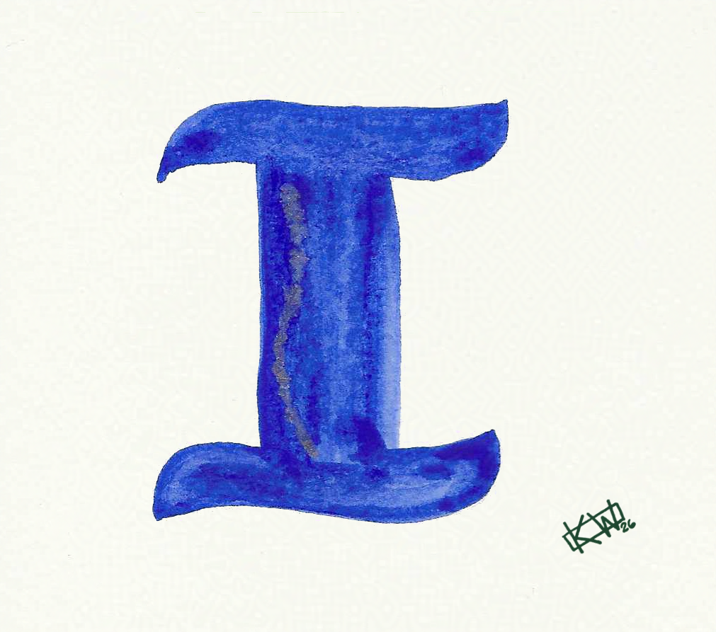
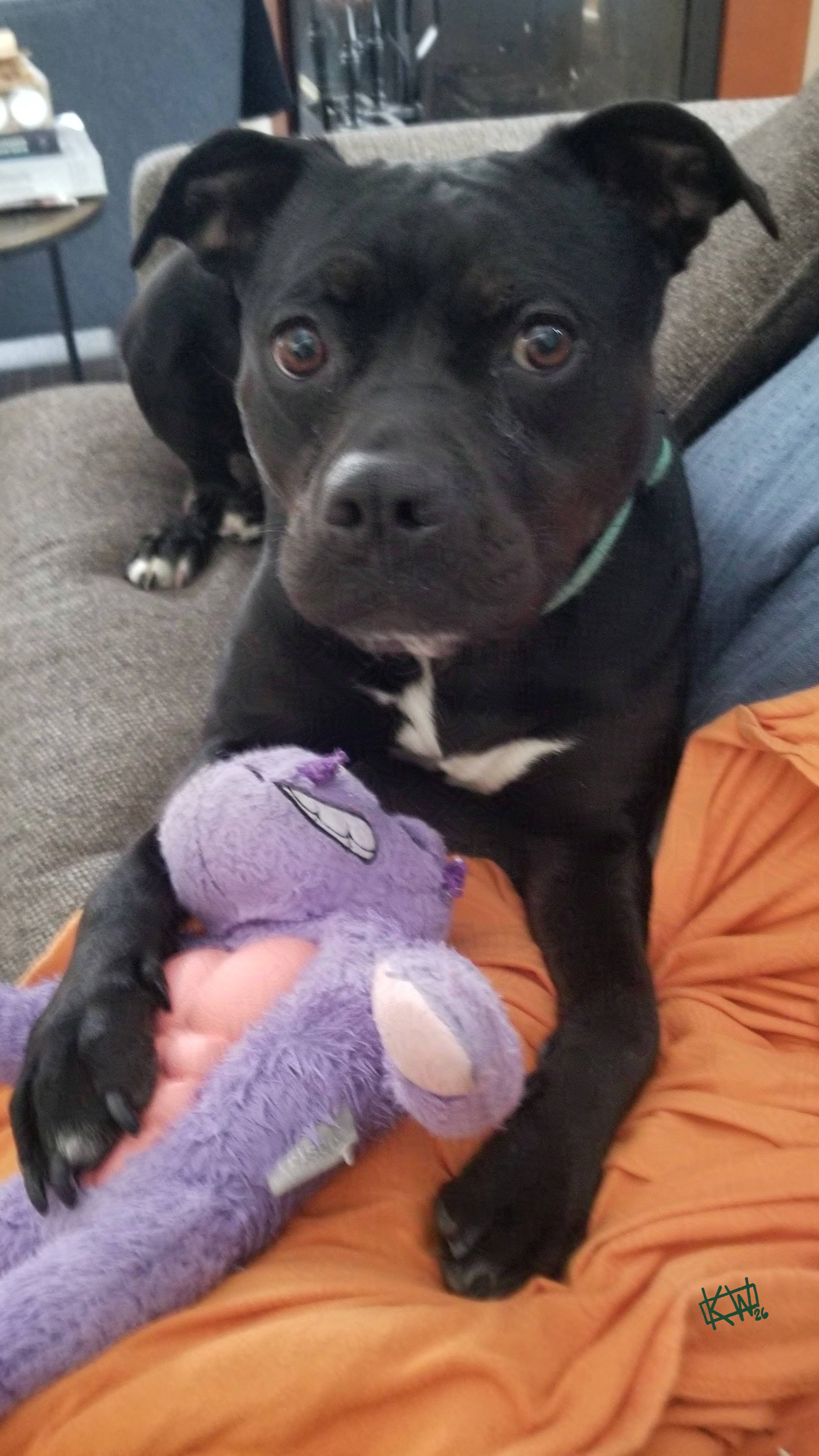 I is for Irresistible
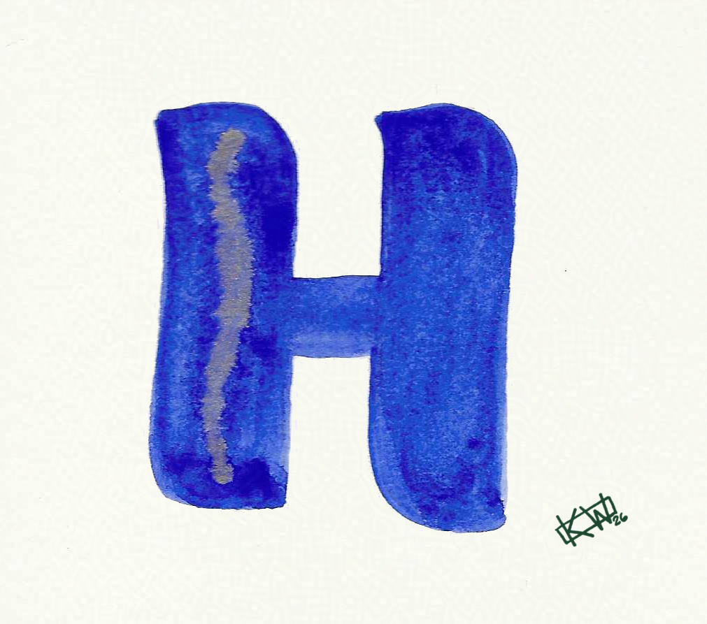
 H is for Hoopy: a really together guy
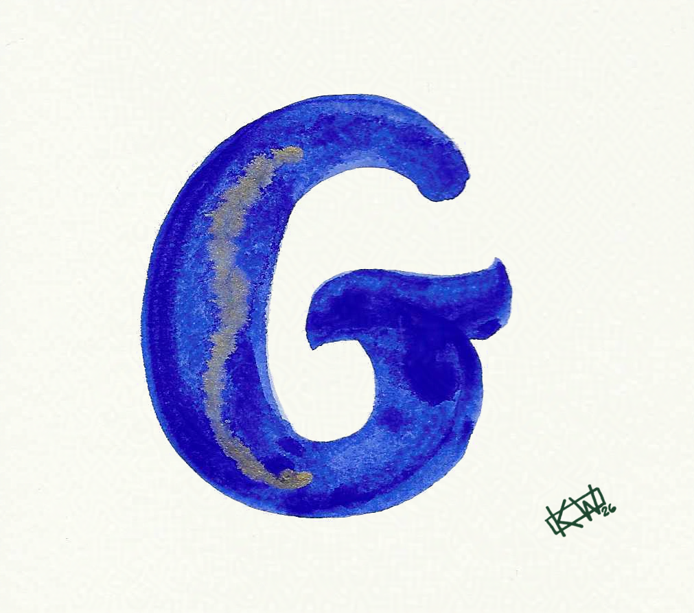
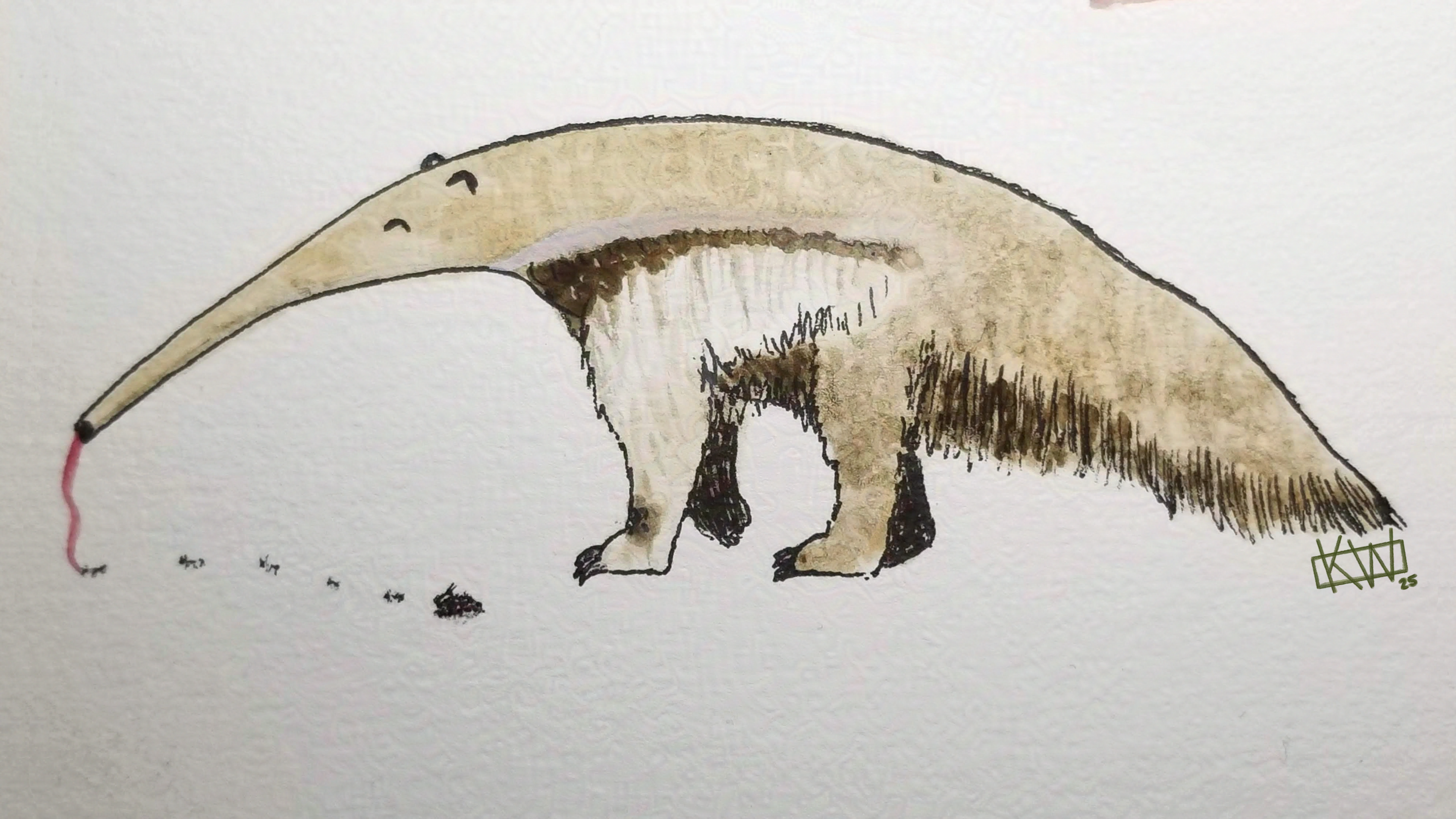 G is for Giant Anteater
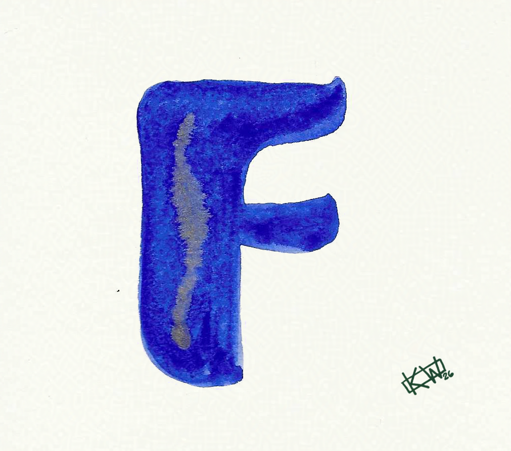
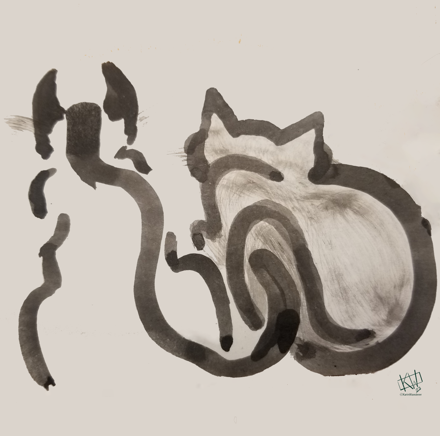
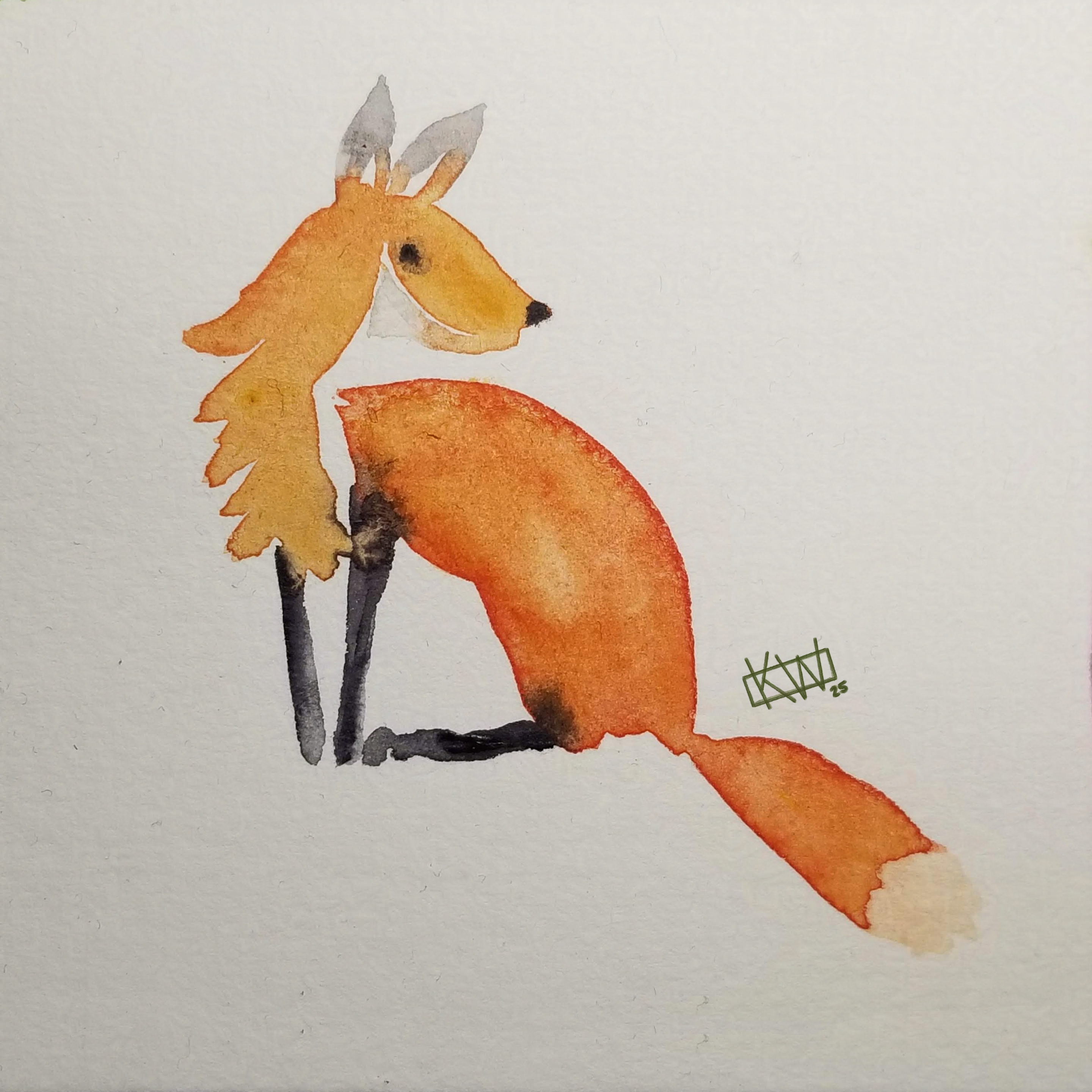 F is for Fox