The Color of Money
Welcome to #ColorFull part 3!
Logos are a bit of visual shorthand; a symbol used as an identifier for an organization in place of (or supplementary to) their name. They have been around a long time, in one form or another. Nobility had seals, signets, & coats of arms. Expert crafters, such as jewelers or blacksmiths, often stamped their works with their ‘maker's mark.’ Today, logos are a pervasive part of our culture. Even science gets logos: NASA’s logo is just as recognizable as their stellar photography
Take a moment to look around you. The odds are good that, wherever you are, you are surrounded by logos right now. There may even be one on the screen you’re using to read this very article!
 This picture has a notable lack of branding on the electronics & food.
A lot goes into designing logos. There is so much variety! Anyone trying to come up with a new logo is truly spoiled for choice. Is your logo going to use symbols? Letters? A mix of both? Will it be colorful or monochromatic? Is it intended to be used alongside a slogan, or to stand on its own? Will there be different versions for different uses, or are you looking for a one-size-fits-all type of logo? The questions go on & on. Lucky for me- this is a #ColorFull series, so I don’t have to go on & on.
Color is Crucial
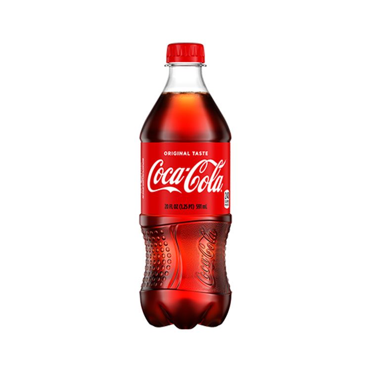
Color is an absolutely essential aspect to consider when designing a logo. To understand why, look no further than classic rivals Pepsi & Coca-Cola. I didn’t link to their logos there, but did I need to? When you read their names you were probably able to picture each soda’s distinctive logo. Just in case you can’t: Coca-Cola has a red can with white script reading ‘Coca-Cola’. Pepsi has a blue can with the Pepsi Globe on it- a circle with red, white, & blue lines swooshing across it with black or dark blue print reading ‘Pepsi’. These competing brands have such incredibly different logos that you could never mistake one for the other.
Color plays an enormous part in making sure you can discern which brand is which, even at a distance. Way back when Pepsi was still Pepsi-Cola its label looked quite different: red script on a white background. If I walked into a supermarket aisle these days & saw red cans with white script & white cans with red script, I might just think all of it was regular & diet Coca-Cola. Pepsi-Cola must have had the same thought, because as competition between themselves & Coca-Cola ramped up they dropped the “-Cola” from their name & changed their logo to the now-famous Pepsi Globe. The logo has been presented with more & more blue, until the most recent version is the Pepsi Globe on a can that is not only blue, but electric blue. Coca-Cola has responded by leaning heavily on the red/white logos. Recently when Disney Parks opened Star War attractions their Coca-Cola sodas had labels in Aubresh, but they are still perfectly recognizable.
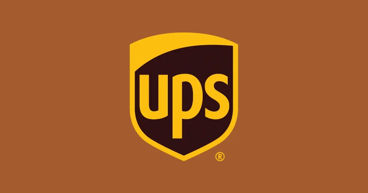
Color is so powerful it can sometimes represent the company even better than the logo. Google’s capital G logo is just an unremarkable letter- until you add the rainbow coloring, at which point it is recognizably the Google logo. Do you know offhand what the UPS logo looks like? I don’t. I had to look it up. But I could tell you without looking that UPS colors are brown & yellow. If I see a person in a brown uniform getting out of a brown & yellow truck I will immediately assume they are delivering something. Once in Italy I saw a person in a brown uniform getting out of a brown & yellow truck & I was genuinely surprised to find out it was a moving company!
Of course, not all logos depend so heavily on color. The logo on your iPhone can be just about any color, but it is still the same recognizable apple. The same goes for Android’s logo; although the Robot is usually green, that is not a hard & fast rule. Do you even know what the “official” color of the Nike Swoosh or the Disney Castle are? Such ‘color-flexible’ logos can shift & change with the times or situation, but the color is still an important element that is carefully considered before such changes are made. You’re probably not going to see a pukey brown Nike Swoosh, unless that color somehow becomes trendy. It has happened before.
Now that you’ve read this, spend some more time paying attention to the logos that surround you day after day. Are the logos reliant on color, or are they color flexible? What colors did the organization choose? How does the color choice make you feel? What message is the organization trying to convey with their color choice? What if the colors were wildly different, e.g. a blue logo was orange, or a dark logo was neon? Would that change what you feel when you see the logo? How? Color psychology is its own whole can of worms, & so we will have to give it its own article in the future!
 I don’t have a logo, but I do have an avatar. Do you think that counts? Last time in the #ColorFull series, we talked about how different people see color. Did you figure out your CPT? How do you think that affects the way you feel about different logos?
Let me know!
Mastodon
BlueSky
I don’t have a logo, but I do have an avatar. Do you think that counts? Last time in the #ColorFull series, we talked about how different people see color. Did you figure out your CPT? How do you think that affects the way you feel about different logos?
Let me know!
Mastodon
BlueSky
Tune in on future Tuesdays to learn more about color!
We’ll be talking about how our ancestors made pigments & what they used them for. We’ll be talking about how we currently make pigments & what we use them for. We’ll be talking about how we physically see color, how we categorize it, & how we organize it. Additionally, we’ll be getting down to brass tacks & talking about specific colors! It’s going to be a wild ride.
My 2-week #KWPrompts art challenge is ongoing!
We still have another week of the #Animals prompt Check out the #KWPrompts list for more information!
Get my art on mugs & vinyl stickers in my Shop!
Donate to support my works & get cool perks on Ko-Fi
Join us for #ArtABCs, the best art challenge on the internet!
- All pictures posted are my own work.
- All reviews are my own unpaid & unsolicited opinions.