Hello & Hello Again! We are talking about paints today. I usually avoid mentioning brands, because no one is paying me. Today I need to specify that I use Daniel Smith watercolors. Every brand has their own unique spin on a color- it may be a little cooler, or more transparent, etc, compared to other brands. If you love a shade you see from a specific brand, buy that color in that brand! If you really like a shade but think it could be better, check out that color in different brands! #NotSponsored
Welcome back to our ColorFull series!
Colors have great names. Paint colors doubly so.
Alizarin Crimson. Quinacridone Pink. Isoindoline Yellow. Some paint names make immediate sense, like Sap Green. Some make no sense whatsoever, like Elephant’s Breath. One color I have always wondered about is…
Payne’s Gray
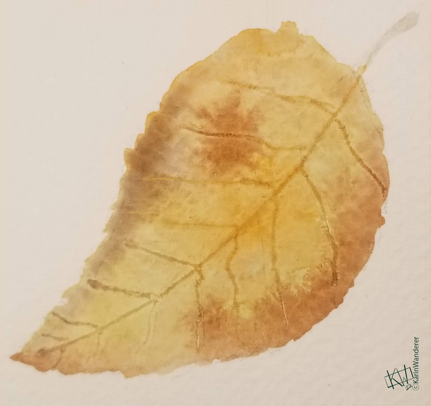
Payne’s Gray is one of my most frequently-used colors. It is an absolutely lovely shade of blue-gray. At its most concentrated it is almost black, which shows more & more blue as you dilute it. It makes for lovely shadows, & nothing matches that blue-black you find in cats’ fur better. I use just a touch of it mixed with other colors all the time. I blend it with other colors so often, in fact, that I had a hard time finding paintings that actually show off the color itself.
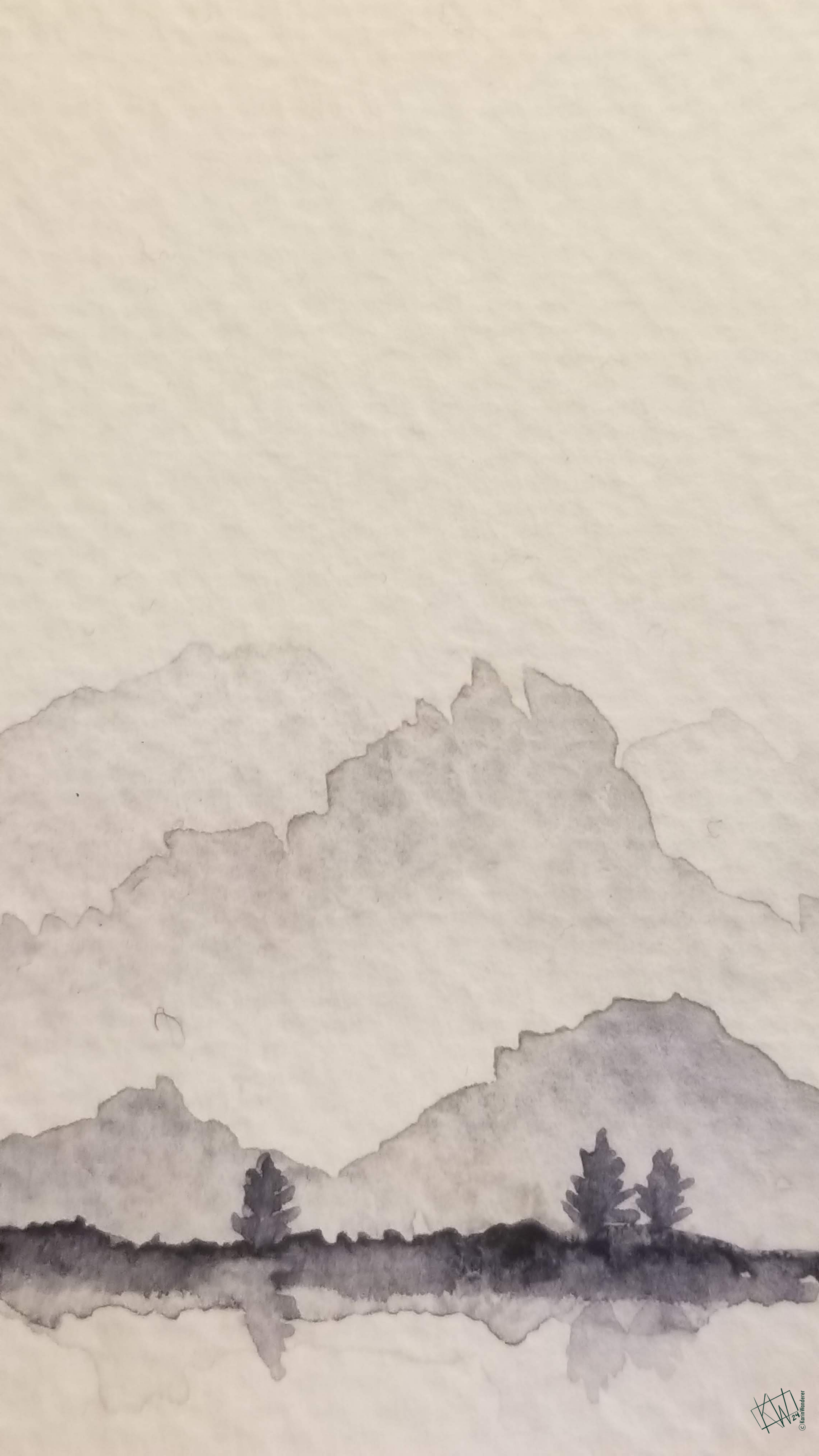
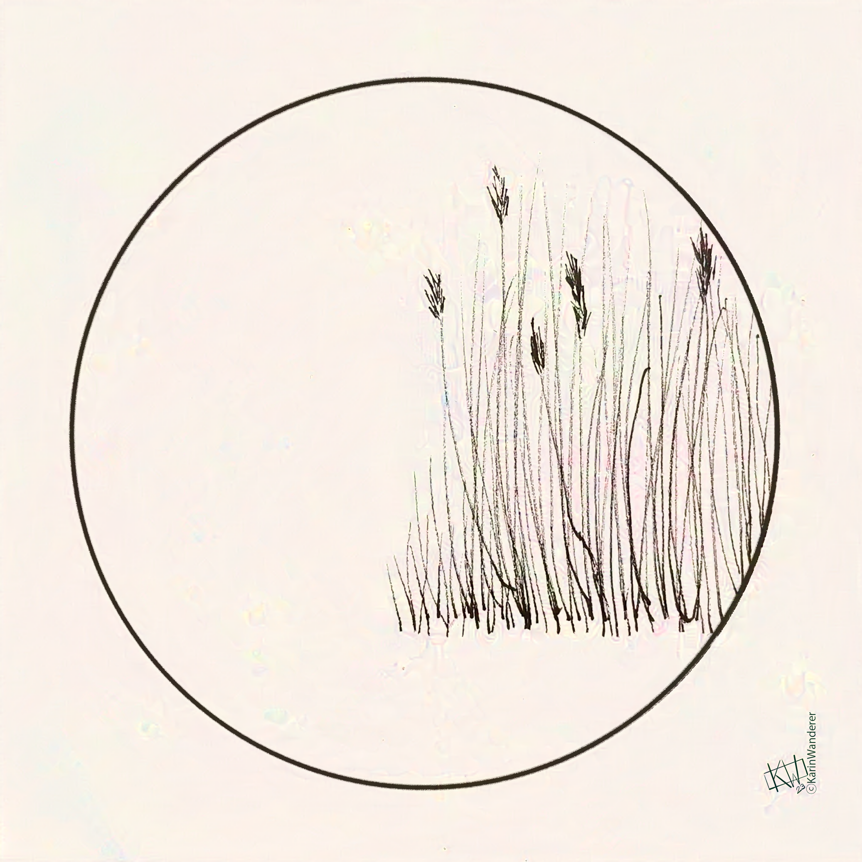
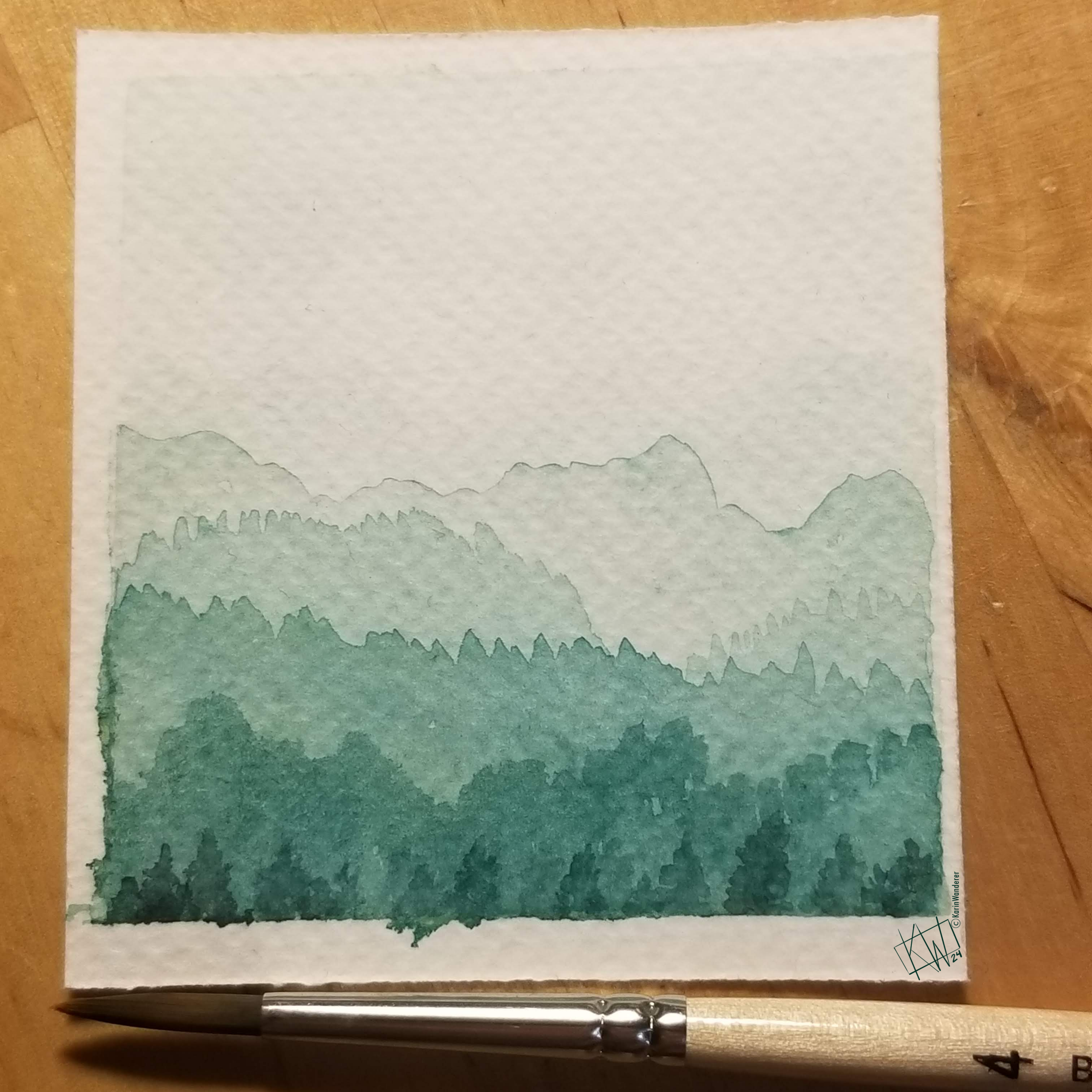
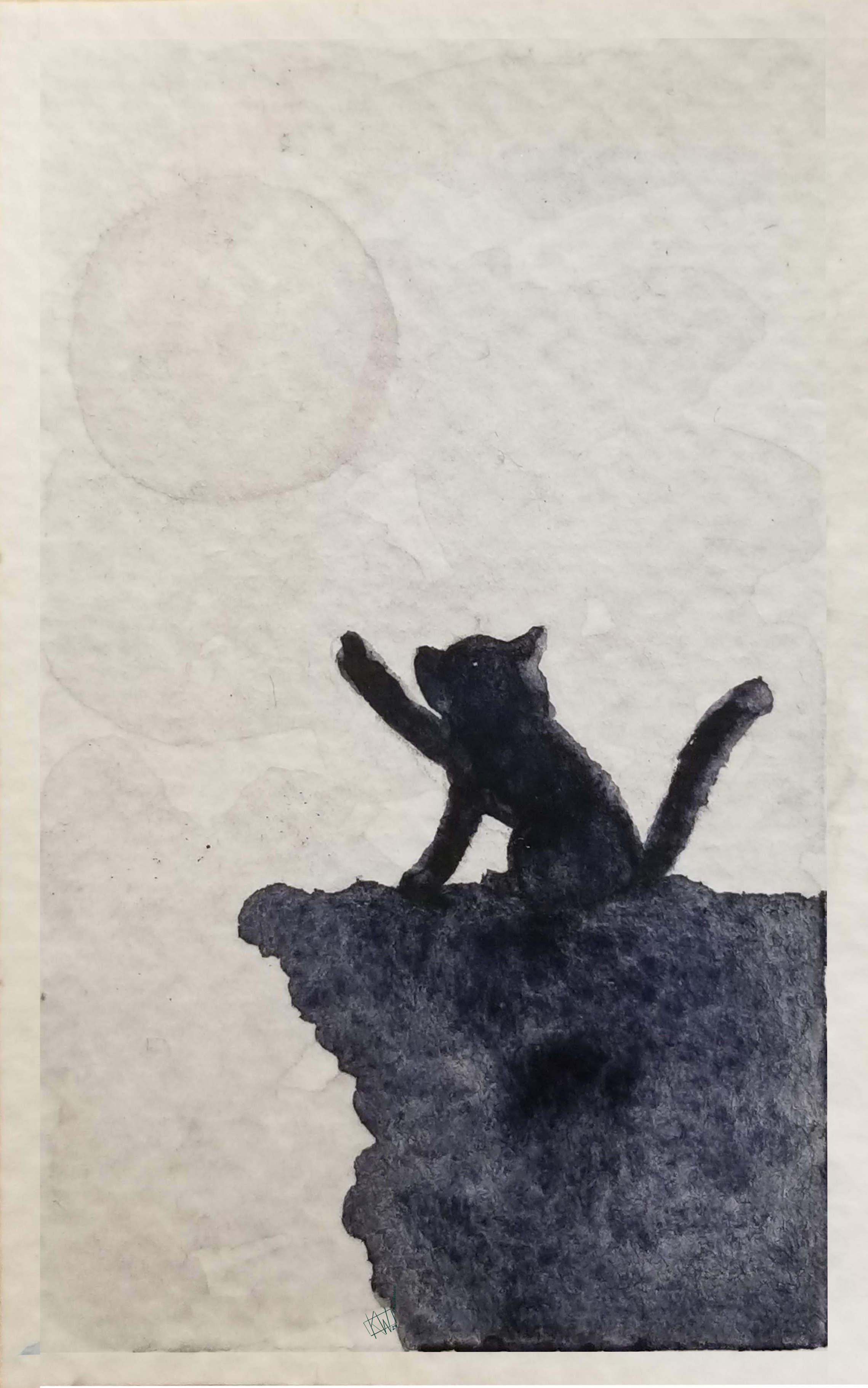 Good thing one of the past #KWPrompts was #Monochrome!
Payne’s Gray was named after William Payne. Although he sounds like an old-timey vampire in a YA novel, William Payne was a watercolor artist. He supported himself by tutoring other watercolorists, & eventually gained a measure of renown. Landscapes were his specialty.
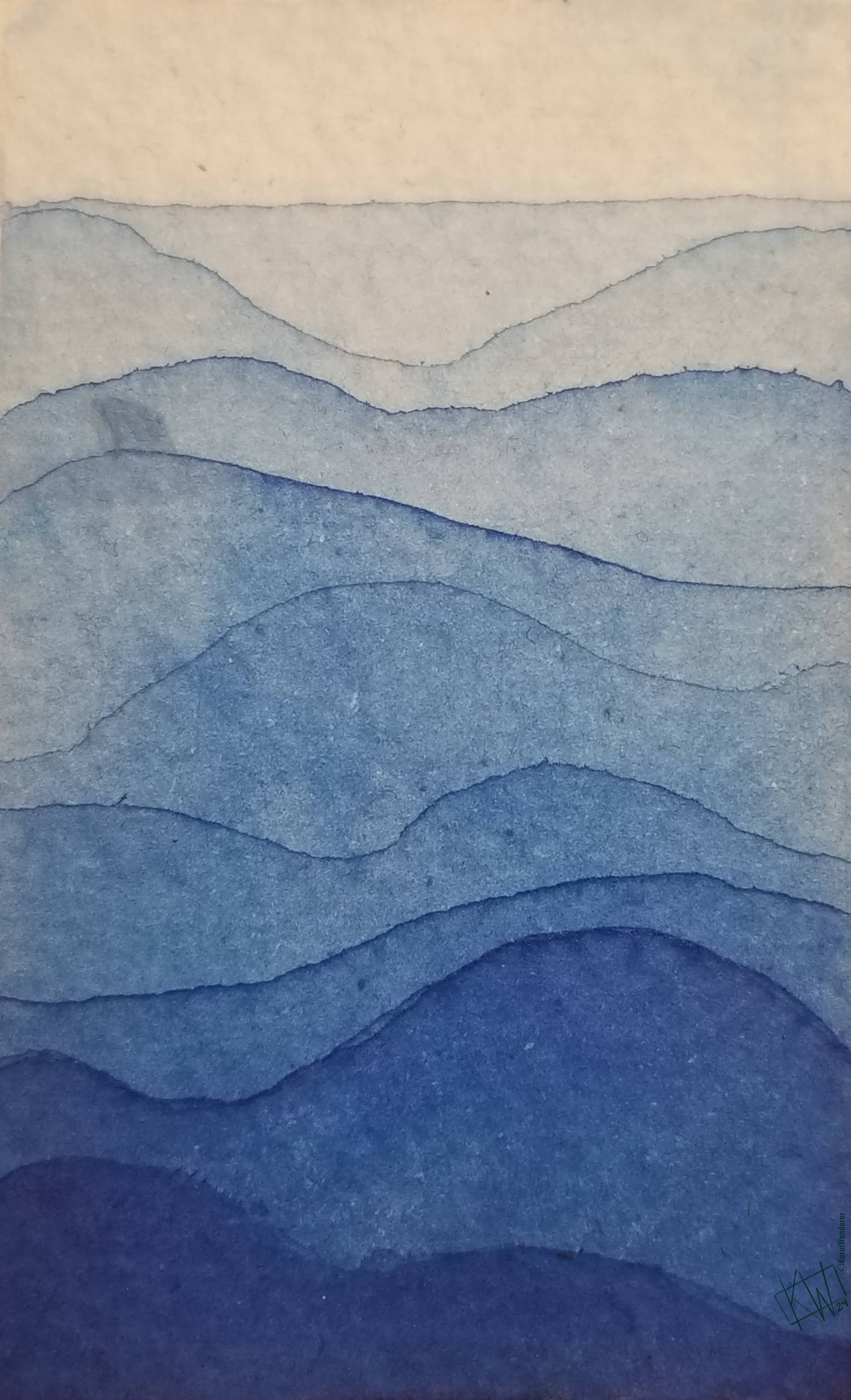
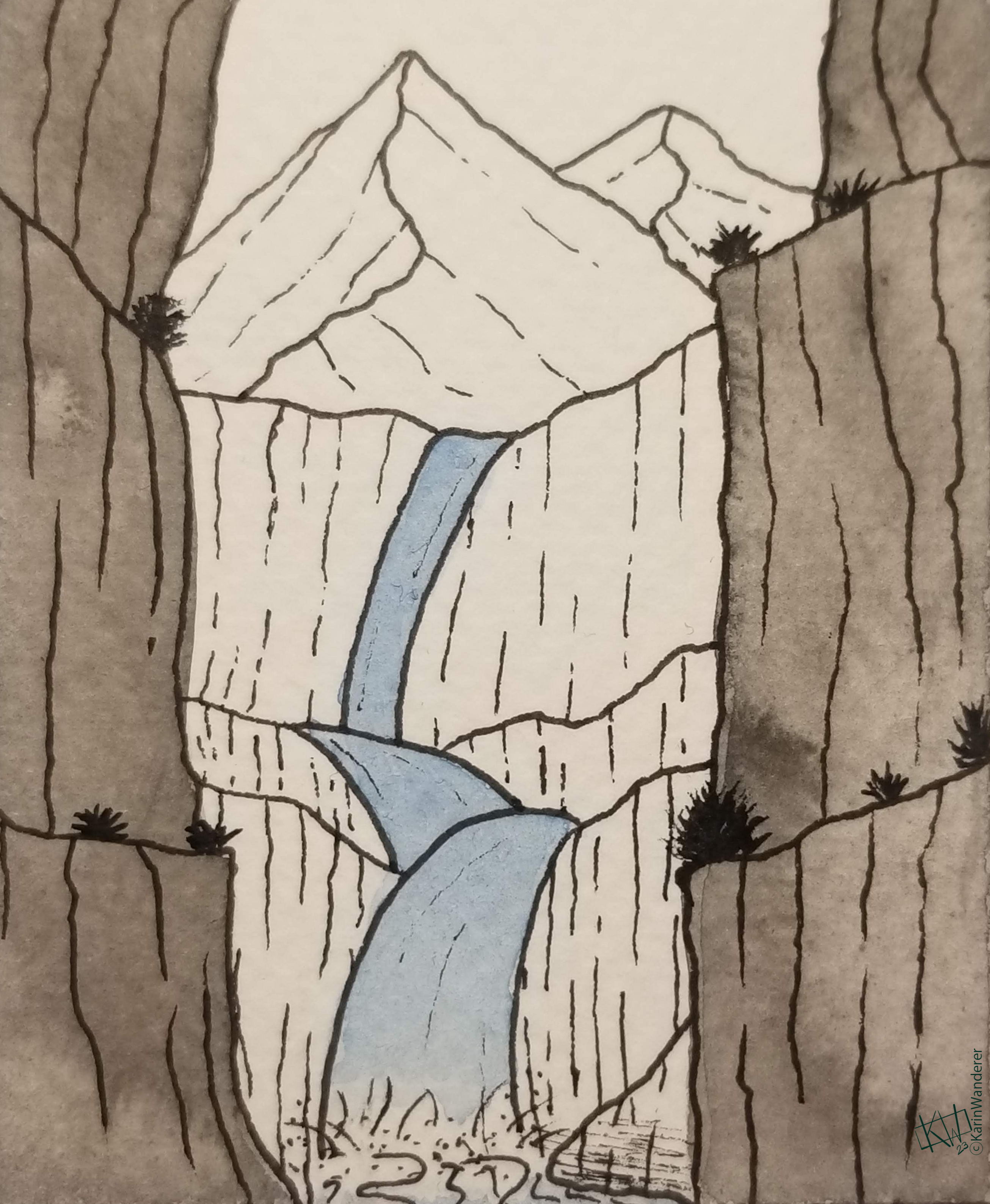
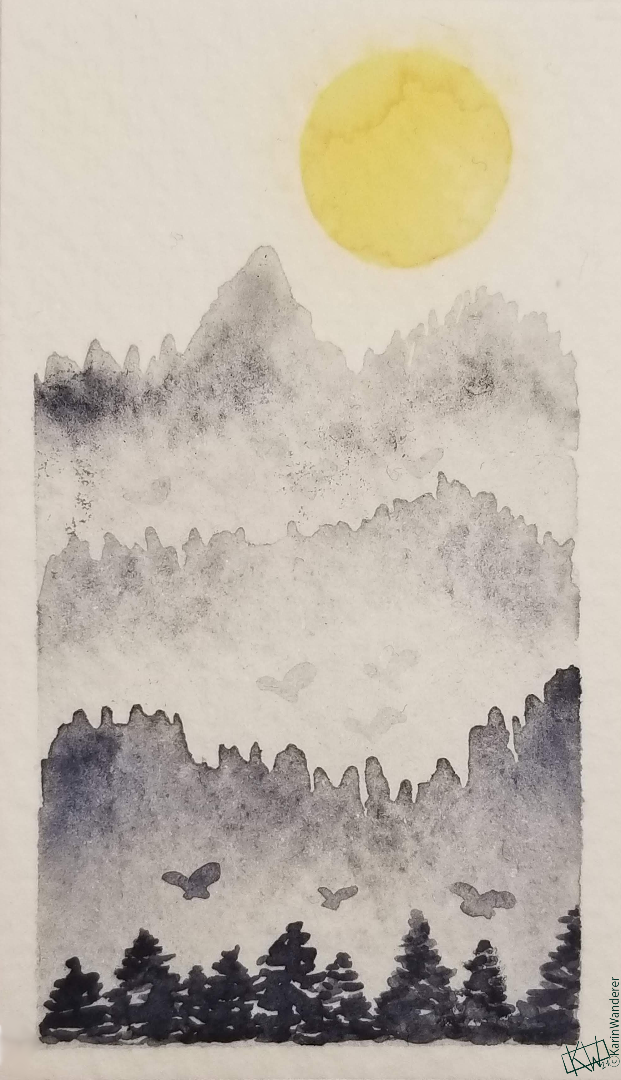 An alien mountain range full of giant butterflies, as Payne intended.
There are a lot of stories about why, exactly, Payne made his Gray. The most popular one is that he was trying to make a mixer that had a lot of the qualities of black, but was less overpowering. If that was the reason, he certainly succeeded. As I mentioned, I mix & blend with this color all the time! My favorite story is a bit different. It is said that Payne, in his work as a watercolor tutor who specialized in landscapes, got absolutely fed up with having to mix the perfect shade of blue-gray to portray mountains off in the distance. He solved this problem by inventing the perfect color for it! As a teacher, I empathize- anything to cut down on lesson prep.
Payne was a good artist. By all accounts he loved art & he enjoyed teaching others. His paintings are on display in many private & public collections. But his biggest contribution to art was definitely the Gray. Payne’s Gray plays beautiful games with the atmosphere & depth of a painting. It is important to remember that Payne’s Gray loses some of its cool as it ages & becomes a more neutral gray. If you look at his surviving original works, you may not see Payne’s Gray! While Payne’s Gray initially came out for Winsor & Newton watercolors, it is now available in just about every brand & type of paint I could think of to check. I love this color!
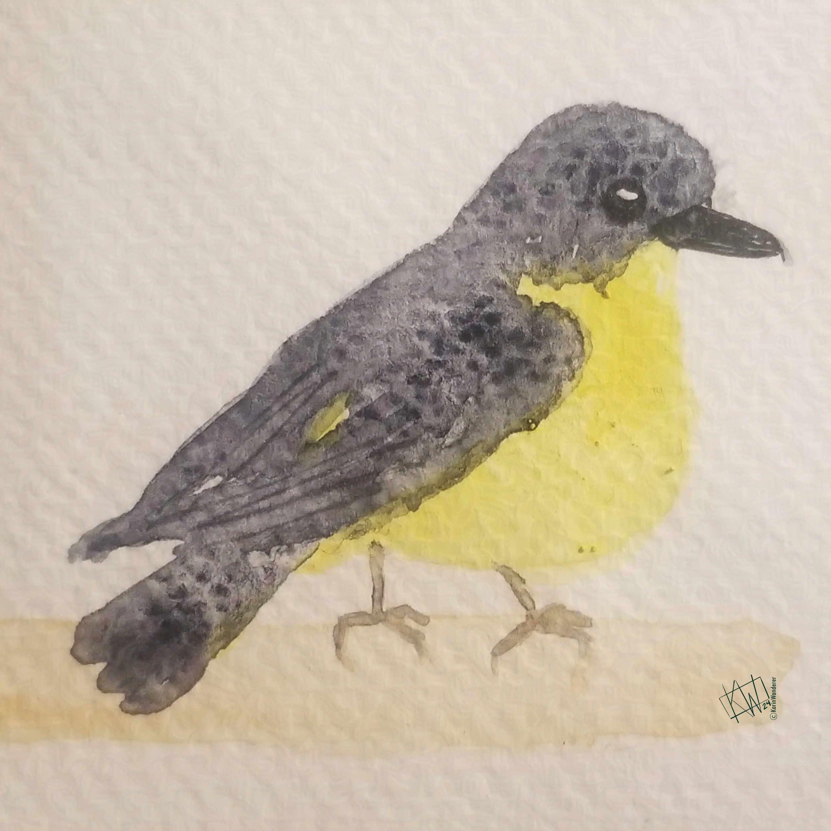 This Yellow Robin has Payne’s Gray in its feathers
What’s your favorite color name? Is it the same as your favorite color?
Let me know! You can find me everywhere
Tune in on future #ColorFull Tuesdays to learn more!
We’ll be talking about how our ancestors made pigments & what they used them for.
We’ll be talking about how we currently make pigments & what we use them for.
We’ll be talking about how we physically see color, how we categorize it, & how we organize it.
We’ll be getting down to brass tacks & talking about specific colors! It’s going to be a wild ride.
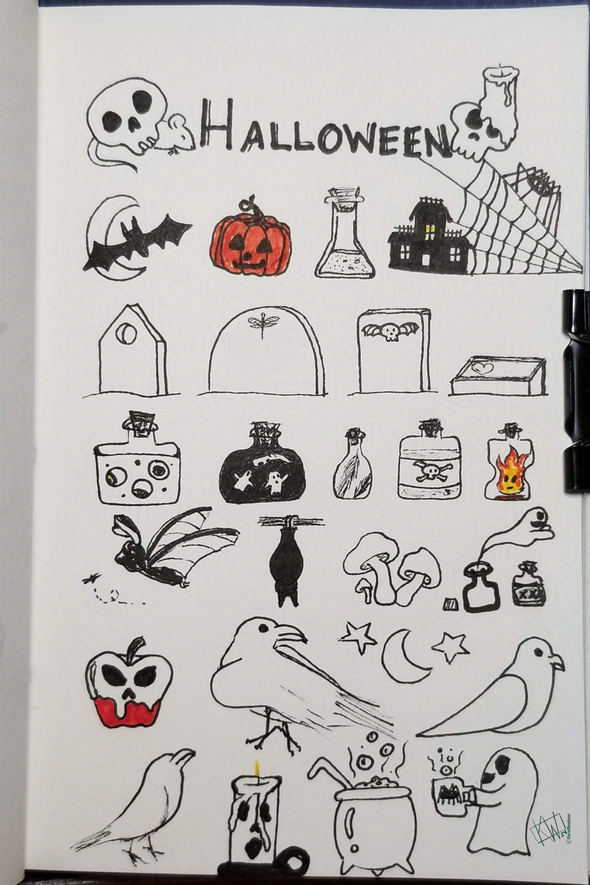
My 2-week #KWPrompts art challenge is ongoing!
We still have another week of the #Sky prompt
Check out the #KWPrompts list for more info!
Get my art on mugs & vinyl stickers in my Shop!
Join us for #ArtABCs, the best art challenge on the internet!
- All pictures posted are my own work.
- All reviews are my own unpaid & unsolicited opinions.

 Painting makes me happy
 Sewing makes me happy
 Gardening makes me happy
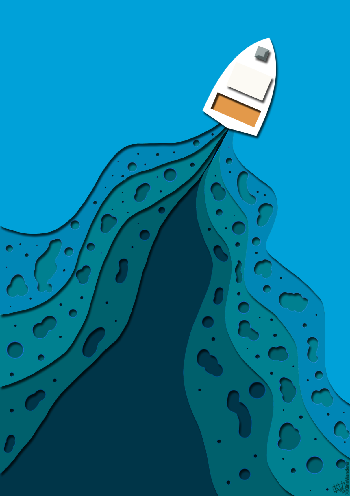
 You can submit a new picture every day, work on one picture for 2 weeks, or post pictures randomly. This is the most laid-back art challenge on the internet, & that means you have plenty of time to make your art however you want. Just make sure you tag me @KarinWanderer so I see it!
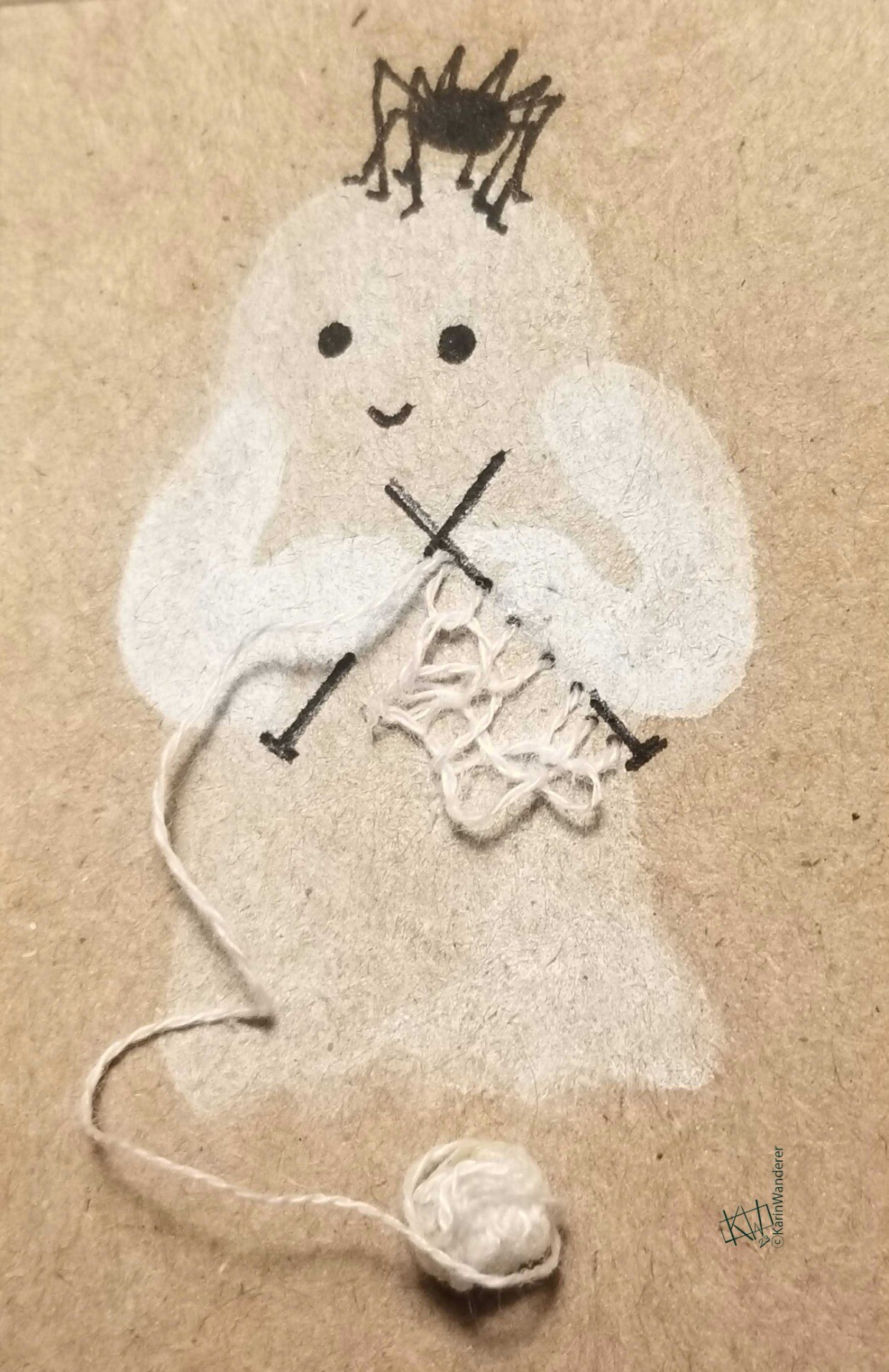
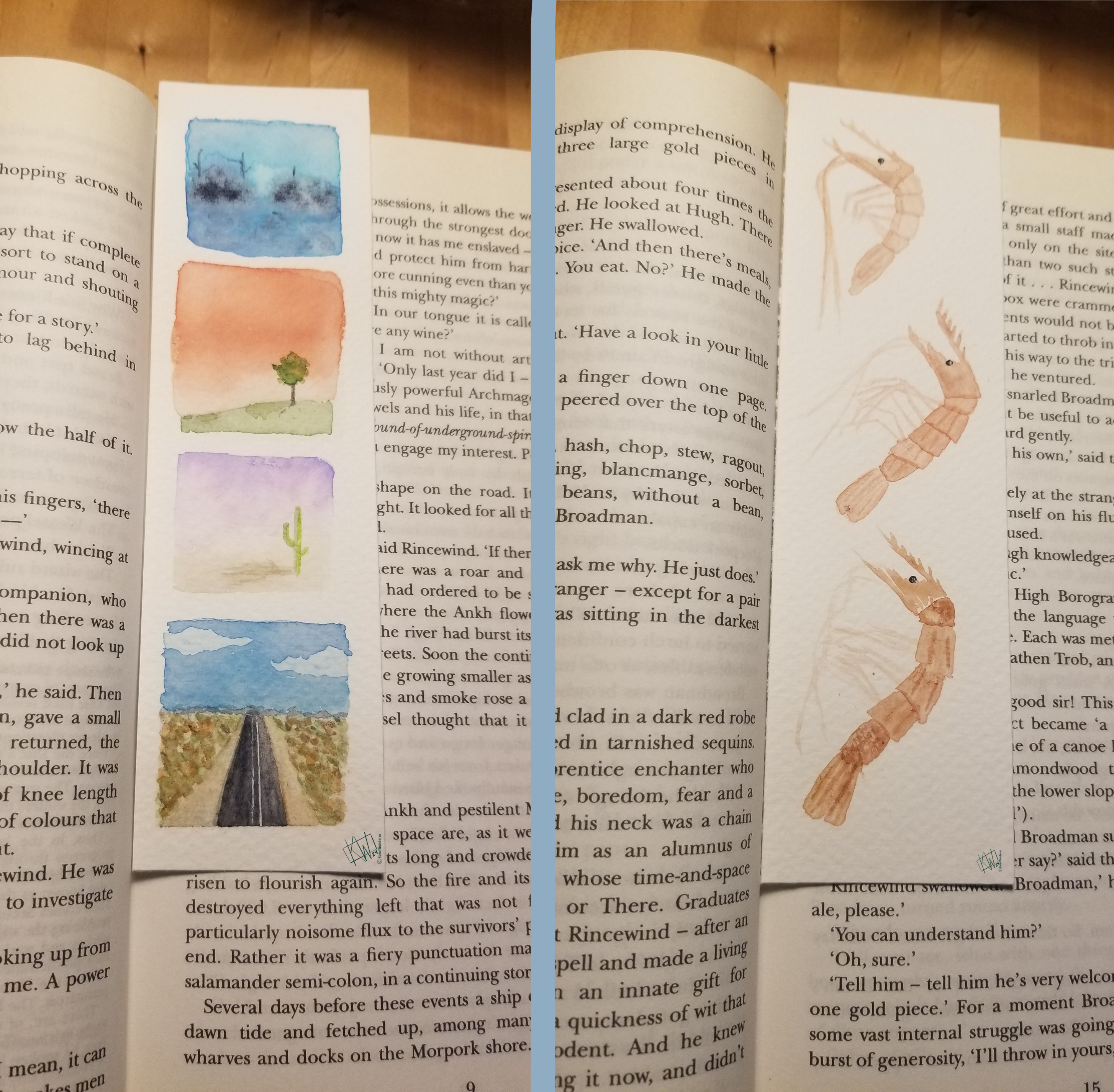 I am new to making bookmarks, so far I only have these 2!
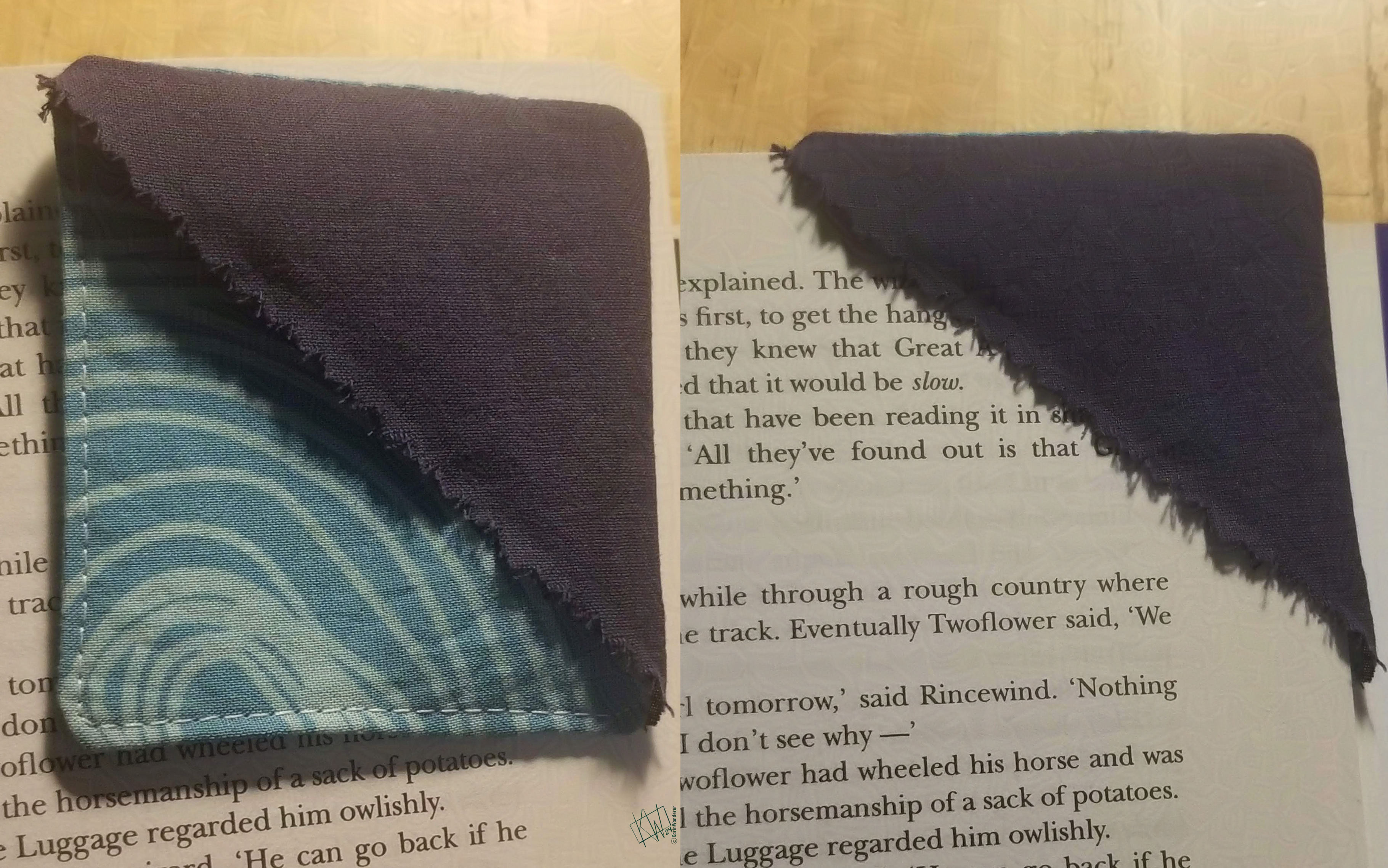
 Your skies can be any colors you like!
 I’m realizing I have tons of cloud reference & barely any cloud paintings…
 Join me in painting lots of clouds!
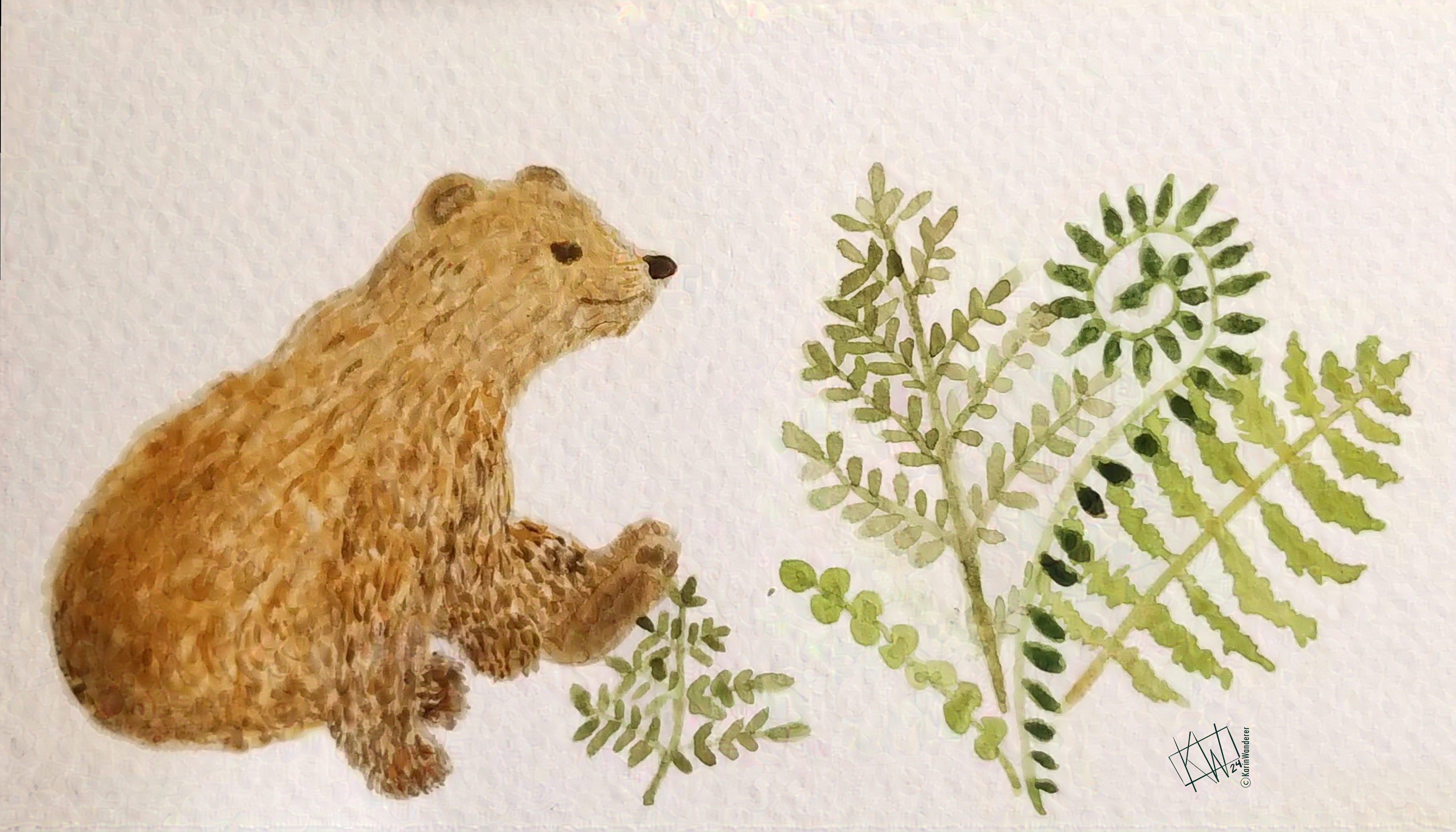 I do not paint bears often
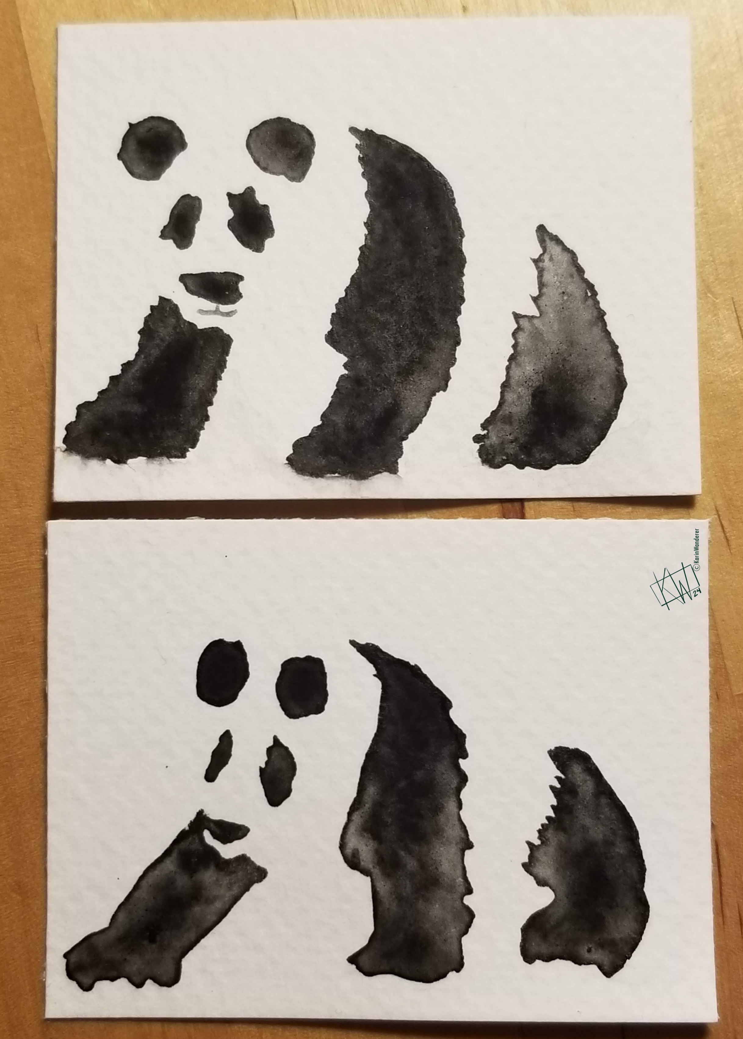 I practically never paint bears
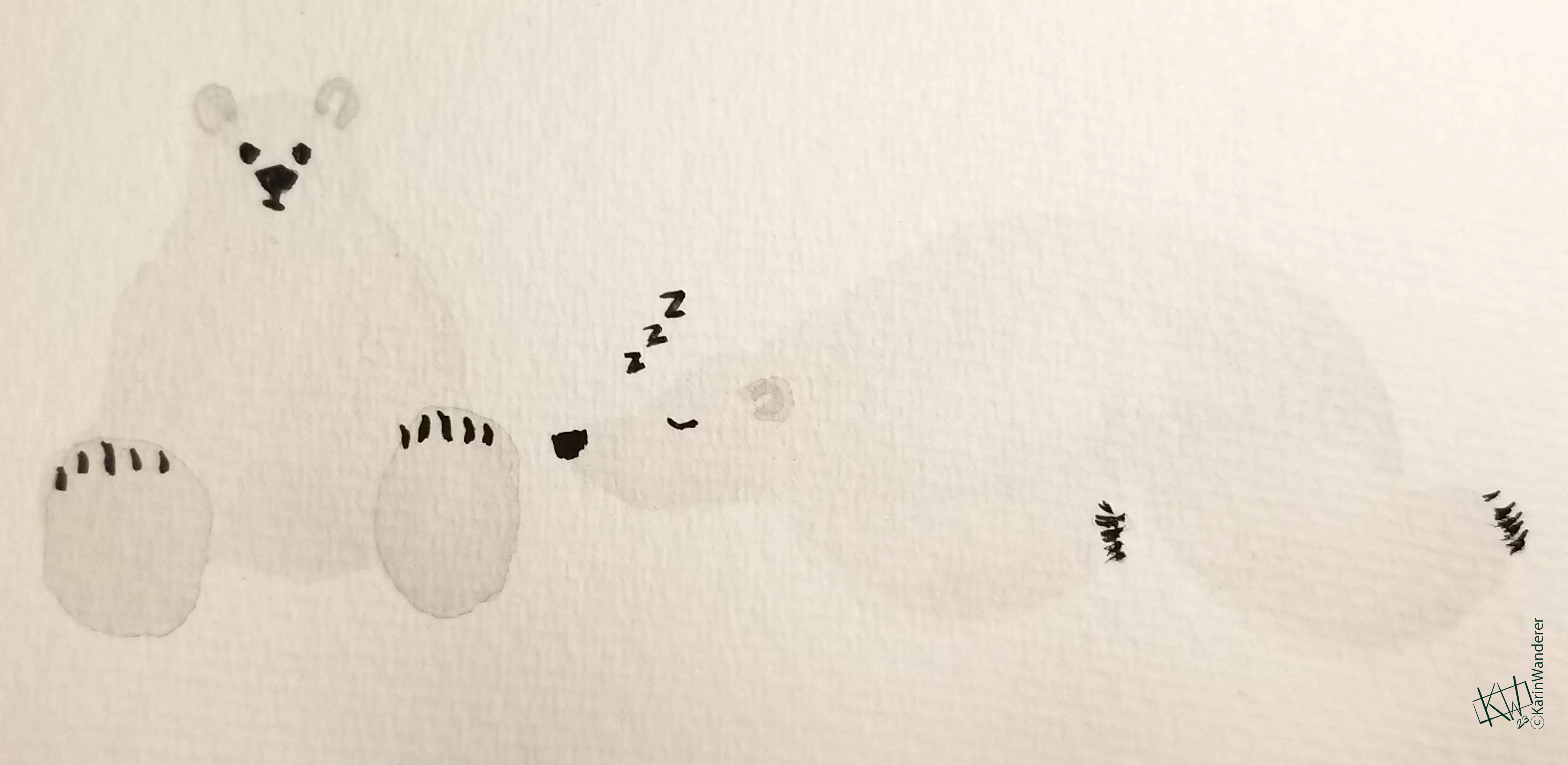 These may be all the bears I’ve ever painted