Pizza Time! Part Deux
Long ago when we were young, the esteemed Wolfe3D visited this blog & showed us how to make delicious homemade pizza! That recipe makes 4 pizza’s worth of dough from scratch. This week I’ll be showing you 2 wonderful recipes you can make with that dough! (You could also make these recipes with store-bought pizza dough if you like.) These recipes are great if you are out of pizza toppings or not in the mood for pizza (which I have been assured happens, although I don’t quite believe it.) Each recipe uses 1 pizza’s worth of dough
Fougasse
Fougasse is kind of like French focaccia. Back in the days when wood-fired ovens were cutting-edge technology, fougasse was used as a sort of “test loaf” to make sure the oven was the right temperature for further baking. This recipe is super easy, delicious, & fast! It is also highly customizable; I tend to make it with whatever I have on hand. Even if all you have is pizza dough & olive oil this makes a delicious bread!
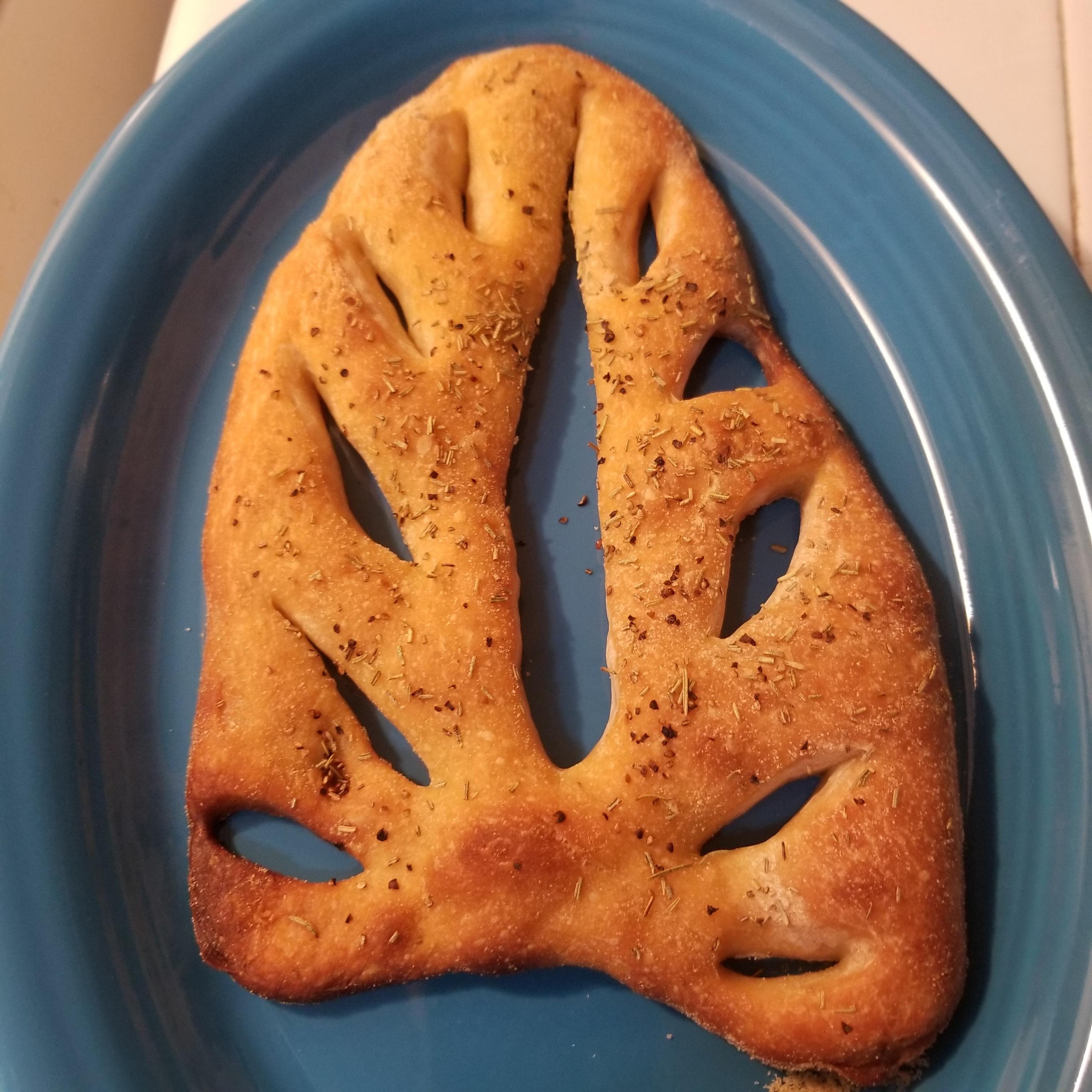 Baked Fougasse
Ingredients
- One pizza dough
- Olive oil
- Dried or fresh herbs, finely grated cheese, or sea salt (optional)
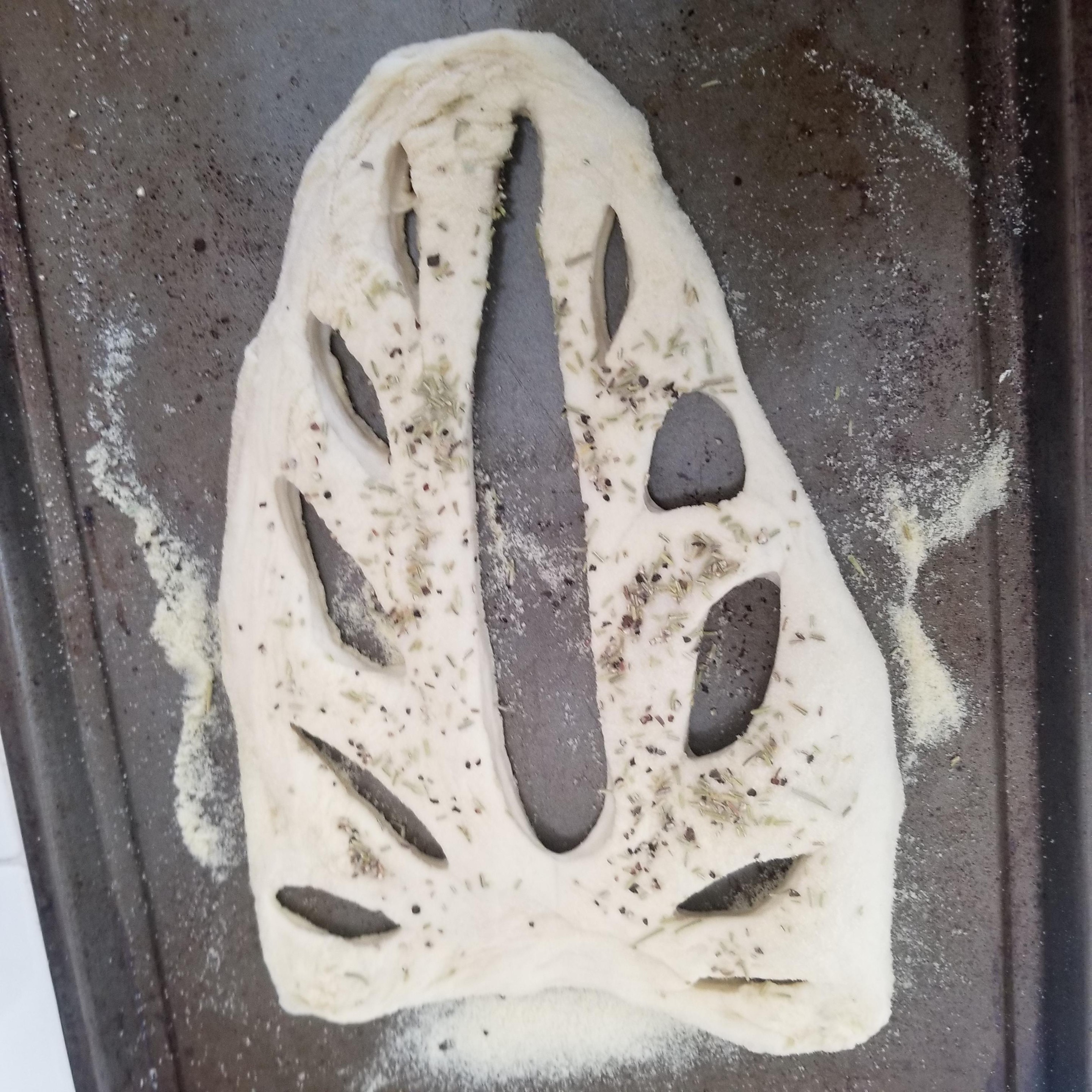 Unbaked Fougasse
Instructions
- Shape the pizza dough like a leaf, then use a sharp knife to make the slashes for the leaf’s veins.
- Pull the cuts further apart than I did so they stay open while baking.
- Let rest for 20 minutes
- Brush generously with olive oil
- Sprinkle on any toppings- keep it light!
- Bake 20 minutes at 425 F (220 c)
- It is common to brush on even more oil after the fougasse comes out of the oven. I tend to skip this step.
- This bread cools quickly!
Scallion Pancake Bread
This bread is everything you love about scallion pancakes, in a delicious loaf of bread. I like to say it’s healthier due to being baked instead of fried, but eating the entire loaf in one sitting probably negates that. Worth it!
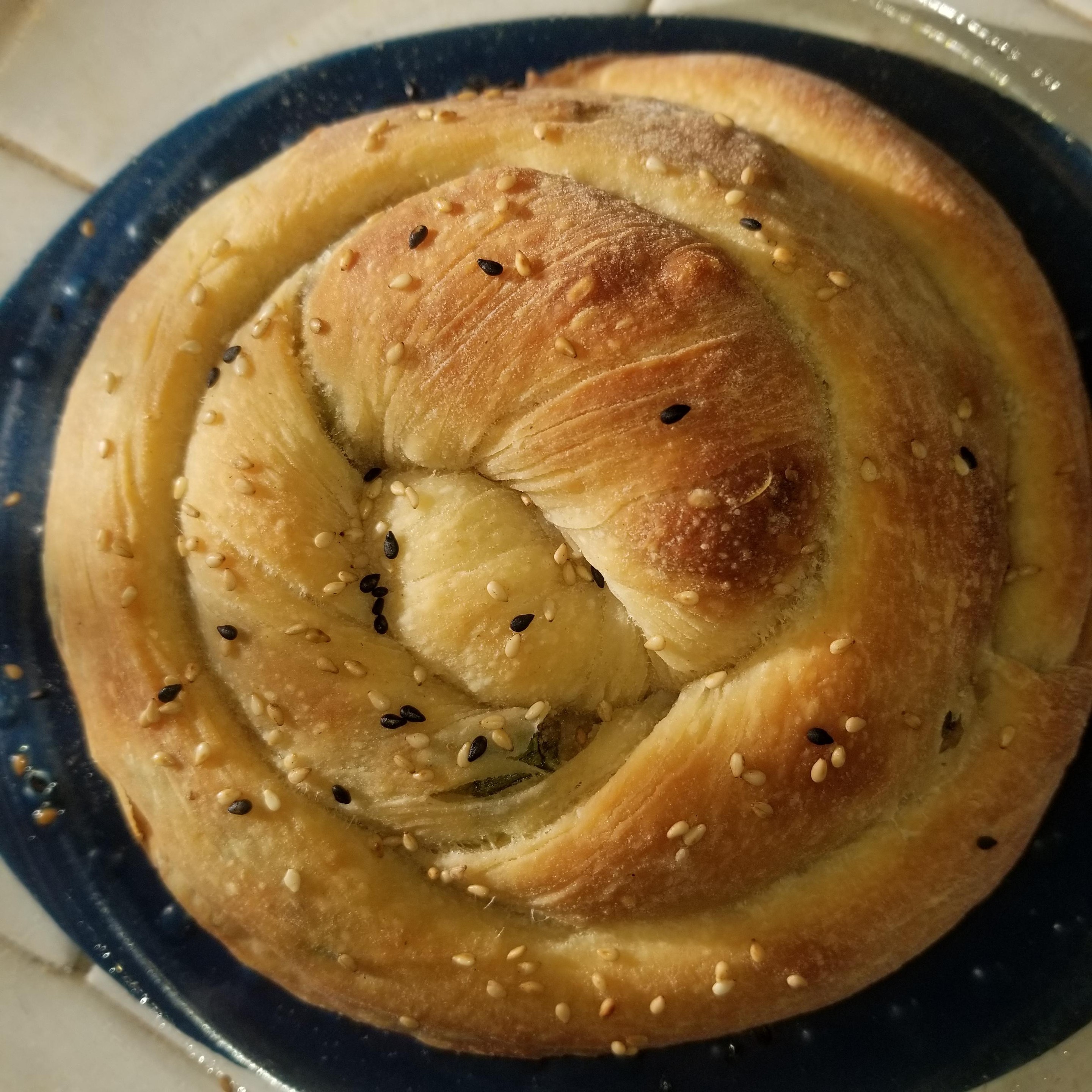 Baked Scallion Pancake Bread
Ingredients
- One pizza dough
- Toasted sesame oil
- Toasted sesame seeds
- Scallions (green onions), sliced
Instructions
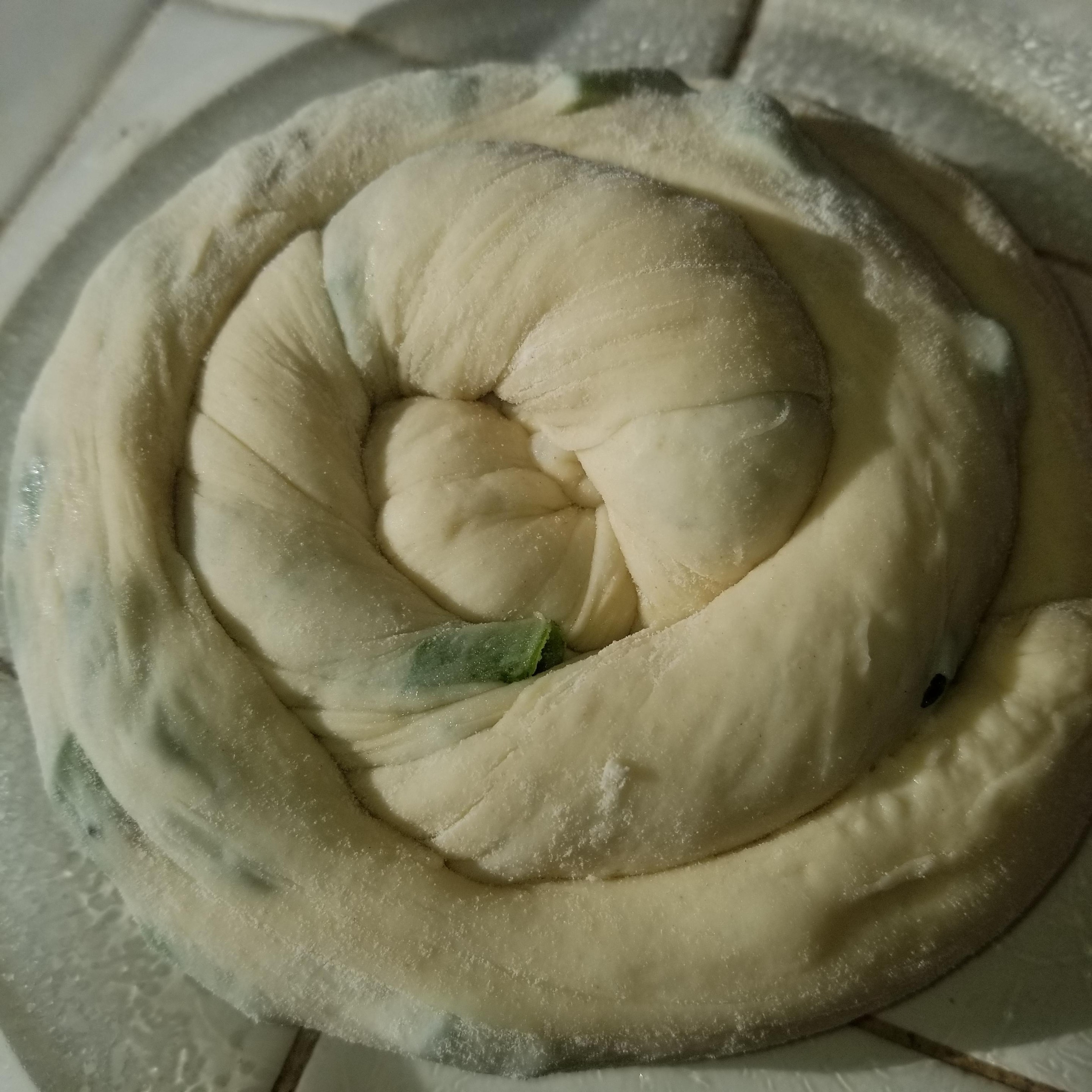
 Unrolled Scallion Pancake Bread
- Stretch out the dough, brush with toasted sesame oil, sprinkle on sesame seeds and lots of green onions. Roll tightly into a long skinny log.
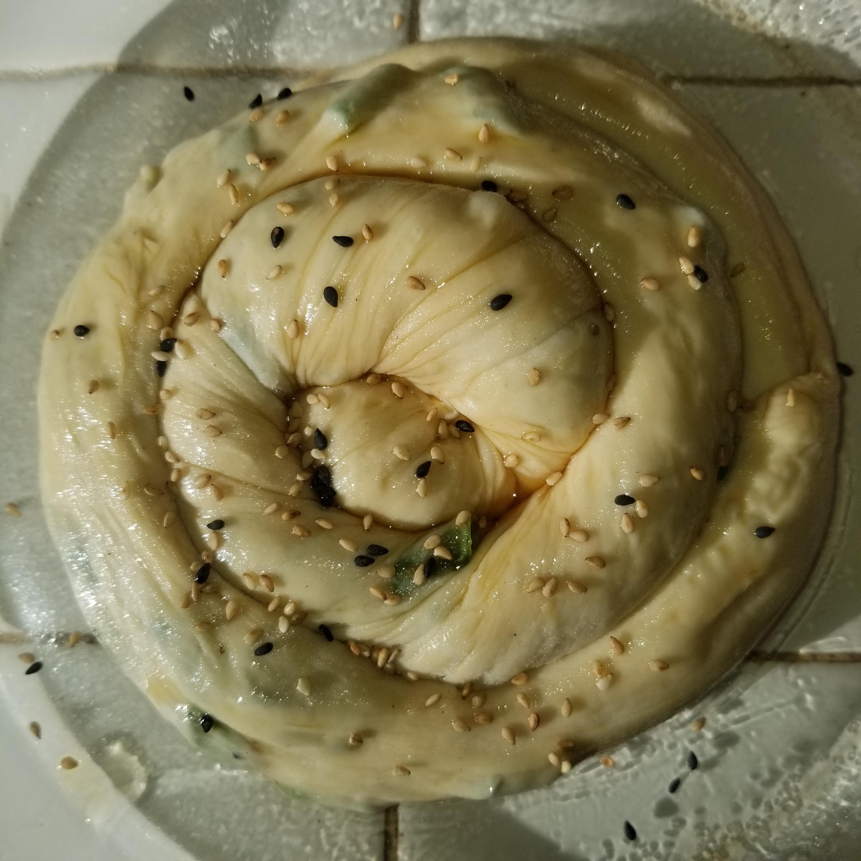
 Rolled Scallion Pancake Bread
- Curl dough into a spiral
- Let rest 30 min
 Ready to bake!
- Brush on more sesame oil and seeds and a little salt.
- Bake 35 min @ 400 F (205 c)
- Bake until very nicely browned; stuffed dough bakes slow!
- Give this bread a good long time to cool
Enjoy!
I hope you like these recipes. If you make them, please post pictures & tag me (@KarinWanderer on all the socials). We'll be back next week with a brand-new #KWPrompts art challenge, & the week after that I'll be back to geeking out about color in my ColorFull series.
Help Us Fight Food Insecurity!
My digital art is available as Charity Bundles in my Ko-Fi shop! Buy a bundle & support the LA Food Bank!
Get my art on mugs & vinyl stickers in my Shop!
Donate to support my works & get cool perks on Ko-Fi
Join us for #ArtABCs, the best art challenge on the internet!
Find me
- All pictures posted are my own work.
- All reviews are my own unpaid & unsolicited opinions.
 The Calm Before The Storm
 Imp Cat wants to play
 If I Fits…
 This picture has a notable lack of branding on the electronics & food.
 I don’t have a logo, but I do have an avatar. Do you think that counts? Last time in the
 Red cardinal, brown branch; all is right in the Color Conformists’ world.
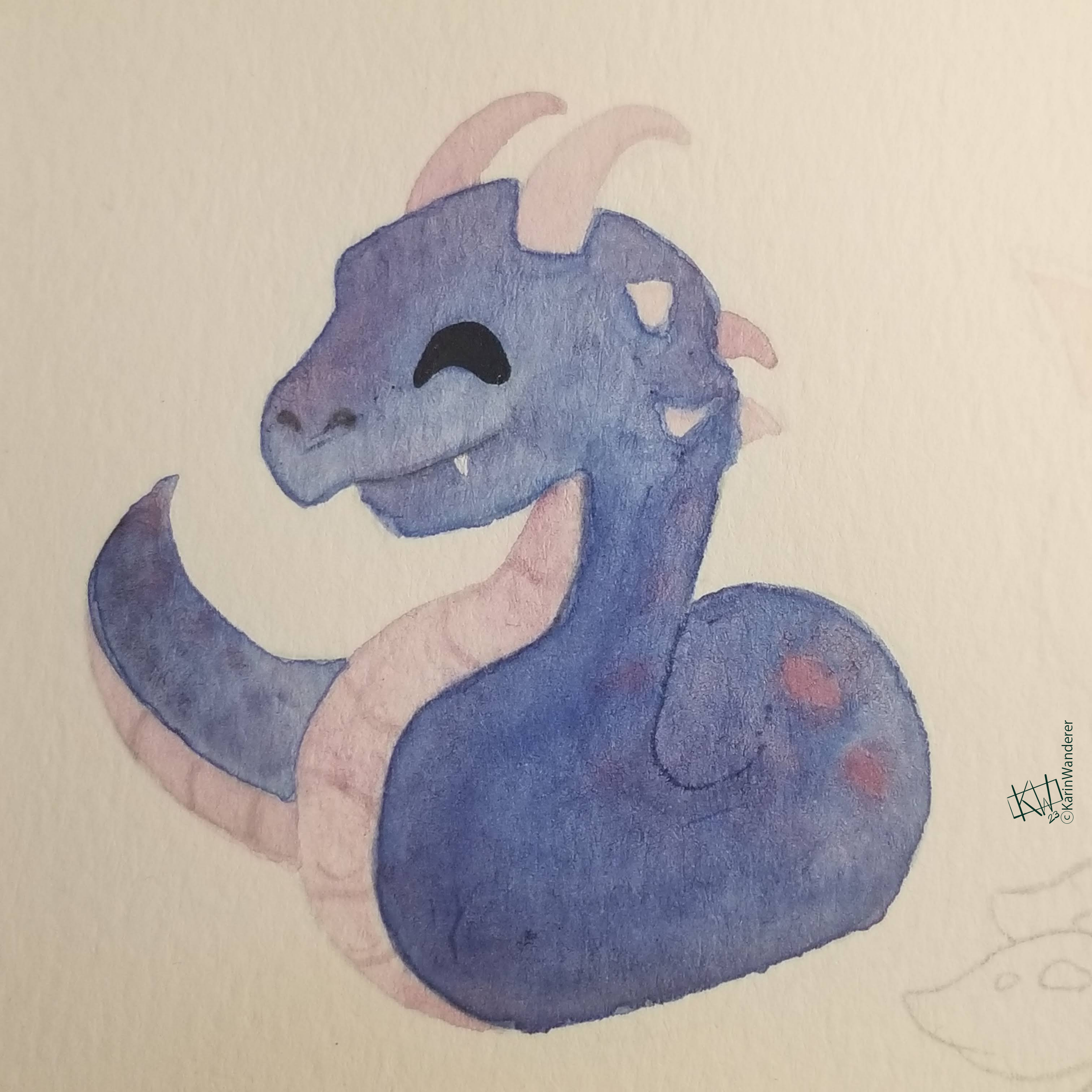 This basilisk is a terrifying monster in a friendly color palette.
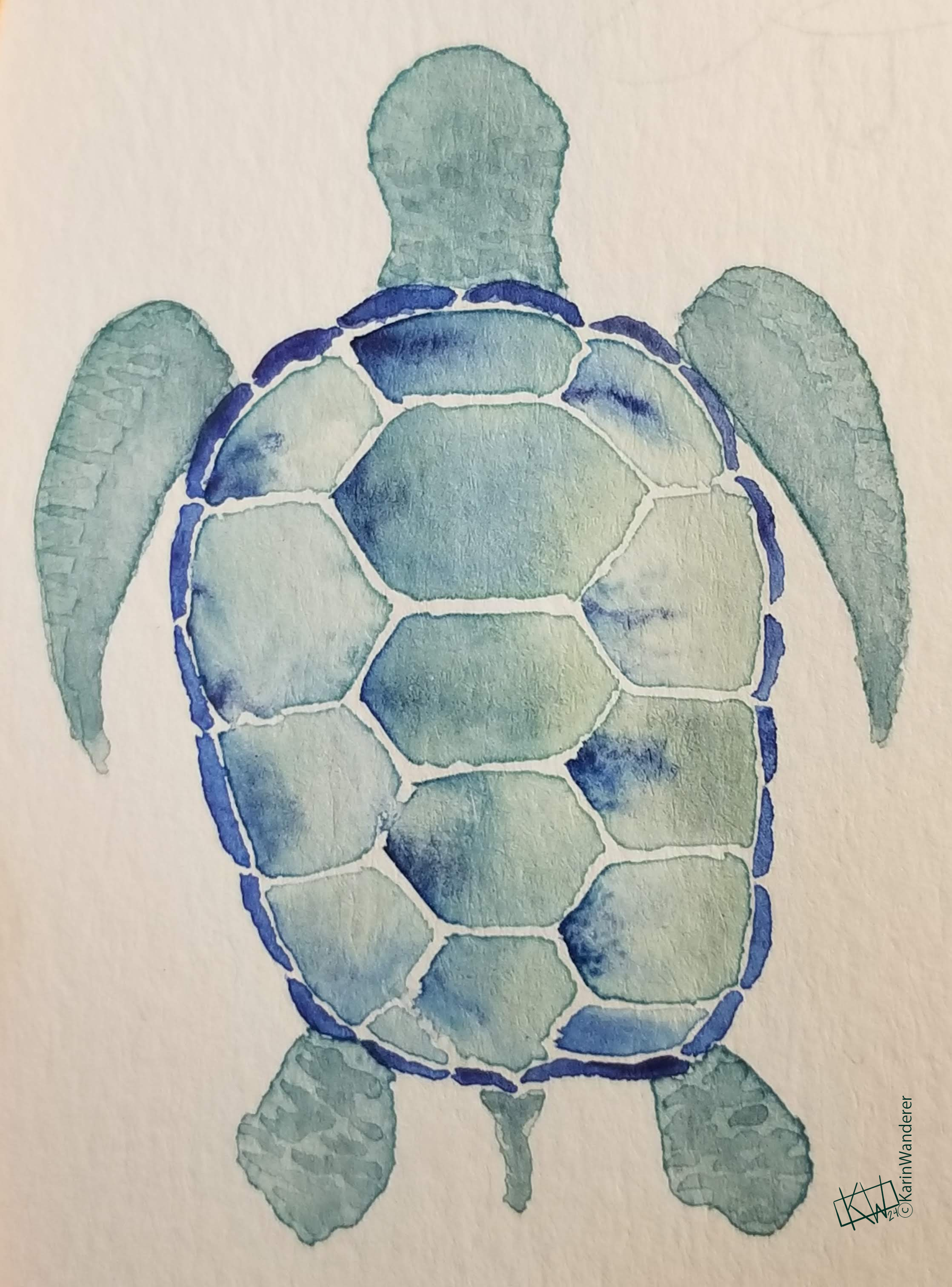 I want a turtle in my favorite colors & I will not let reality get in my way!
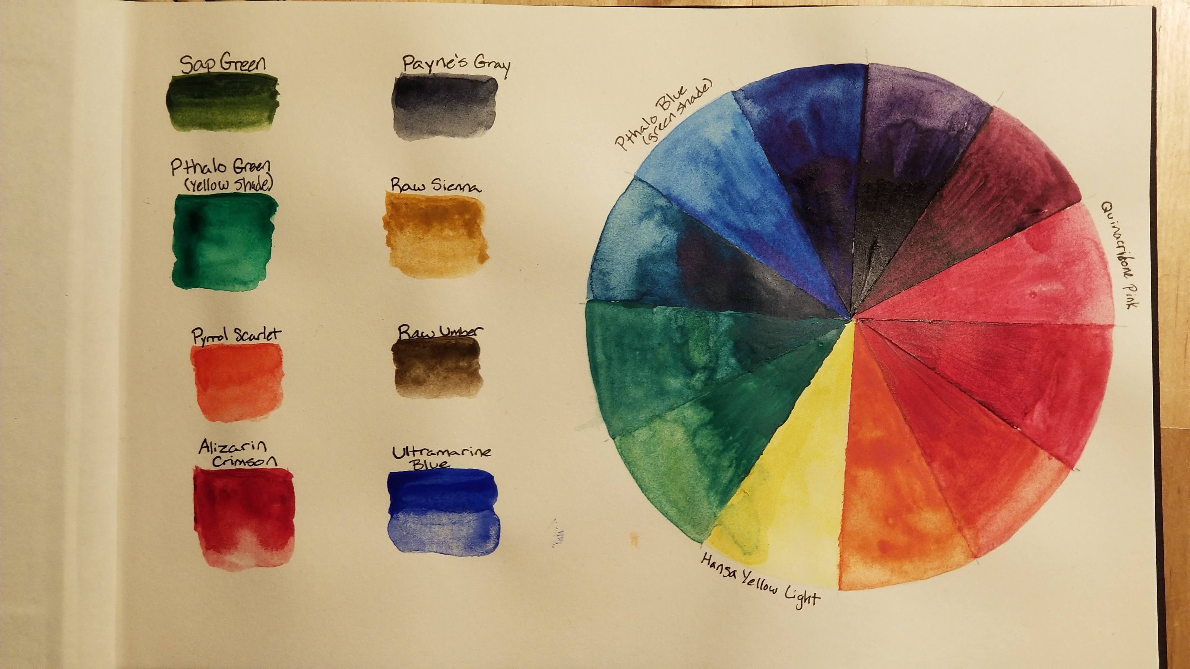 These are all my colors, the wheel is my 3 favorite CMY primaries
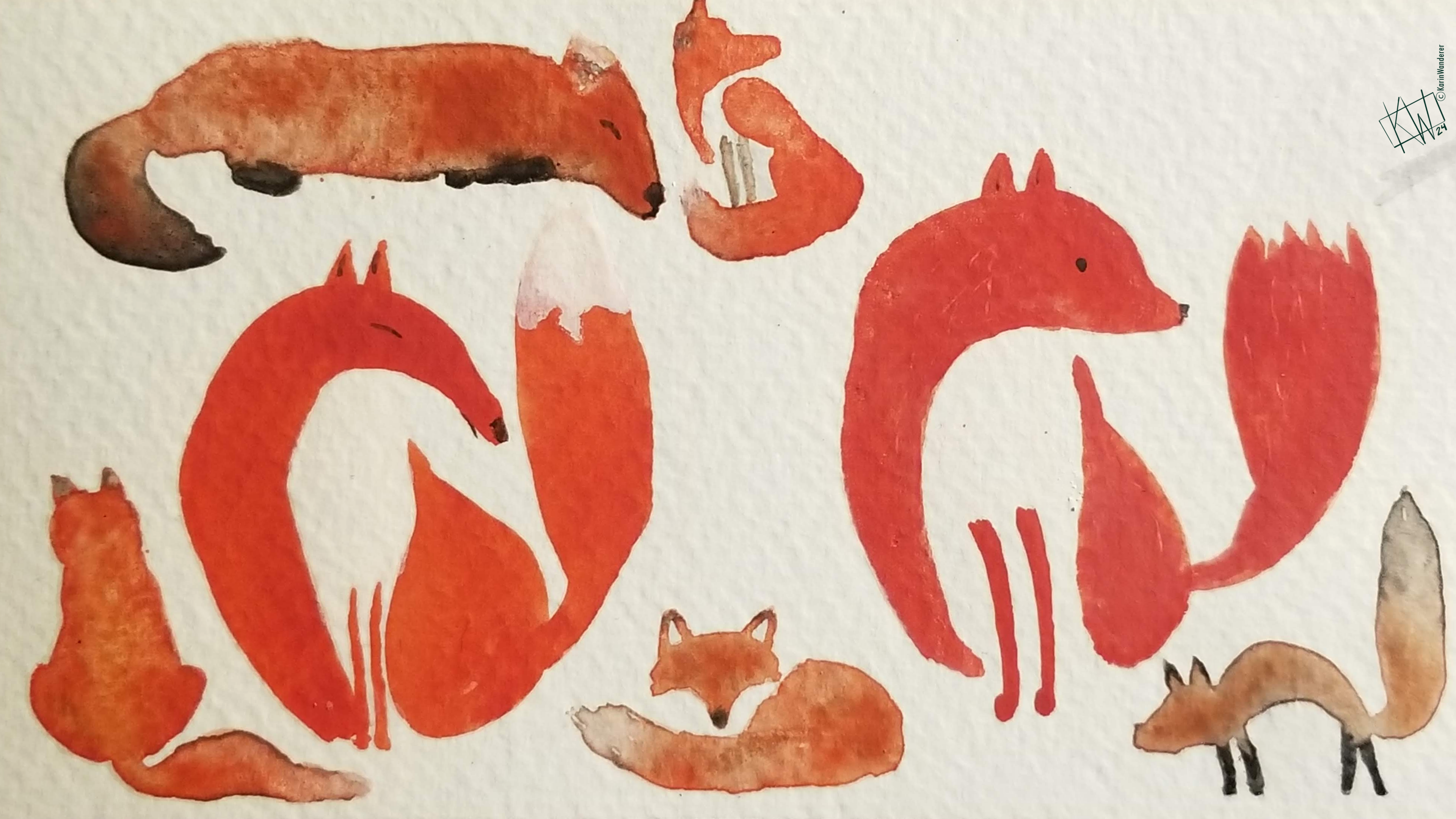 90% of my red paintings are foxes.
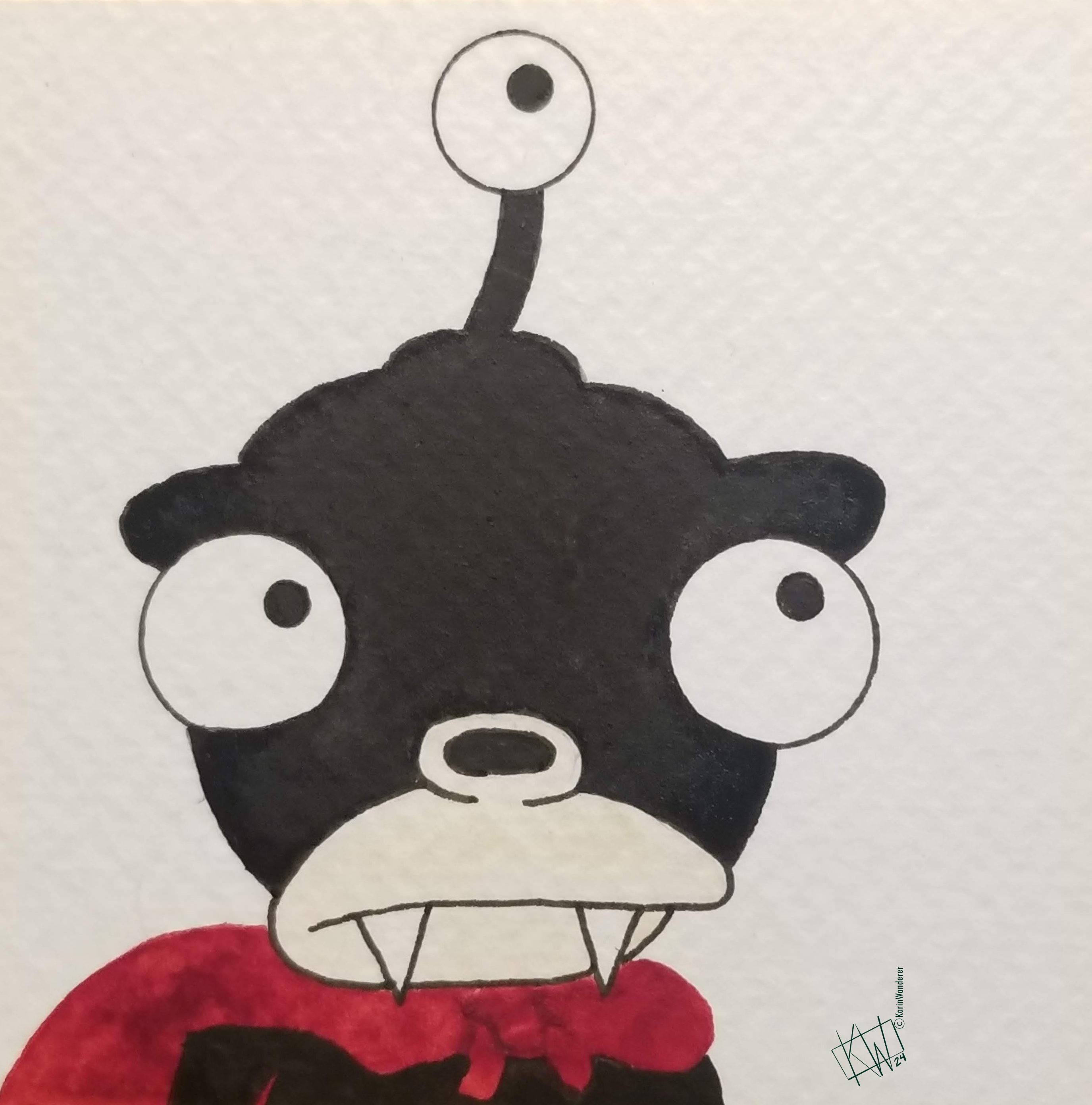 10% of my red paintings are fan art
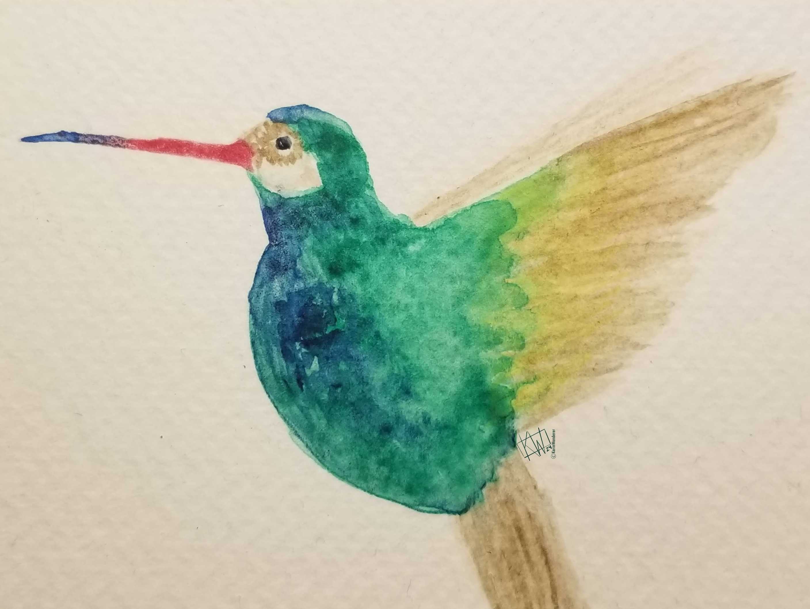 This hummingbird’s bright green feathers look even brighter against beige
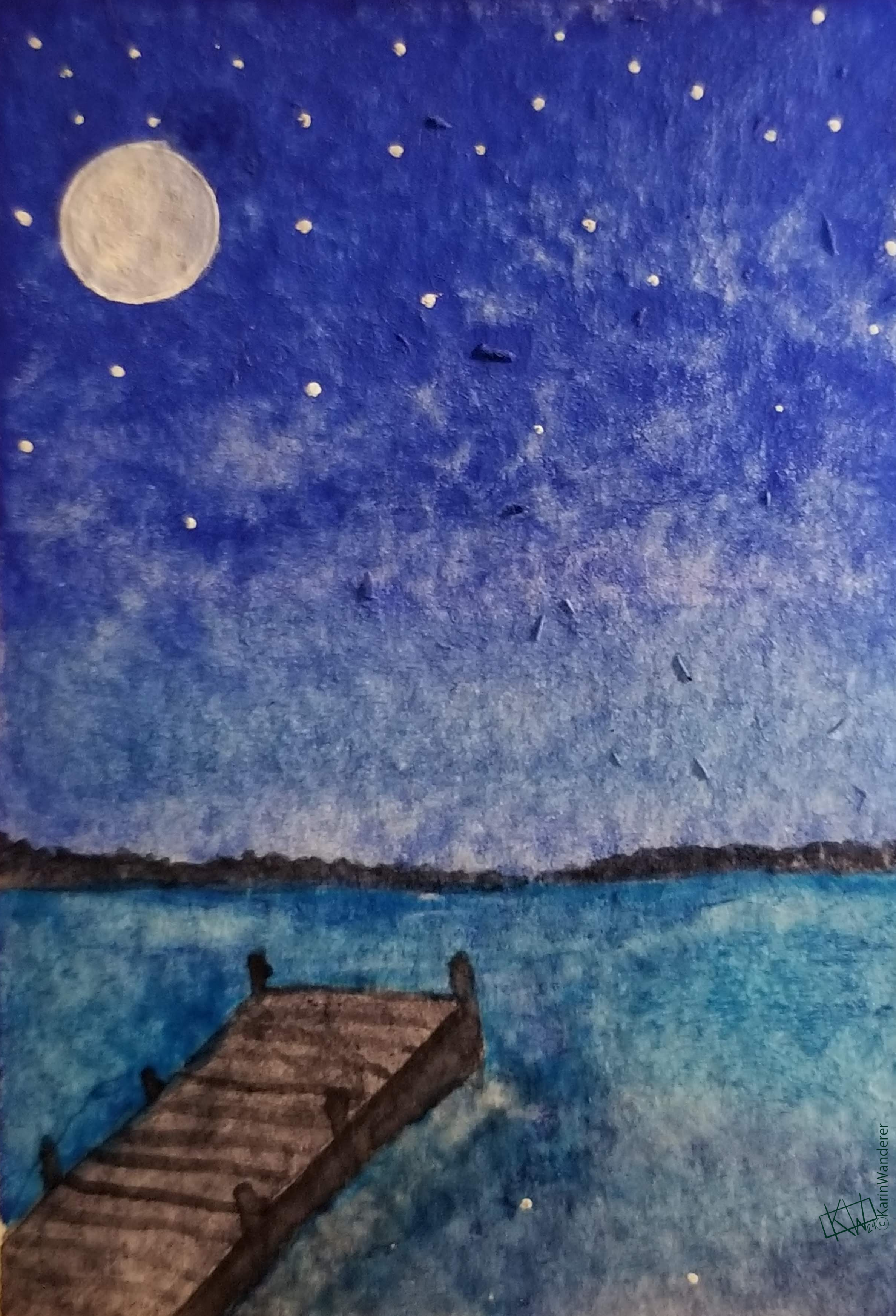
 Two colors
 Three colors
 Three colors
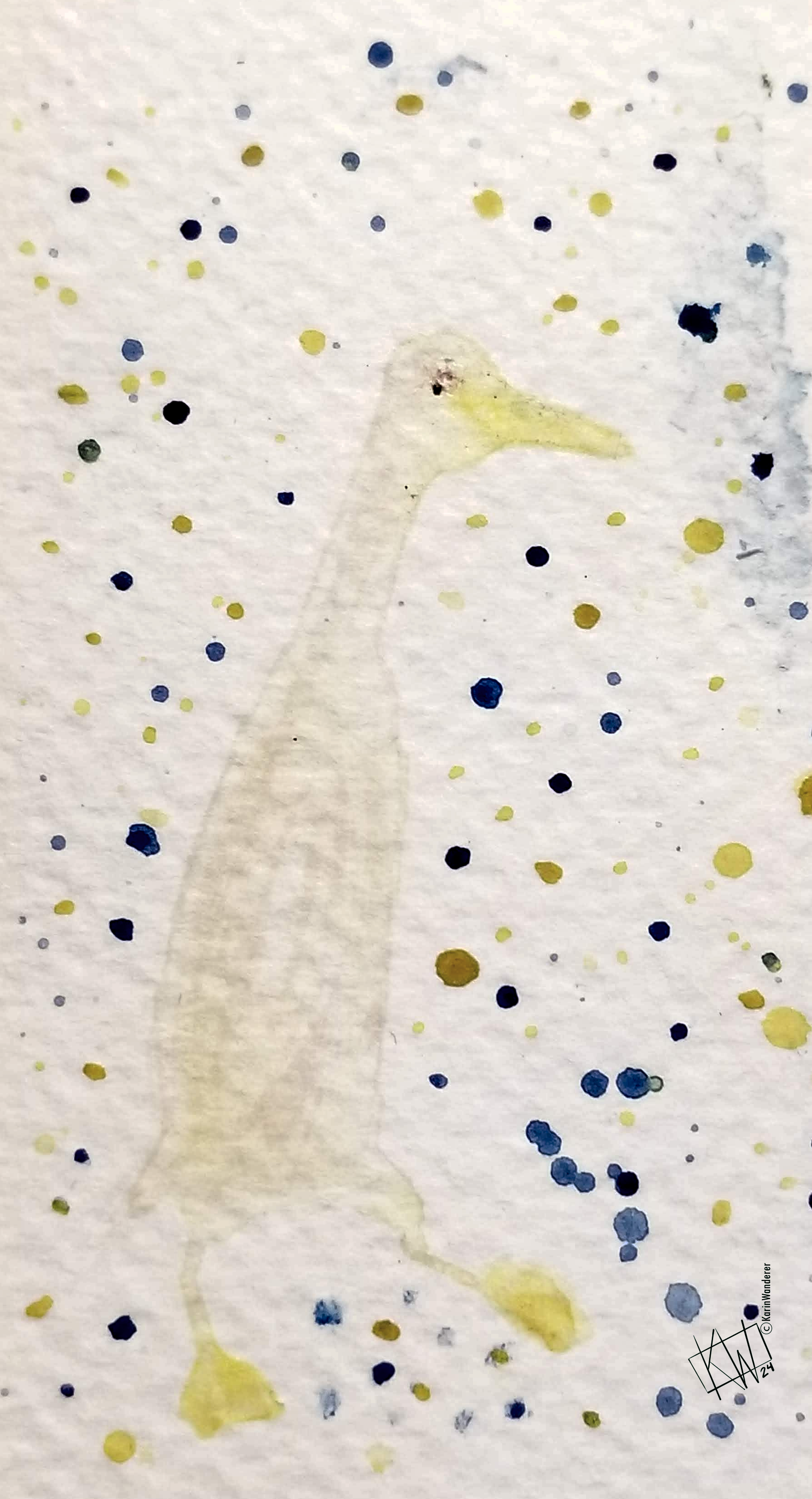 Three colors
This duck was supposed to just use yellow & sienna, but then I splattered it with blue from another painting & didn't notice until it had dried. Always protect you work, friends, & be prepared to roll with your mistakes!
Three colors
This duck was supposed to just use yellow & sienna, but then I splattered it with blue from another painting & didn't notice until it had dried. Always protect you work, friends, & be prepared to roll with your mistakes!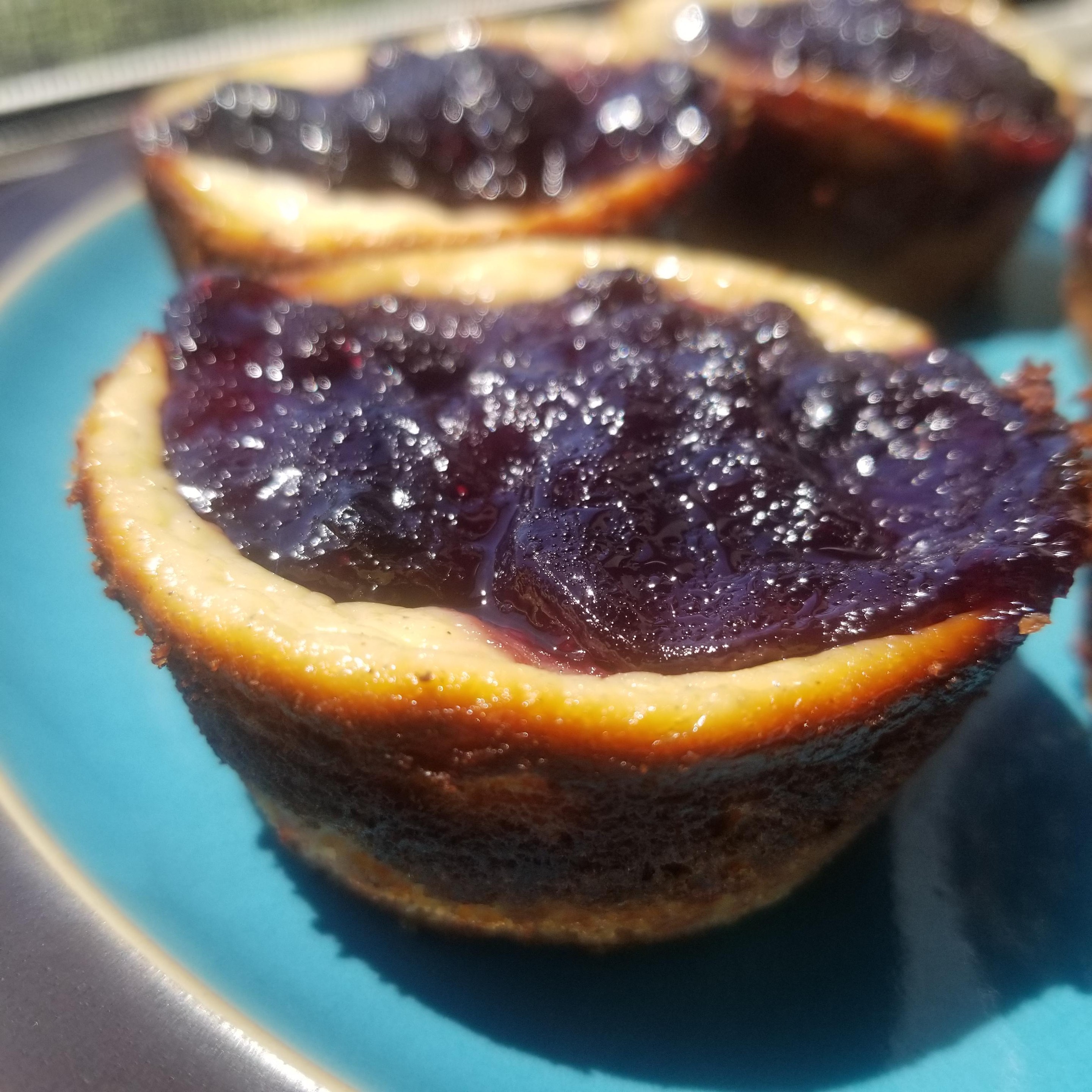
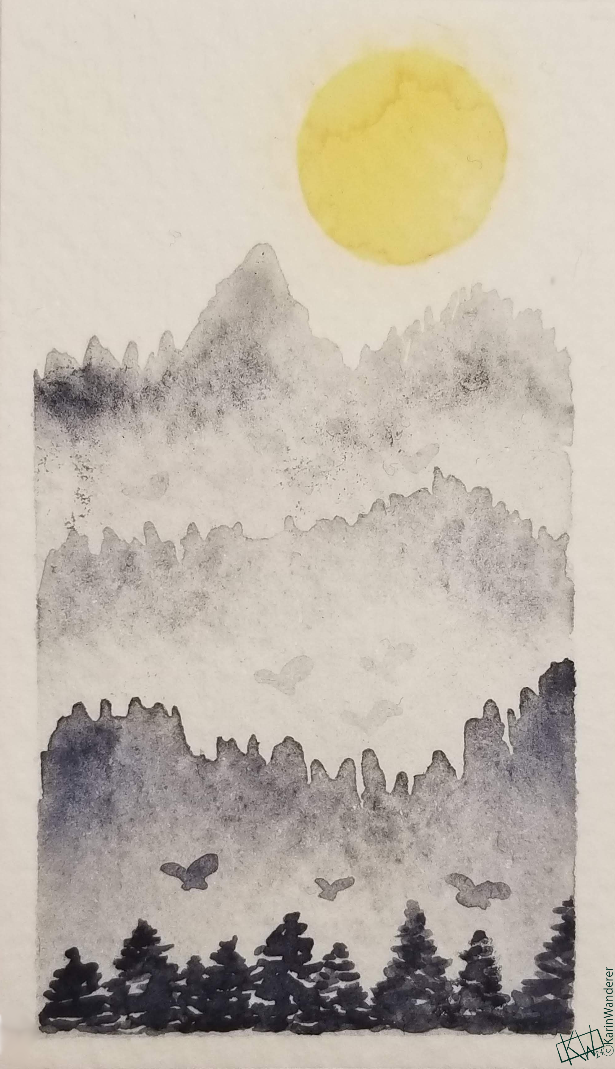
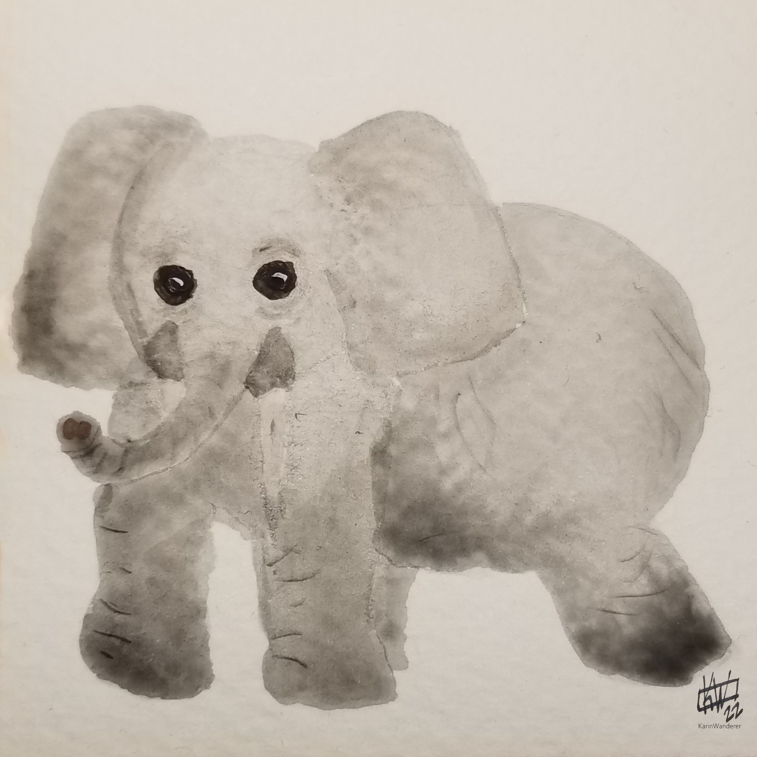 Some subjects are already monochromatic, which makes things easy
 This art challenge is a tribute to the
 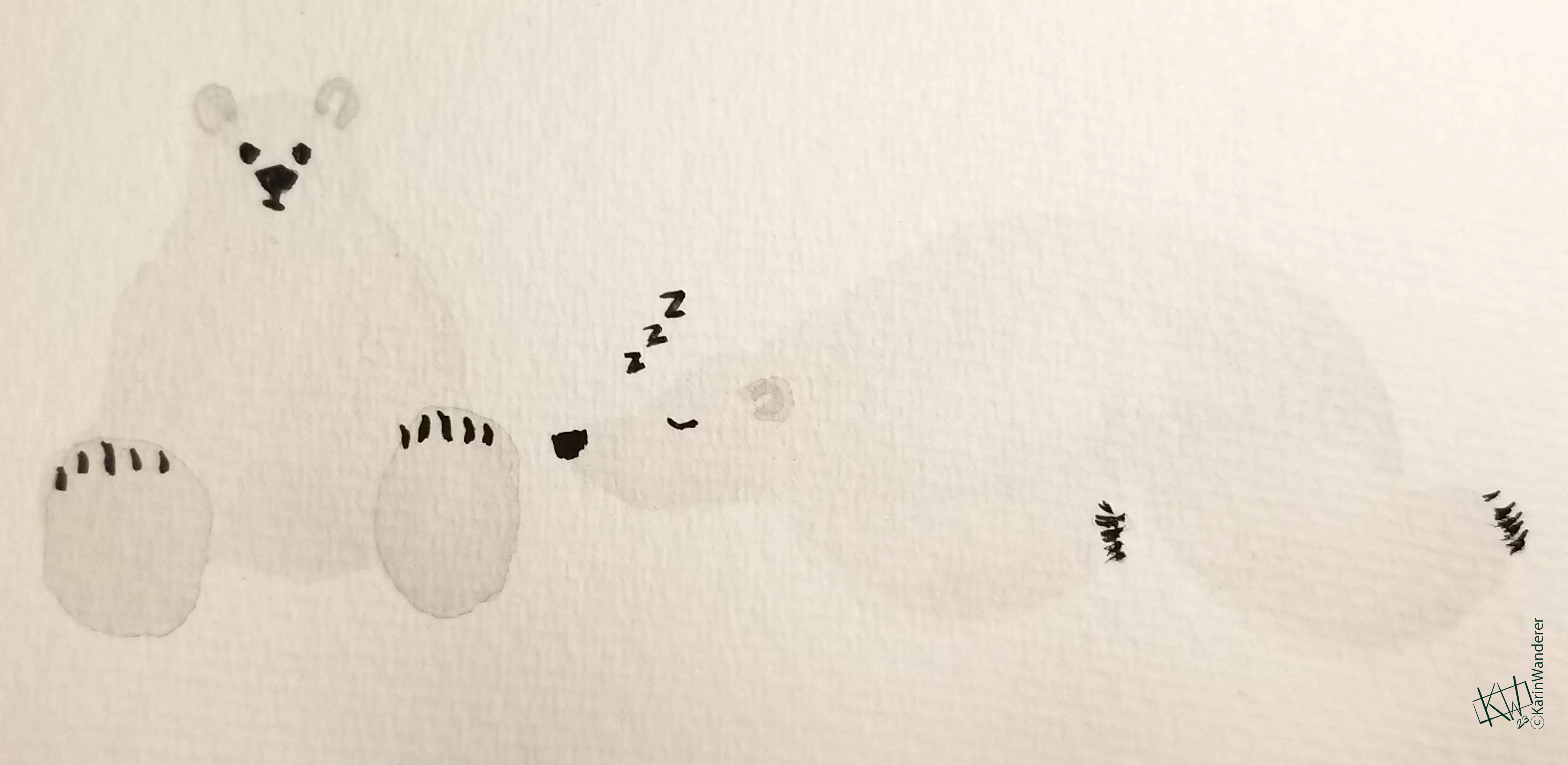 Don't sleep on this art challenge!