Sweets for My Sweet
Every so often on this blog, we take a break & share a #recipe instead of talking about art. I’ve shared my favorite vegan cake recipe & my best plum tea. Wolfe3D shared his pizza recipe in my first collaboration! Would you like to share a recipe in a future blog post? Let me know!
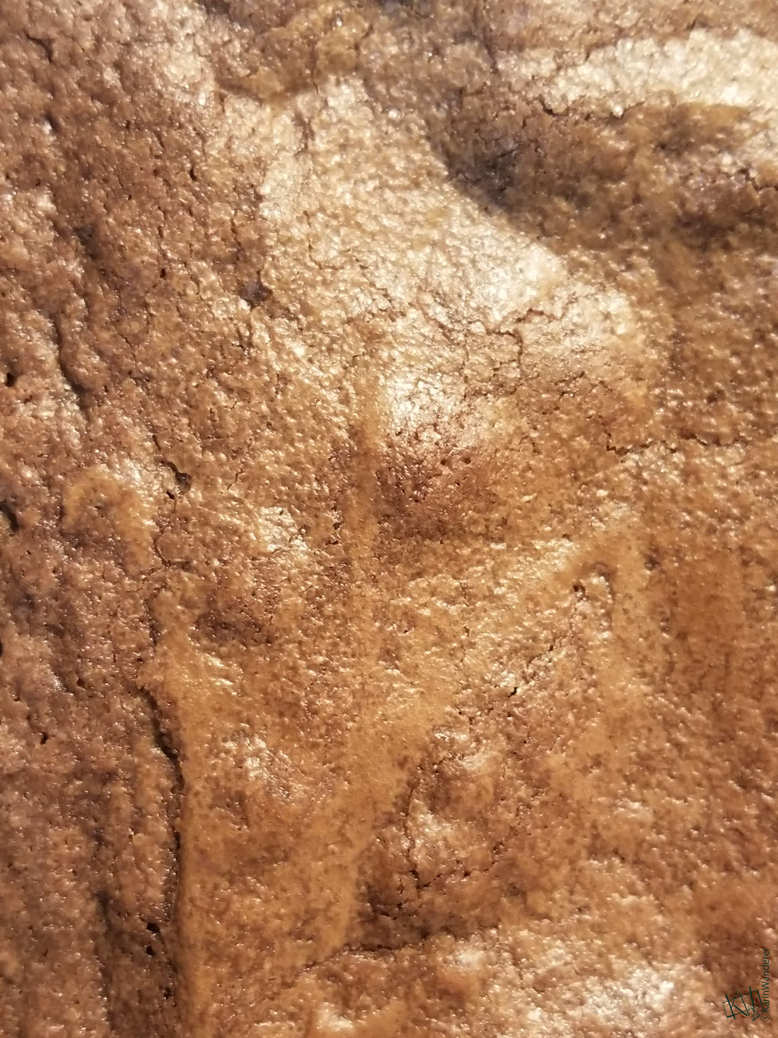
We’re Making Brownies!
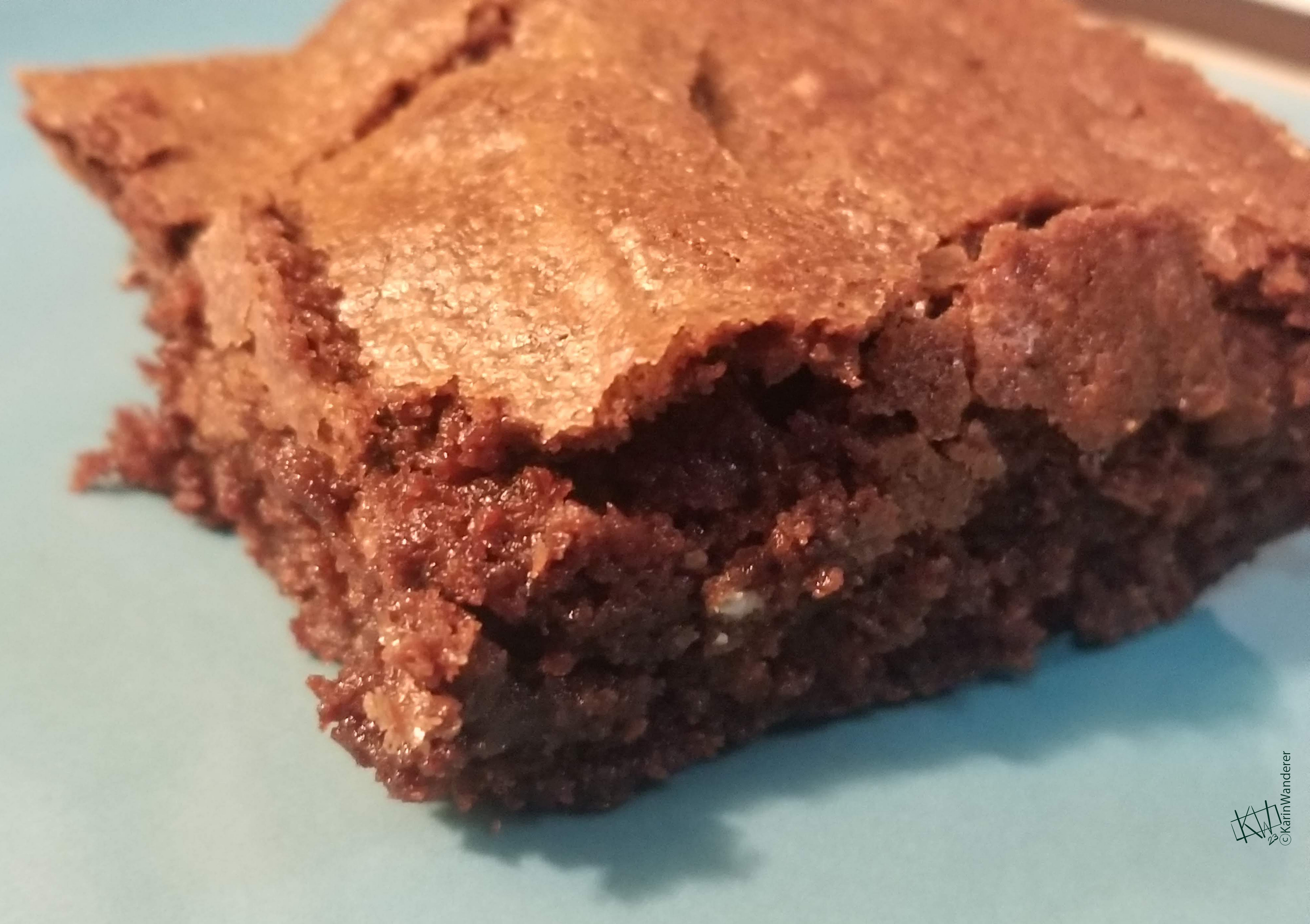
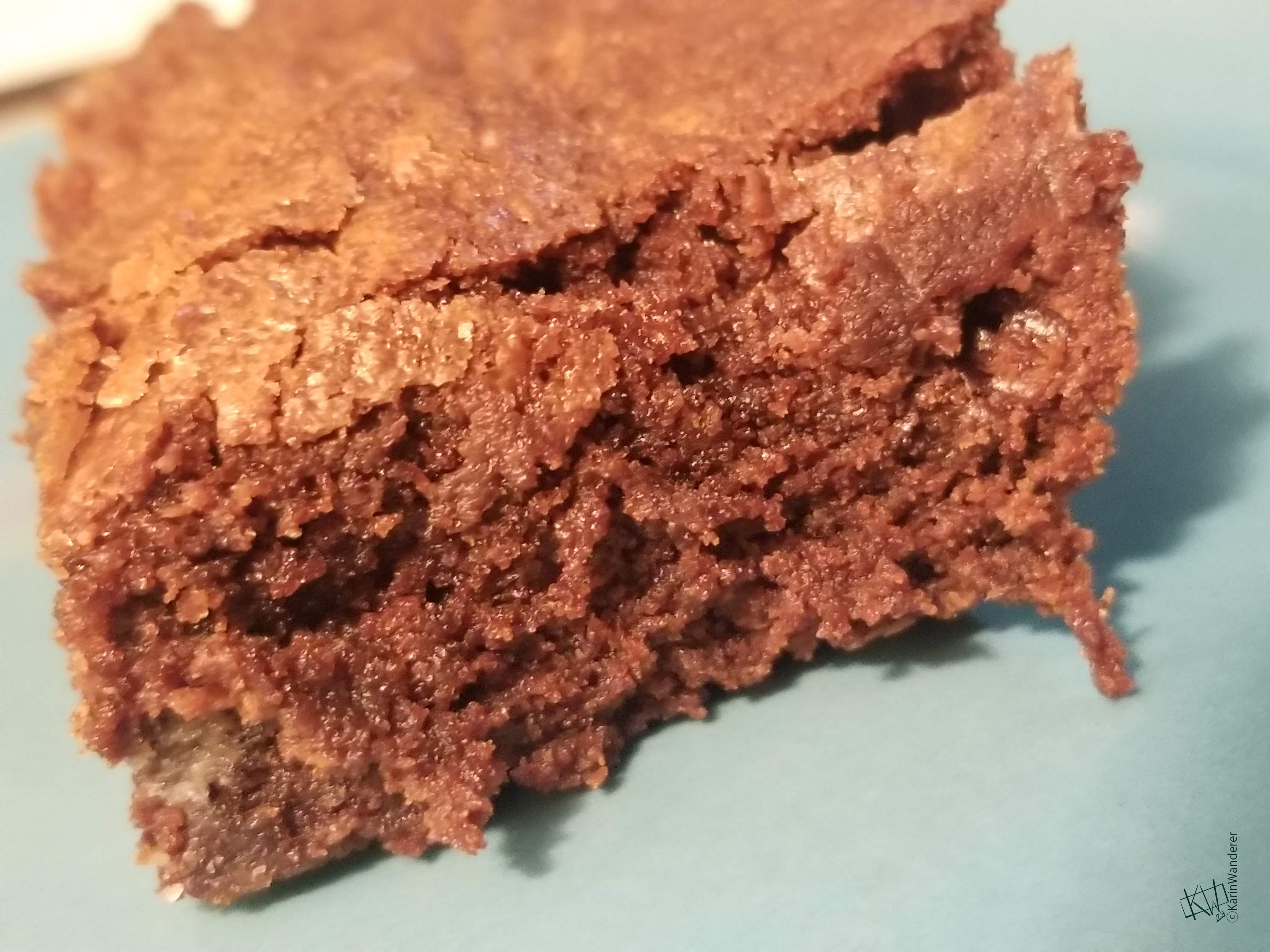
This is one of the oldest recipes in my collection. It is both simple & easy. According to my exhaustive research, there are infinite brownie recipes on the internet. There are prettier brownies, there are fancier brownies- but I can make these when I’m down to my last spoon. To me, recipes like this are invaluable!
Ingredients
- ¾ cup butter, melted & cooled enough that it won’t cook the eggs
- 1 ½ cups sugar
- 1 ½ teaspoons vanilla extract
- 2 eggs
- ¾ cup flour
- ½ cup cocoa powder
- Spices to taste (I use cardamom, cinnamon, & a touch of cloves.)
- ½ teaspoons baking powder
- ½ teaspoons salt
Directions
Preheat your oven to 350 degrees F (177 degrees C).
Grease an 8x8 pan. (If you use sticks of butter to bake this, you can use the paper wrappers to grease your pan. An 8x8 pan is small enough that there is usually enough butter left on one wrapper to grease the whole pan!)
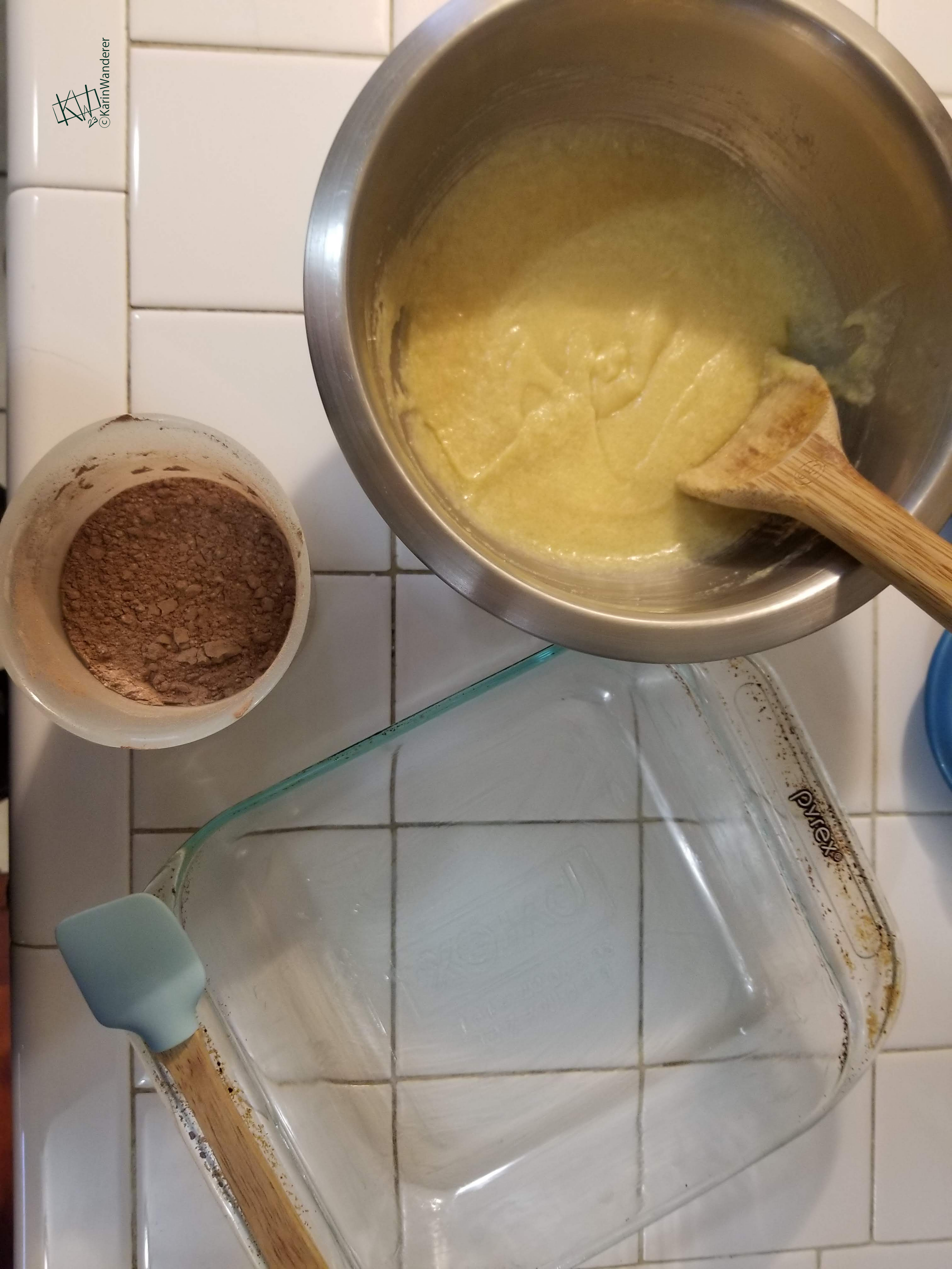
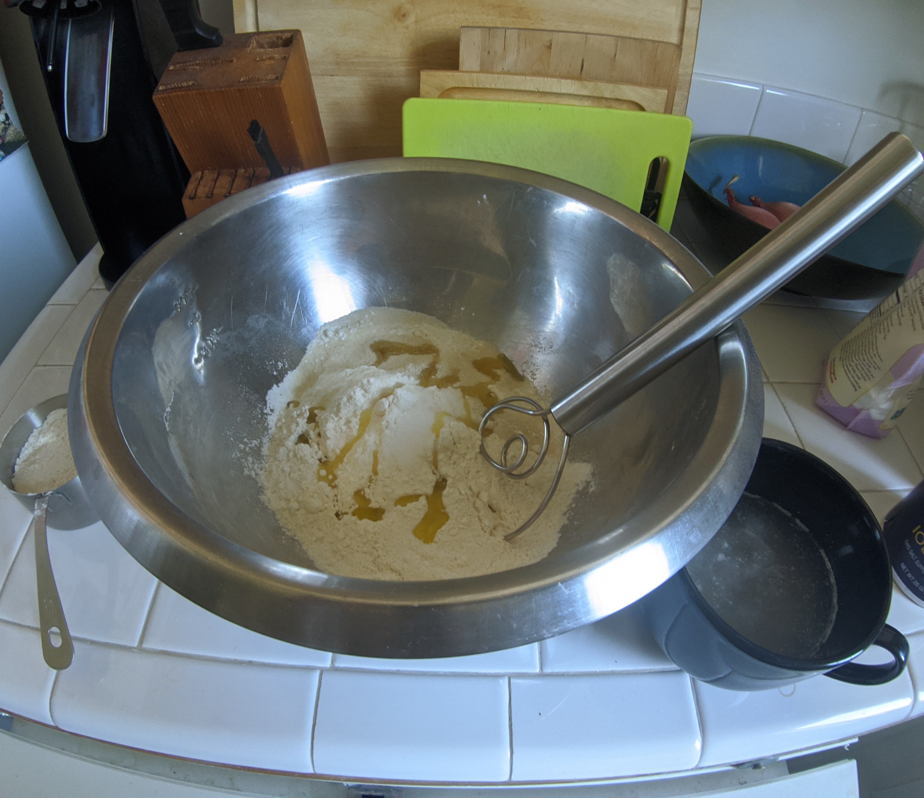
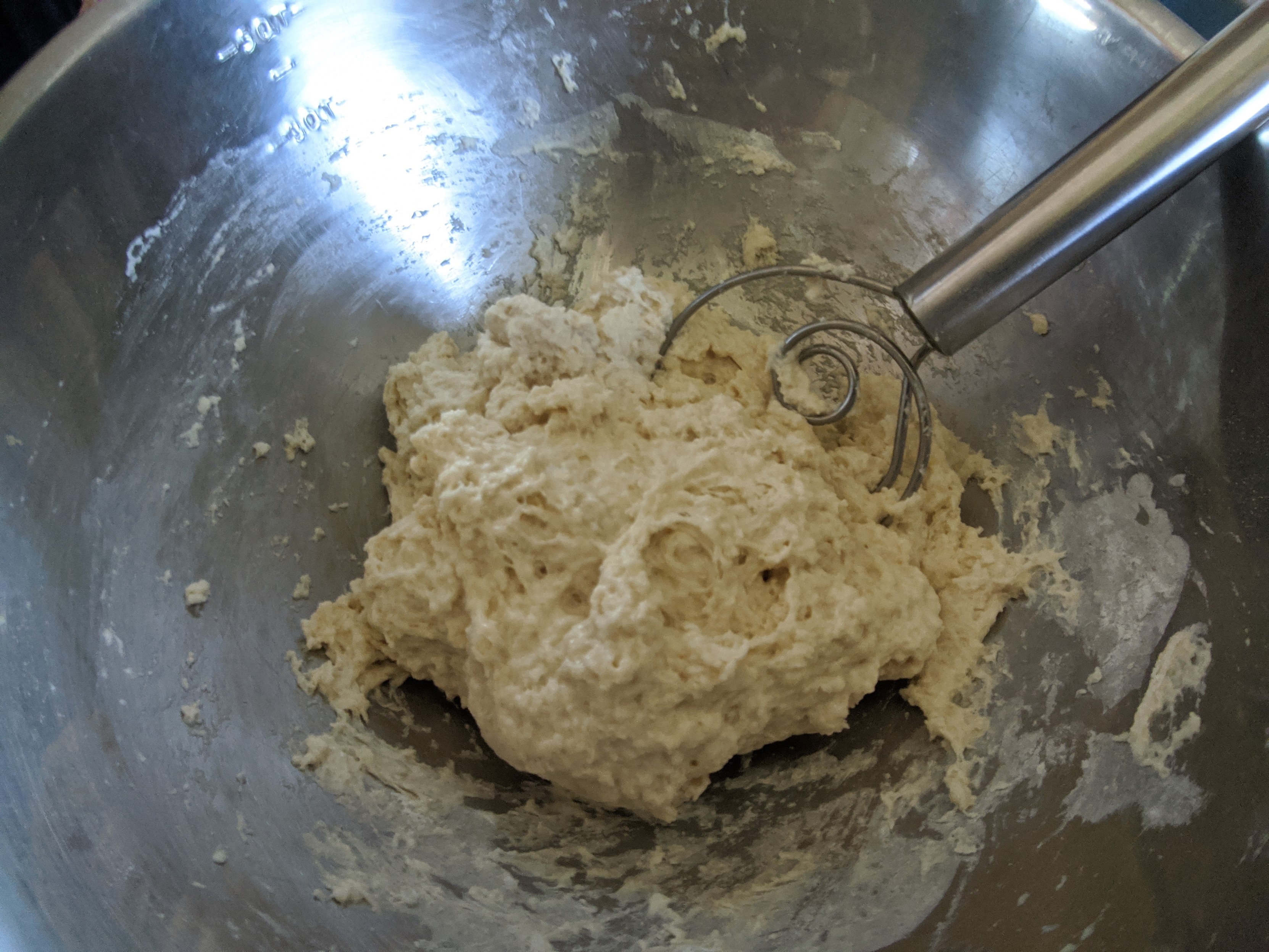
In a large bowl, mix the melted butter, sugar and vanilla thoroughly.
Add eggs one at a time, mixing thoroughly.
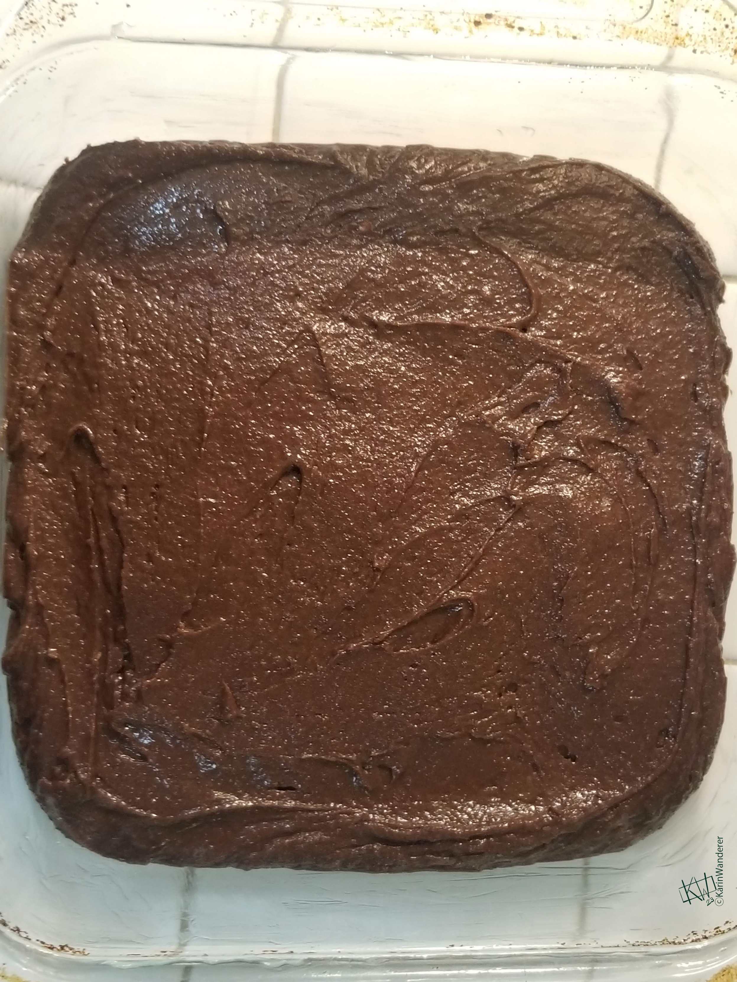
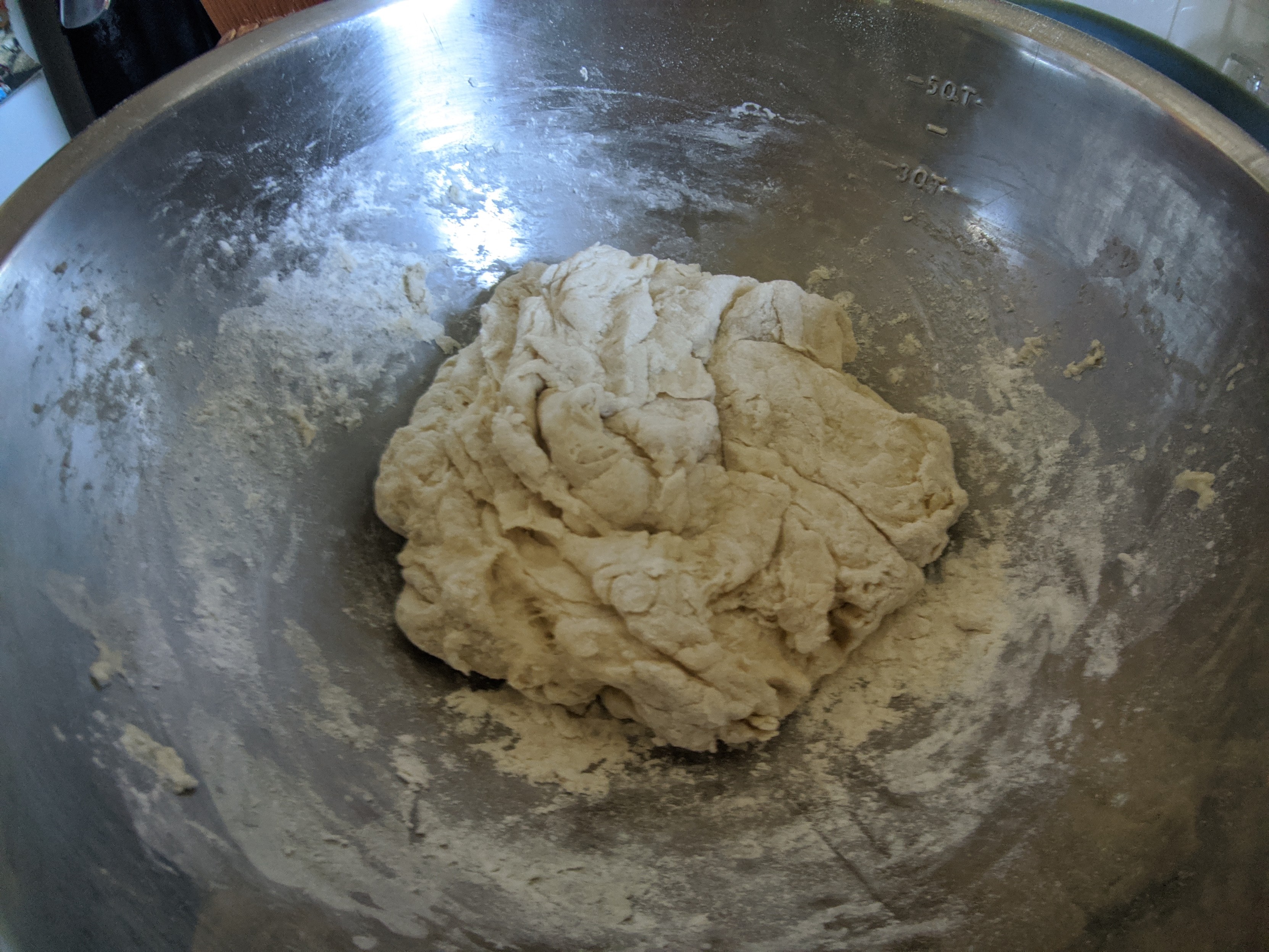
Combine the flour, cocoa, spices, baking powder, & salt in a separate container. Gradually blend this dry mixture into the egg mixture.
Spread the batter evenly into the prepared pan.
Bake for 40-45 minutes, or until the brownies begin to pull away from the sides of the pan.
Let the brownies cool completely in the pan. Do not rush this! If you cut them while they are still warm they will dry out fast & you will lose that wonderful brownie-y texture.
Quick History Lesson
There are many different stories about who invented brownies. The most popular claim is that brownies were created for an event at the Chicago World’s Fair in 1893. I would have thought such a simple, delicious dish was much older!
We’ll get back to talking about art next week. Is there an author or topic you want me to cover? Let me know on Mastodon or Ko-Fi!
Get my art on mugs & vinyl stickers in my Shop!
Donate to support my works & get cool perks on Ko-Fi
Join us for #ArtABCs, the best art challenge on the internet!
Find me
- All pictures posted are my own work.
- All reviews are my own unpaid & unsolicited opinions.
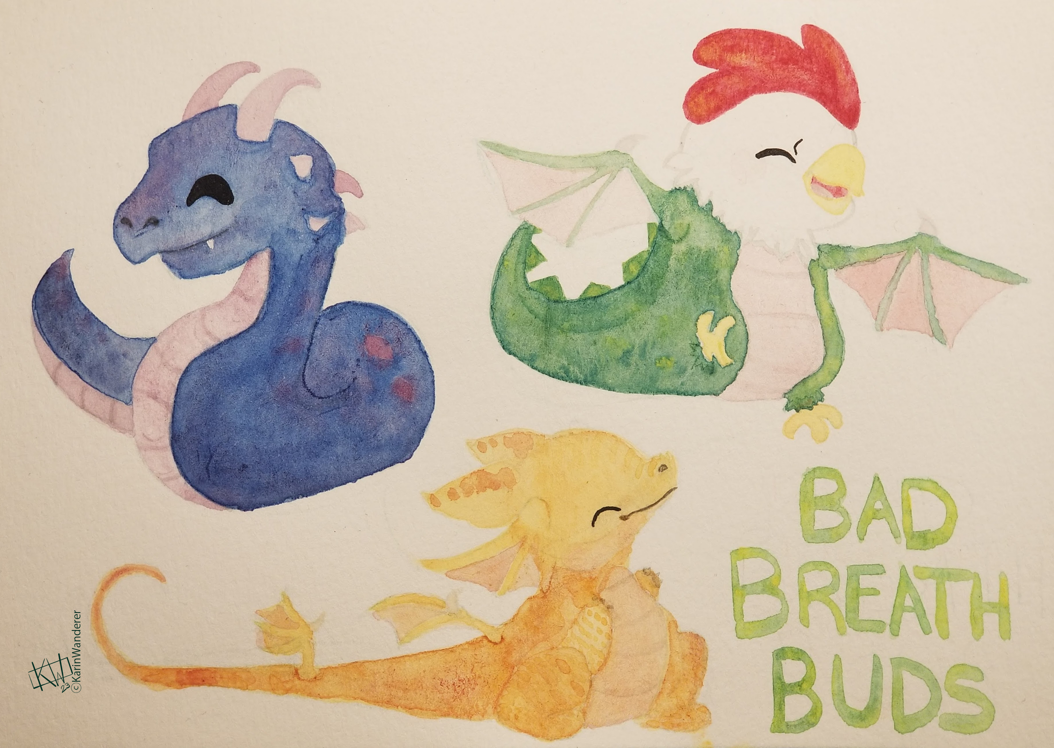
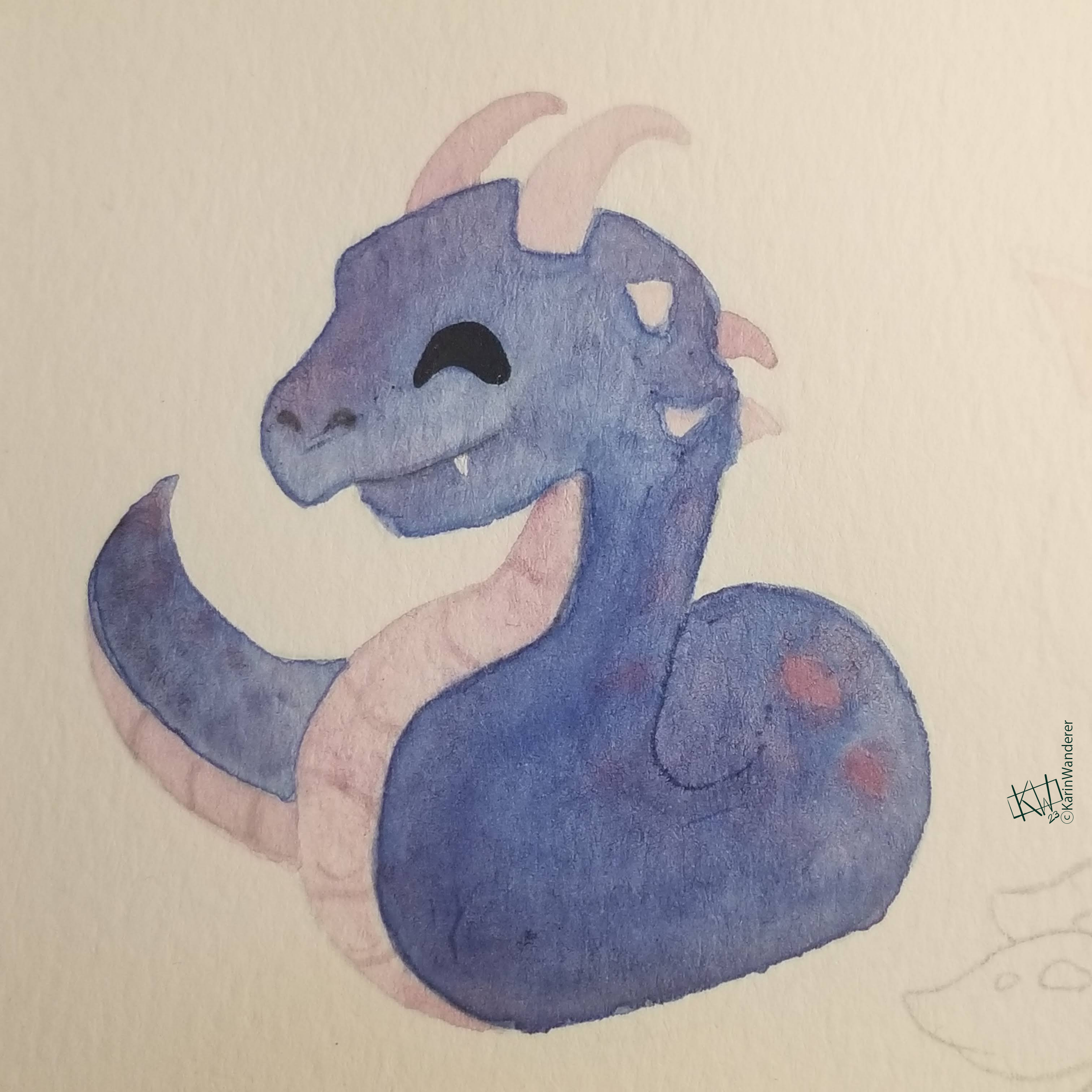
 It would be polite to call this lil friend a chibi-doragon (チビドラゴン)
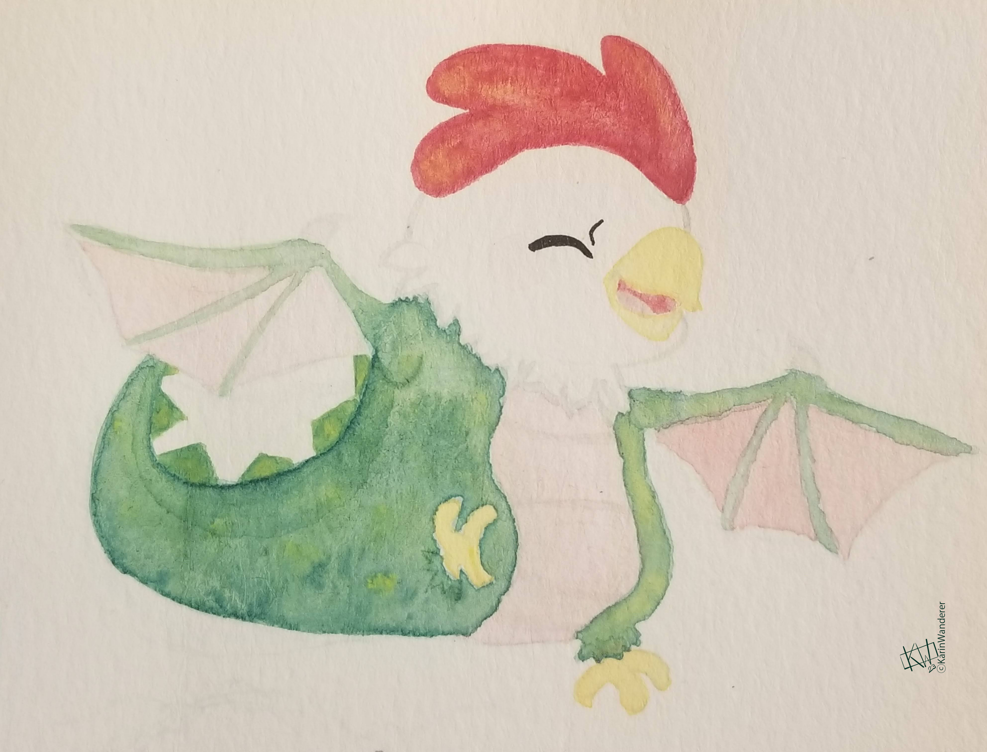
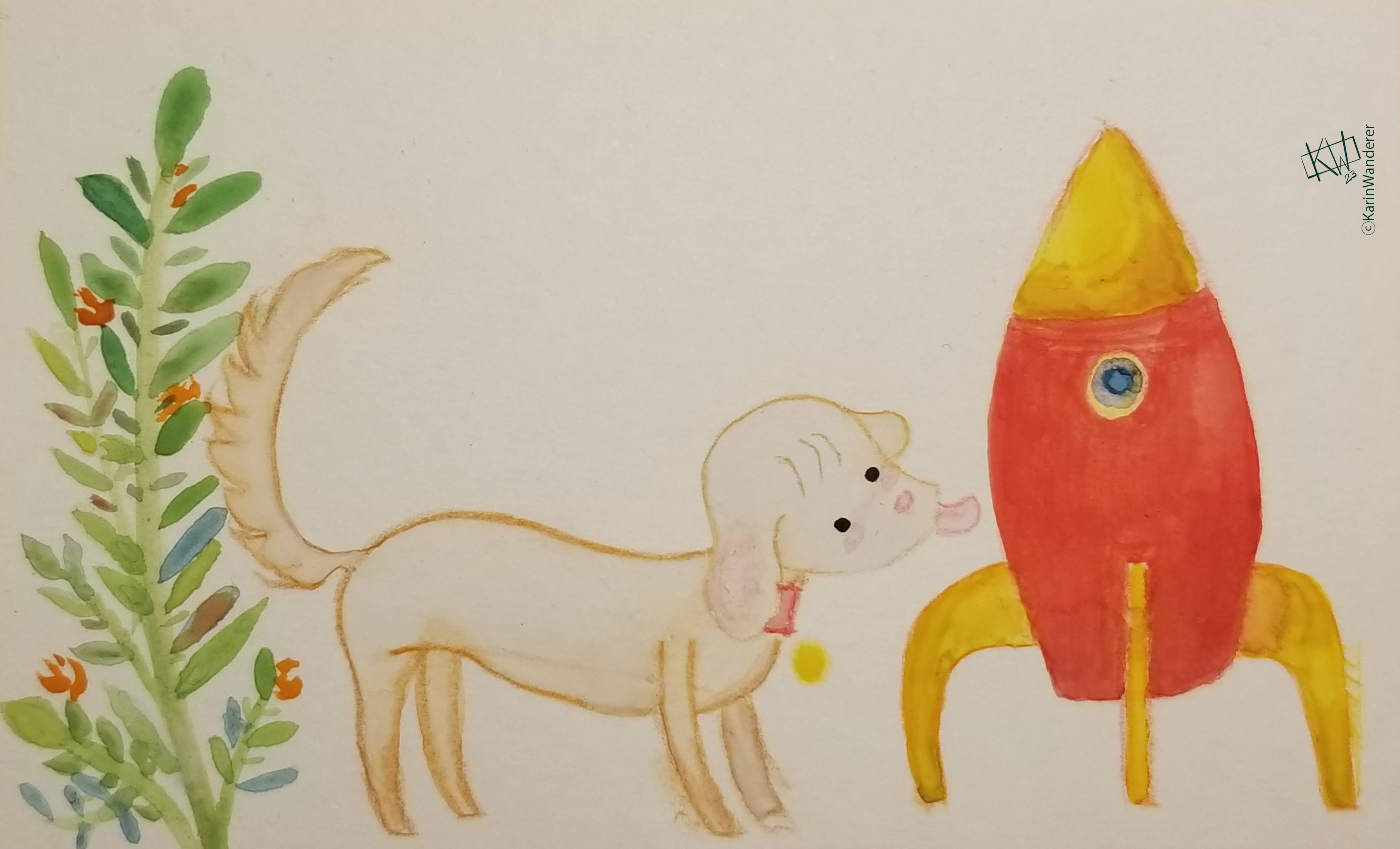 I spent more time than I should have painting scenes from Chau’s books this week
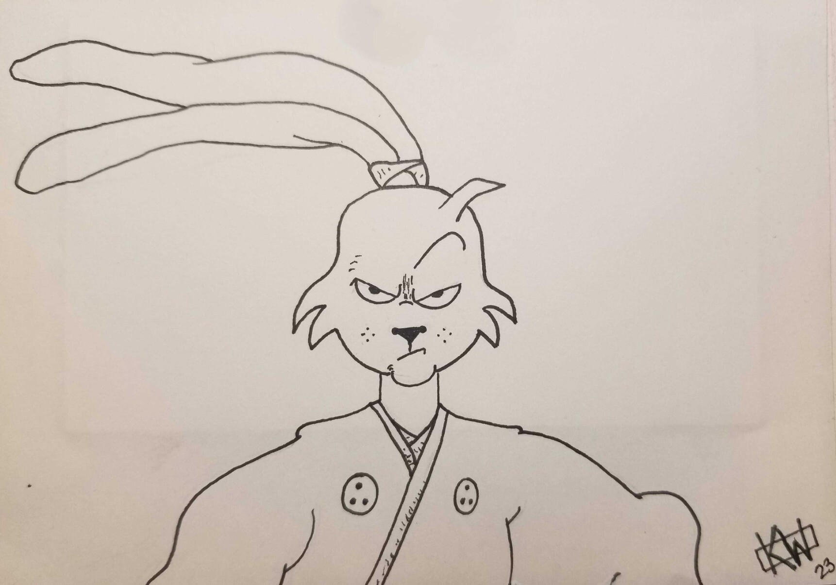
 This is Yu-er’s grandfather, a true insect aficionado.
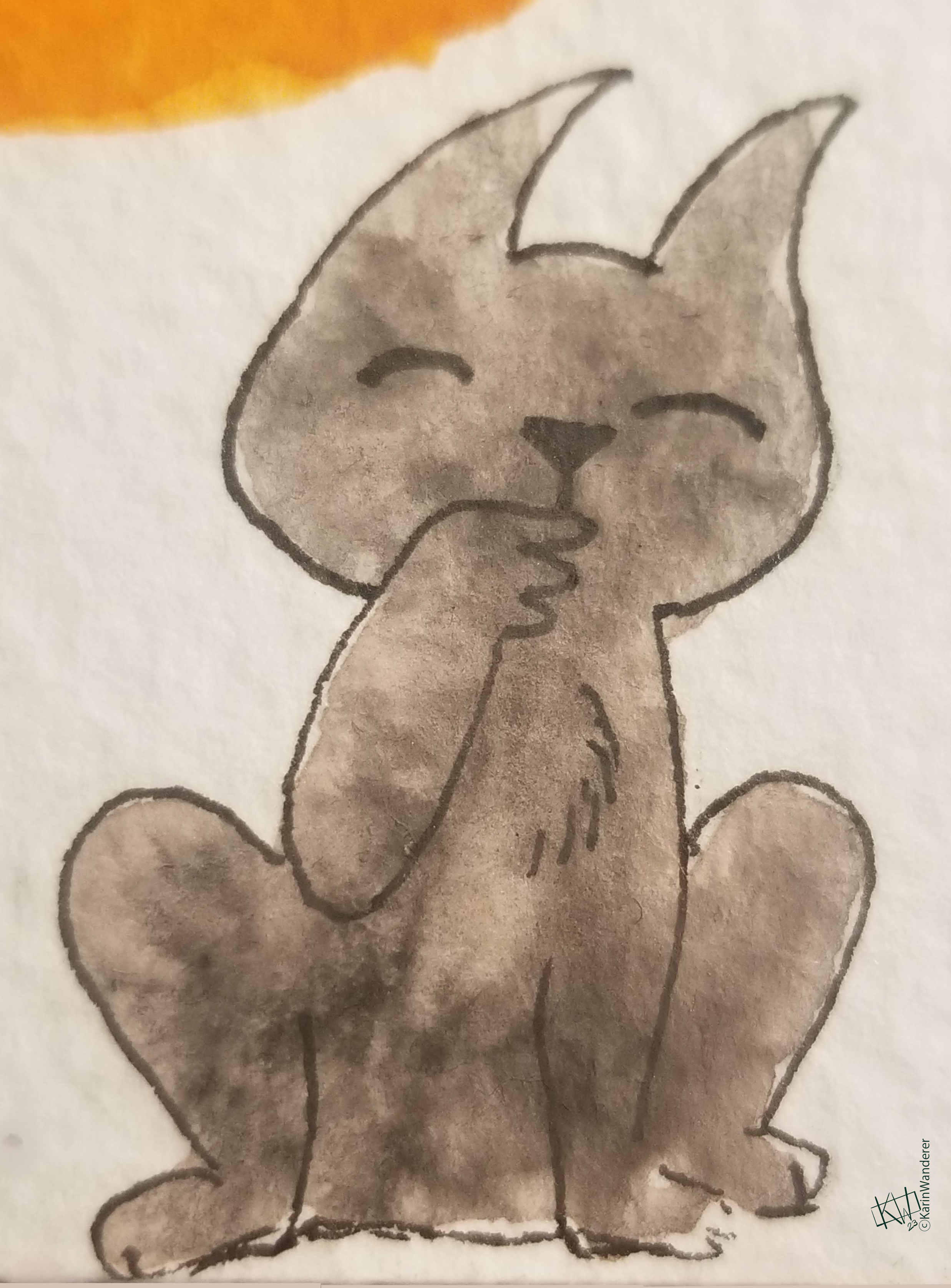 Spoiler alert: cats are awesome.
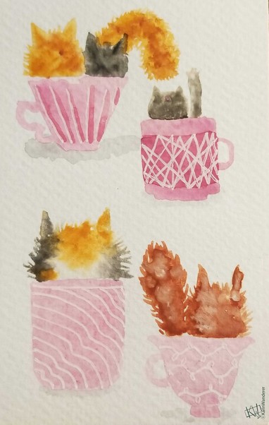 Watercolor cats are a weakness of mine
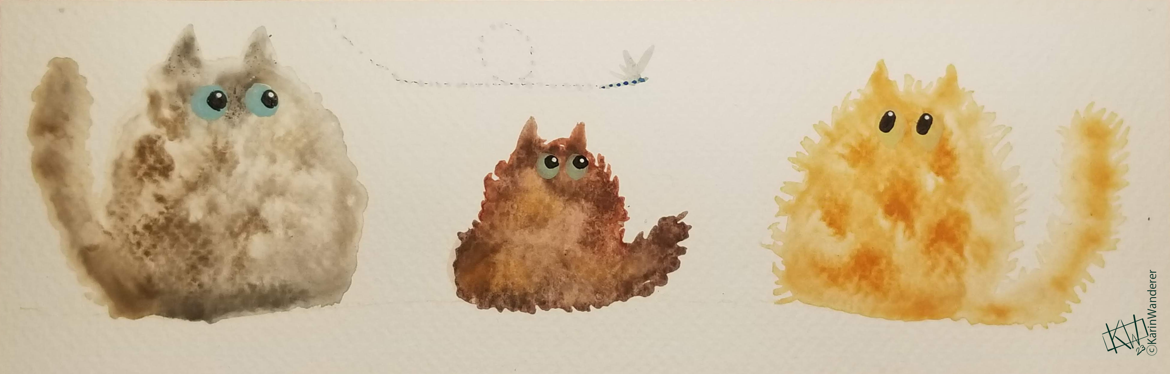 I might have gotten distracted from writing this article by painting cats.
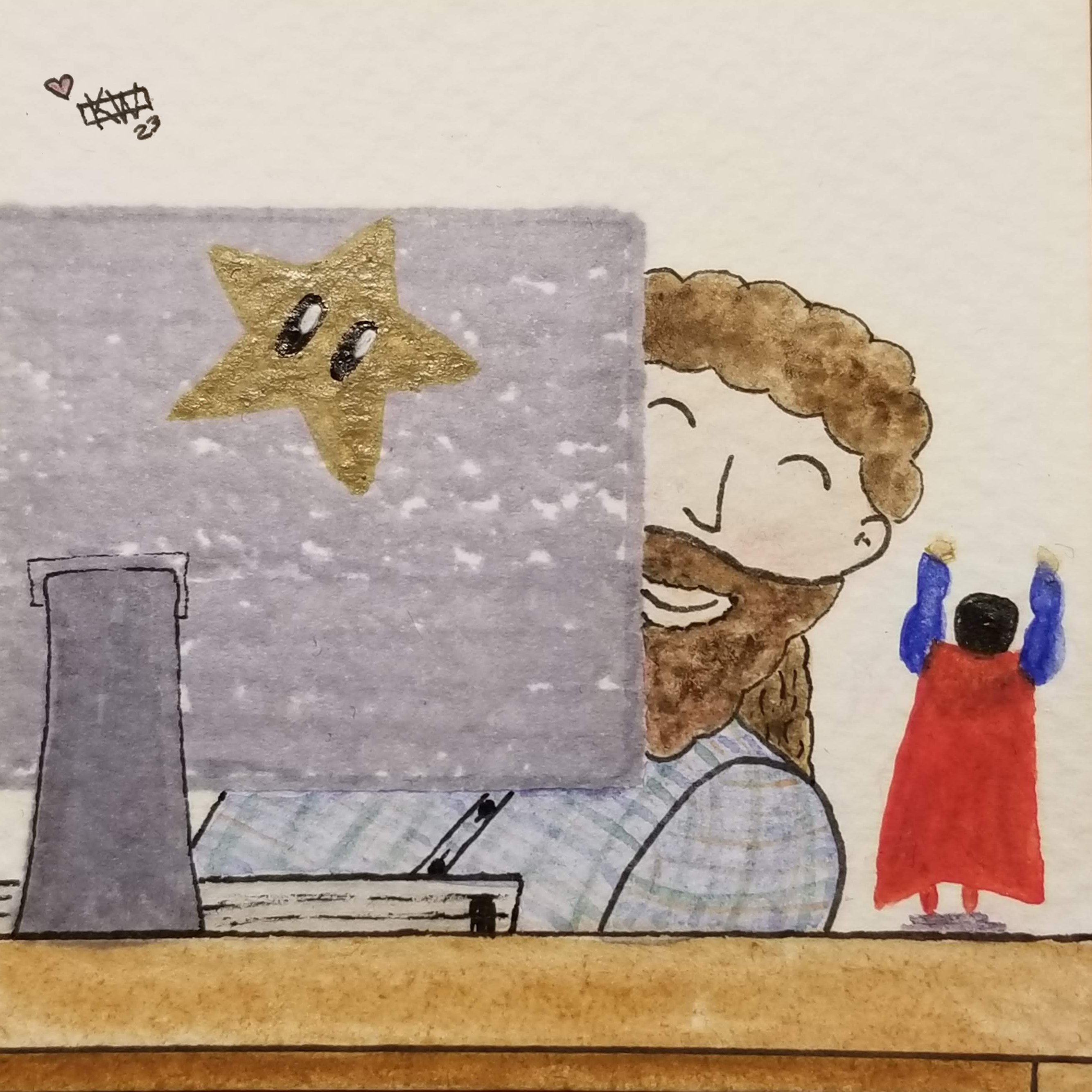
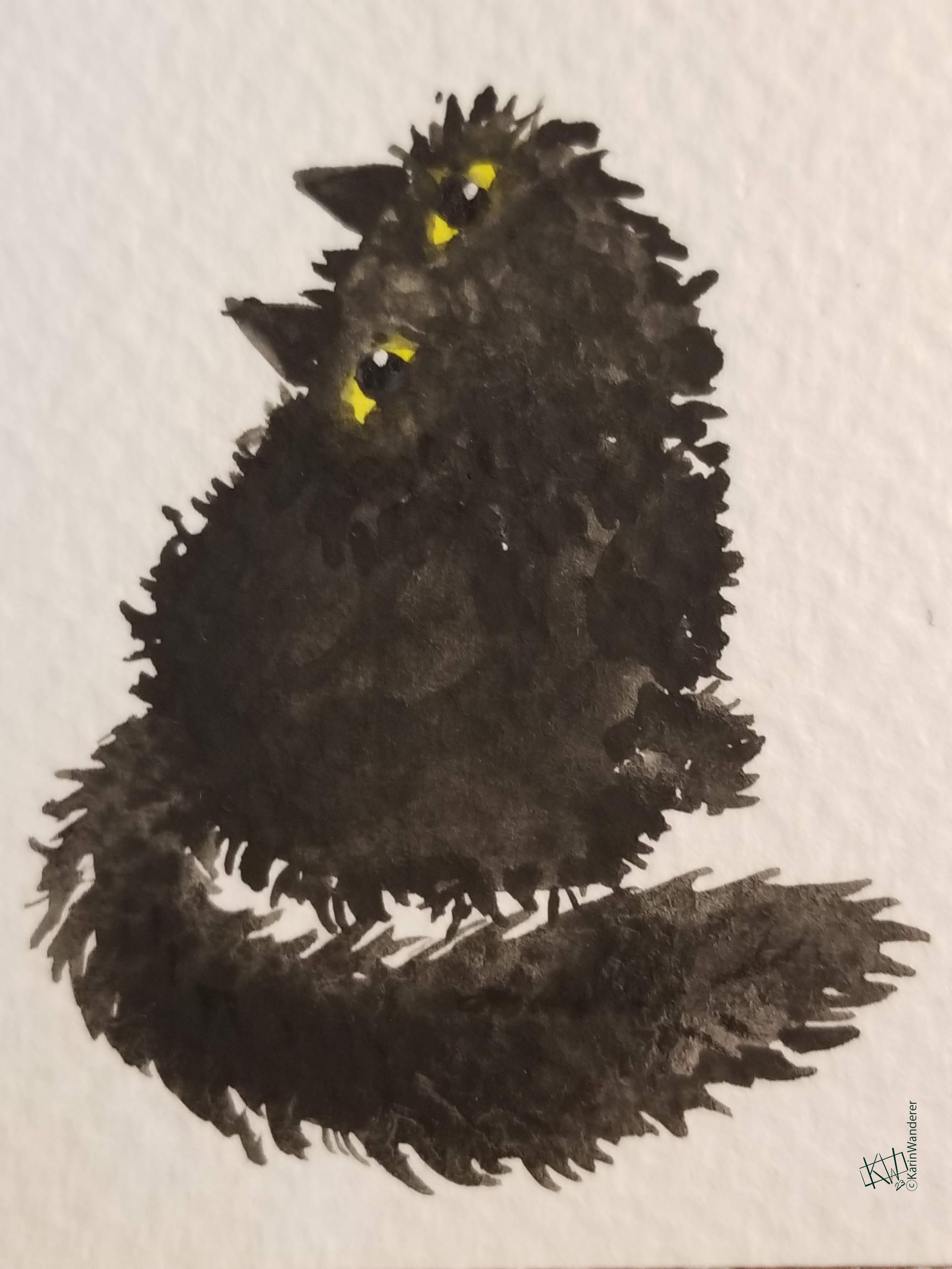 What an adorable ball of demonic rage!
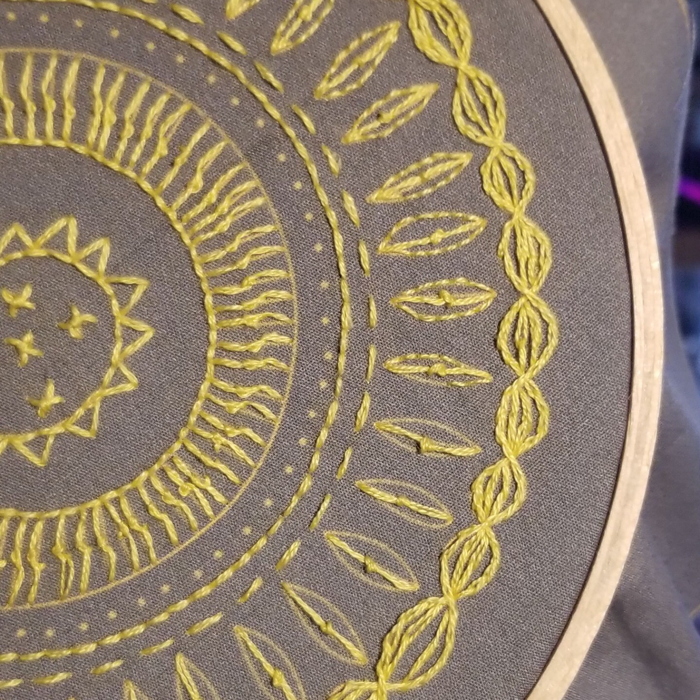
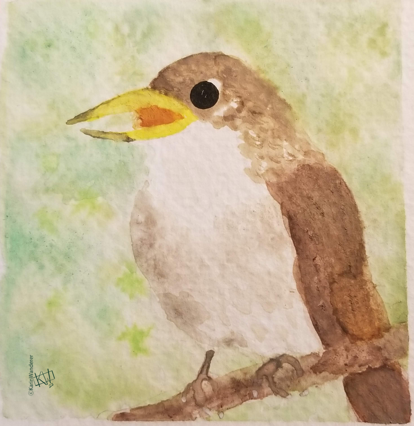 I baked a cake while painting this nightingale.
 A moment of appreciation for my local libraries' audiobook selection.
 Or sitting & enjoying your tiny garden.
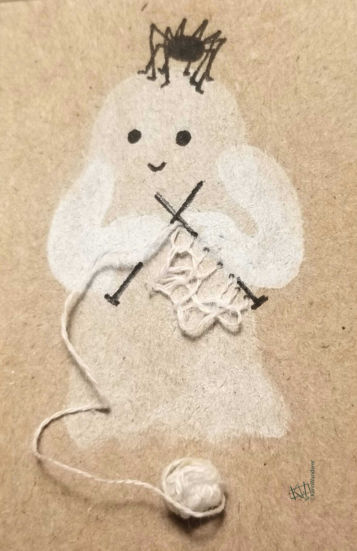
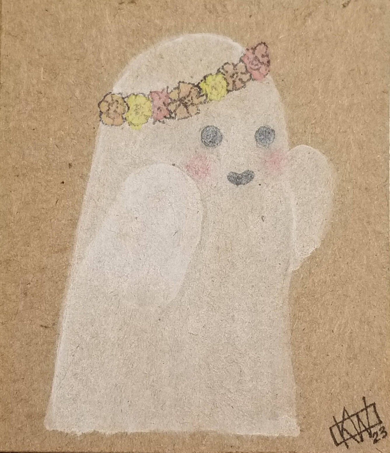 Such ghastly humor!
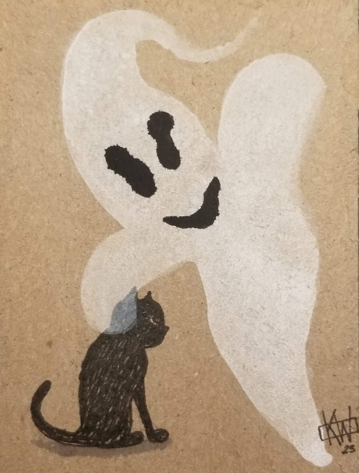
 Eat your heart out, Casper!
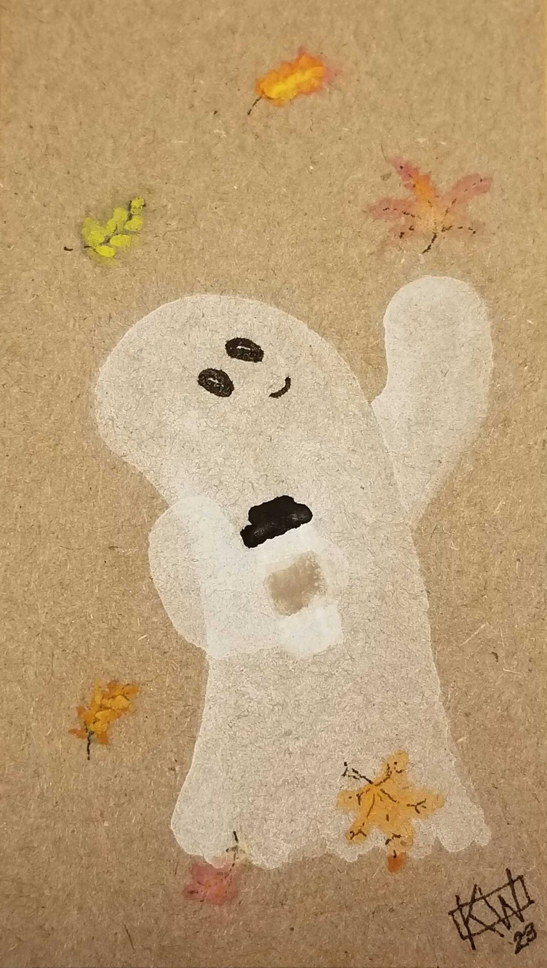
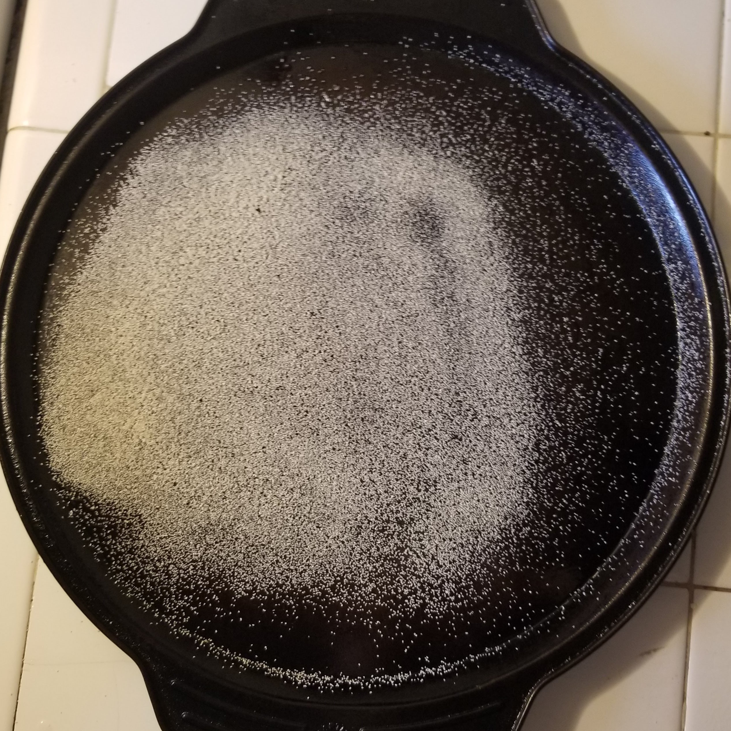
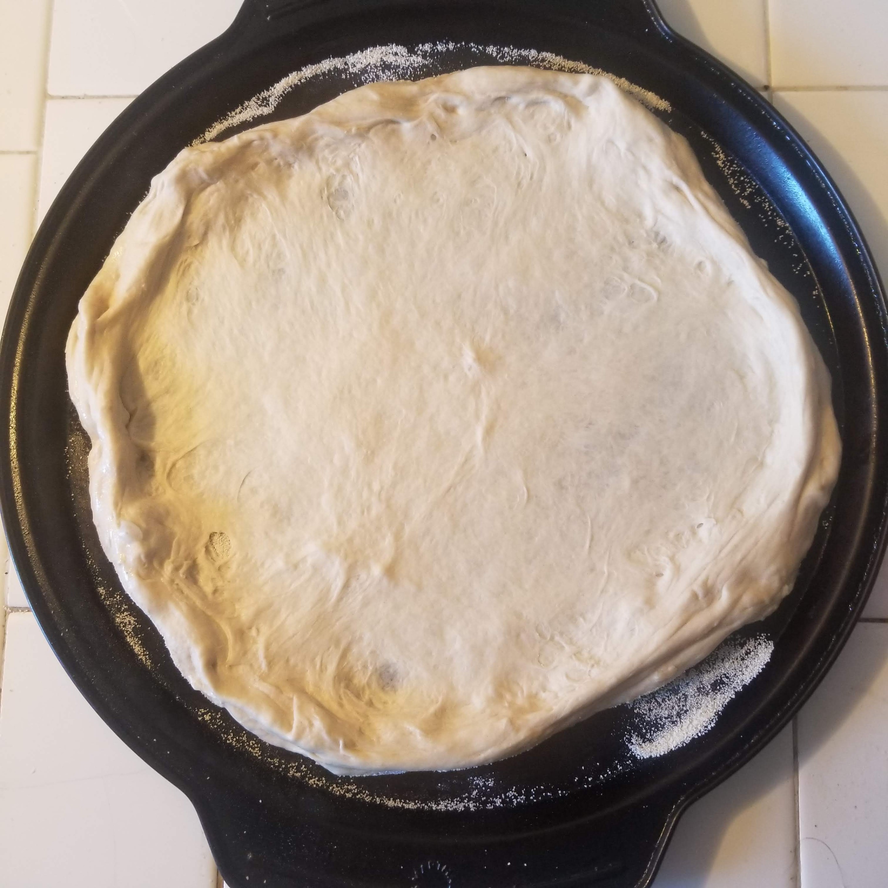
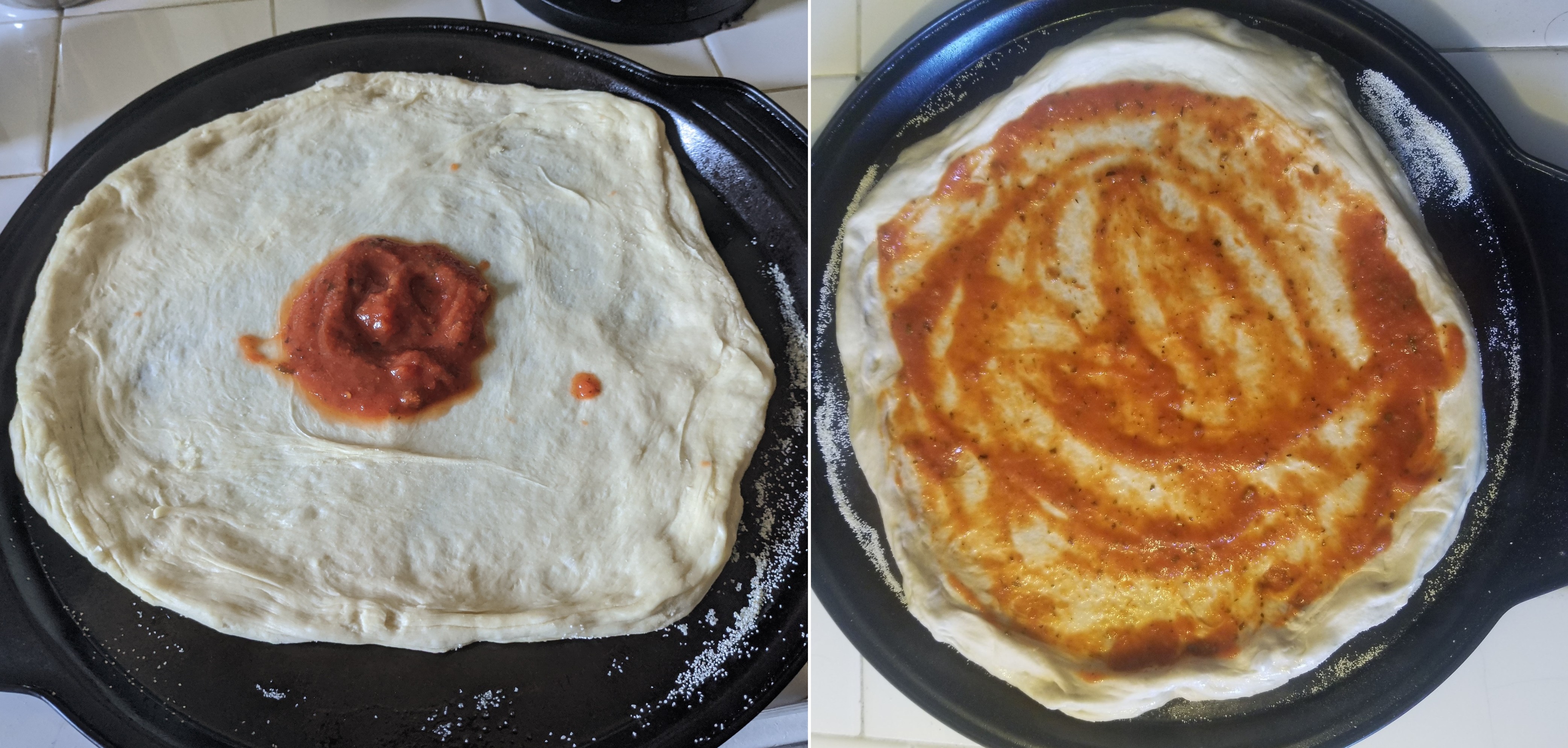
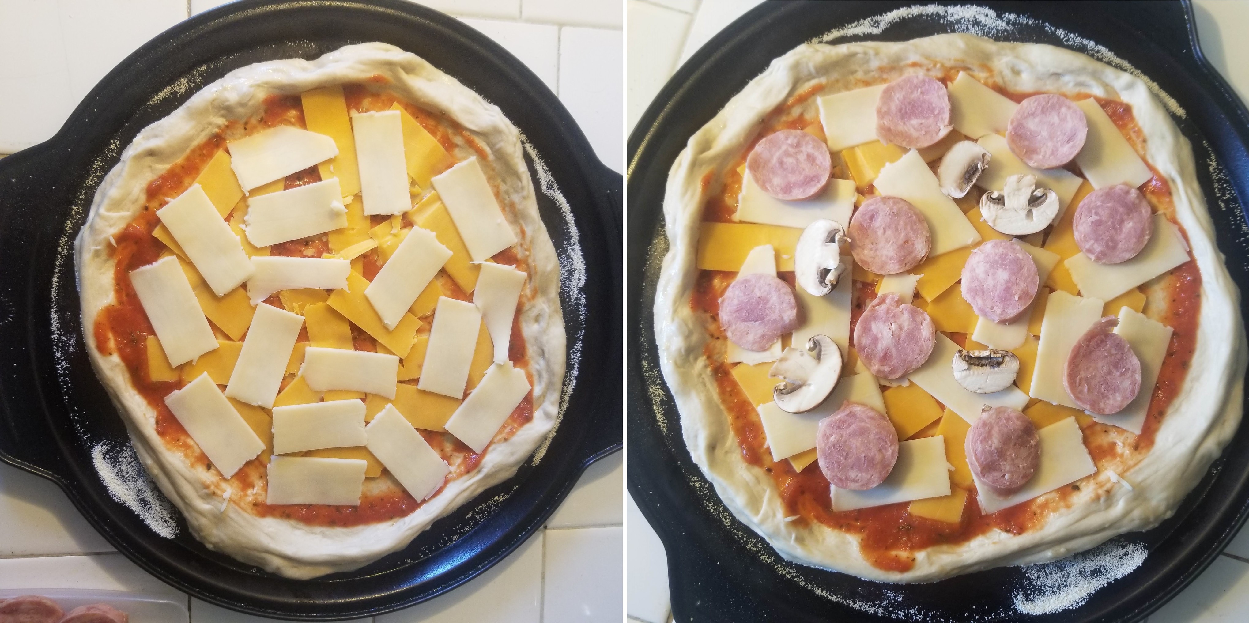
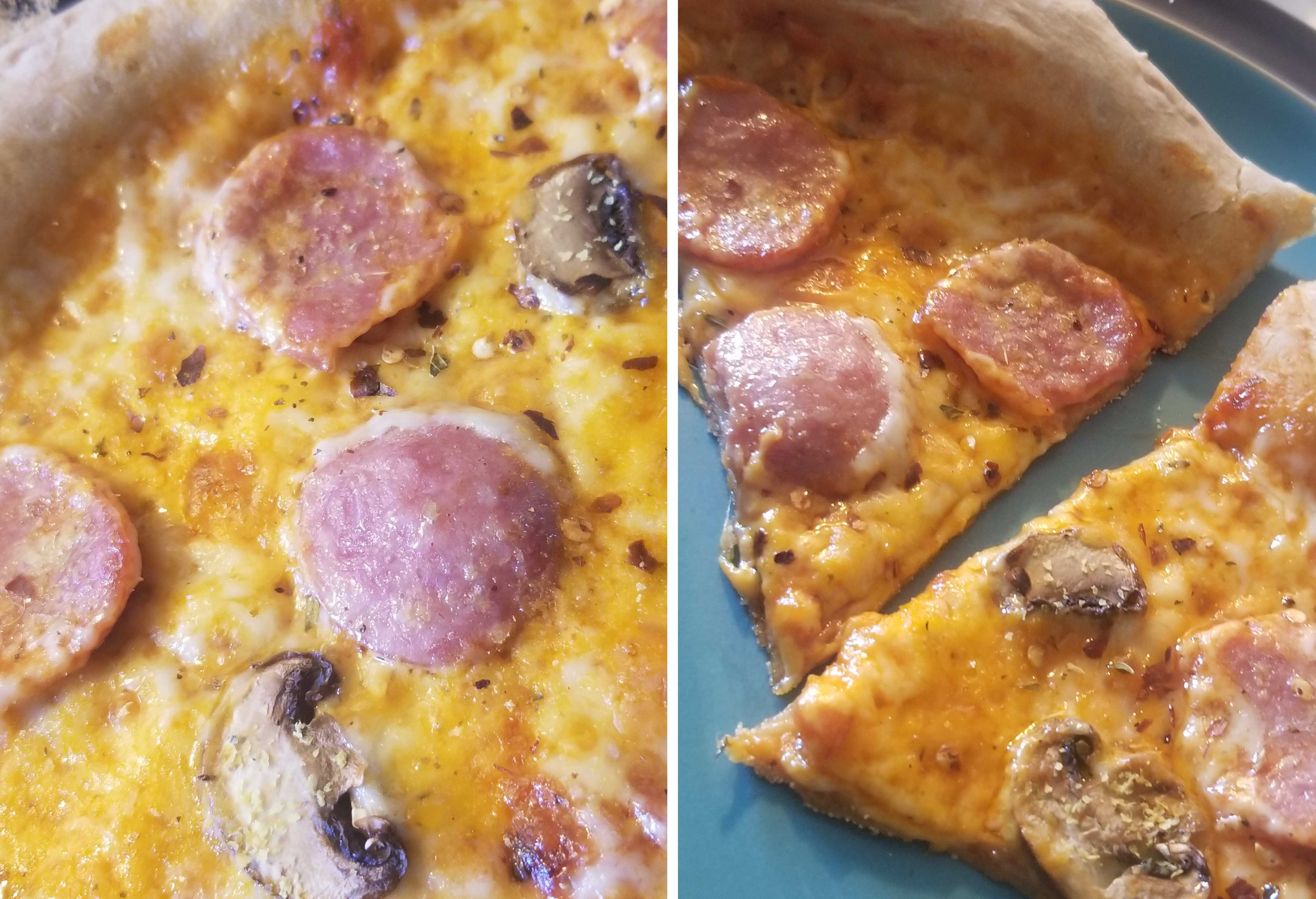
 Certified Pizza Expert
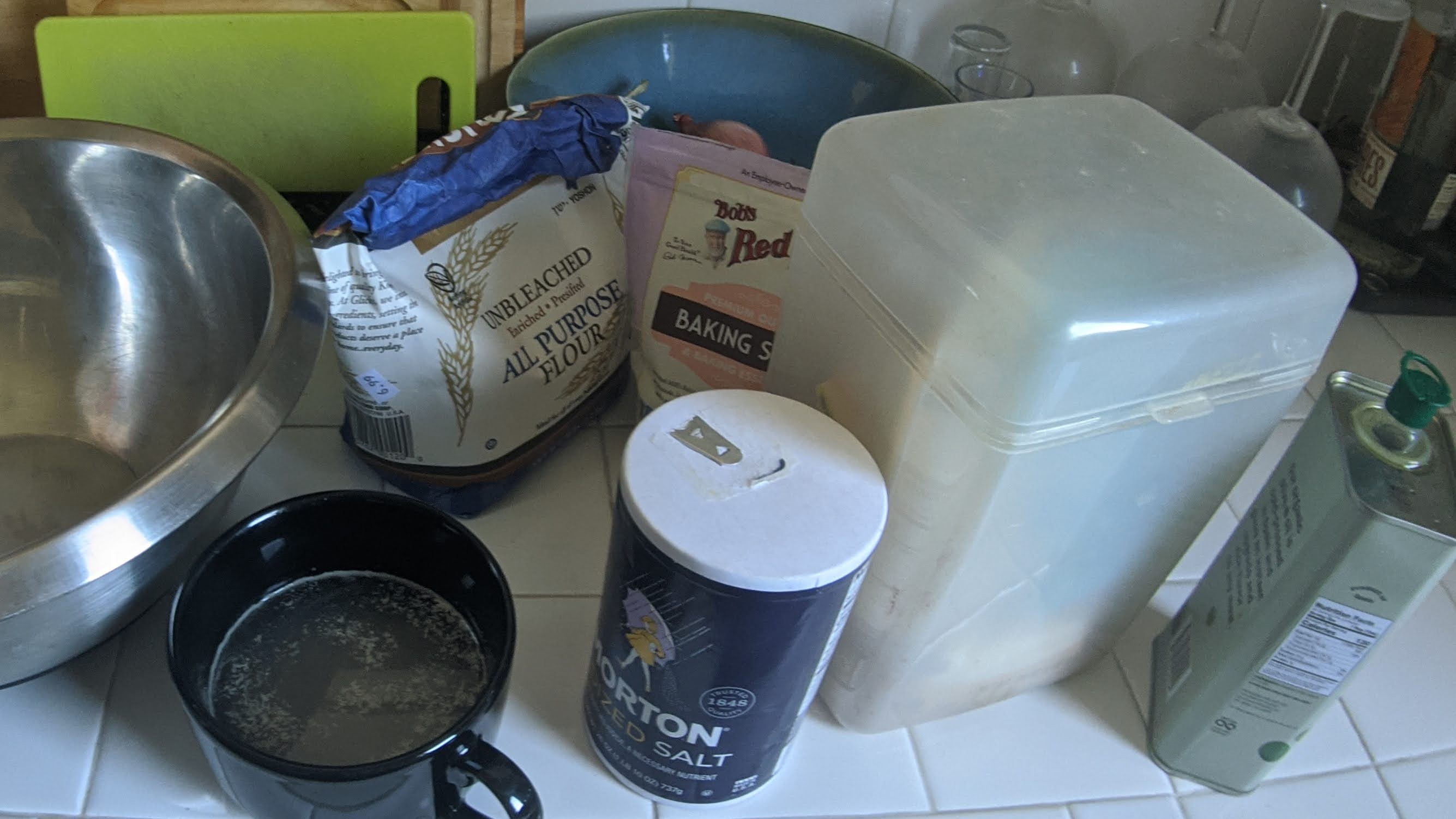