Outside Is Frightful
As 2024 draws to a close, I am reviewing this past New Year's resolutions & trying to figure out what my resolutions will be for 2025. Have you made any resolutions for 2025? Every year since 2015 I have made the same New Years’ resolution: to make better choices than last year. It’s pretty easy to stick to while allowing for slow, incremental change that I can sustain over time. In 2024 I want to add more concrete, specific goals when it comes to art & so I picked five. Here they are, listed in what I expected to be in order from least to most challenging.
What Were My 2024 Resolutions?
Goal 1: Start An Art Challenge Goal 2: Feature More Artists in my Blog Goal 3: Expand My Shop Goal 4: Tell Everyone How Awesome Animals Are Goal 5: Touch Grass, Seek Inspiration
How Well Did I Do?
Goal 1: Start running an art challenge Success! I've been running #KWPrompts all year, and many of you lovely people have joined me! I get so happy when I see the art you all post. The theme as of this posting is #WinterTime so please join us!
Goal 2: Feature More Artists in my blog Fail. Featuring artists involves me doing a lot research into each individual artist, as well as of #DTIYS versions of their art. It is the most labor-intensive type of article I write & at a certain point this year I had to set it aside.
Goal 3: Improve My Shop Meh? I did get in the habit of updating the shop a little more frequently than I had been, but by no means as often as I should.
Goal 4: Tell Everyone How Awesome Animals Are Success. I do this all the time! But really, fail. This goal was about getting my picture book to the “dummy” stage, with pictures and everything, & I more or less abandoned that project when I got sick.
Goal 5: Touch Grass, Seek Inspiration Success? This was definitely the hardest goal for my agoraphobic ass- I wanted to leave the house & go to more movies, art exhibits, etc. While I ultimately could not afford to do this very much, I did manage to get myself out of the house to walk around outside taking pictures of flowers about once a month. Progress!
Overall: I did really well, until I got COVID in August. Ever since then I've been focused on recovery, & am only back to about 80% with serious bouts of exhaustion & brain fog really getting in the way of everything else. I did not have enough spoons already & COVID just made that worse. For example: I cooked a feast for Solstice on Saturday, which exhausted me so much I sat around in a fog all weekend. It was only on Monday night that I remembered I had to write this for Tuesday. Now instead of watercoloring my Simpsons drawing or inking my “Tomte with a battle axe” I'm trying to write a whole article before bed. Thanks, brain fog! 2025's art goals will be simpler so I can focus on my health.
What Will My 2025 Resolutions Be
Goal 1: Keep running an art challenge I have a brand new idea for an art challenge! It will be the same laid-back, 2 week long prompts, & I have plotted out all 26 challenges of 2025! Check back next week to find out more
Goal 2: Keep This blog simple I enjoy writing about all the arty things I learn. I am definitely going to keep posting here every Tuesday! But in the interest of good spoon allocation I'm going to stick to the more direct, shorter blogs I've been writing for the last few months.
Goal 3: Go For More Art Walks Wandering around my neighborhood taking pictures of cool plants is also health-focused, so it is like a 2 for 1 resolution!
We Take Care Of Us
That's it! The next few years are going to be even harder than the last few. Wear your masks & get your vaccines, friends! You do not want long COVID!
What Do You Think?
What were your resolutions this past year? What do next year's resolutions look like? Mastodon Bluesky
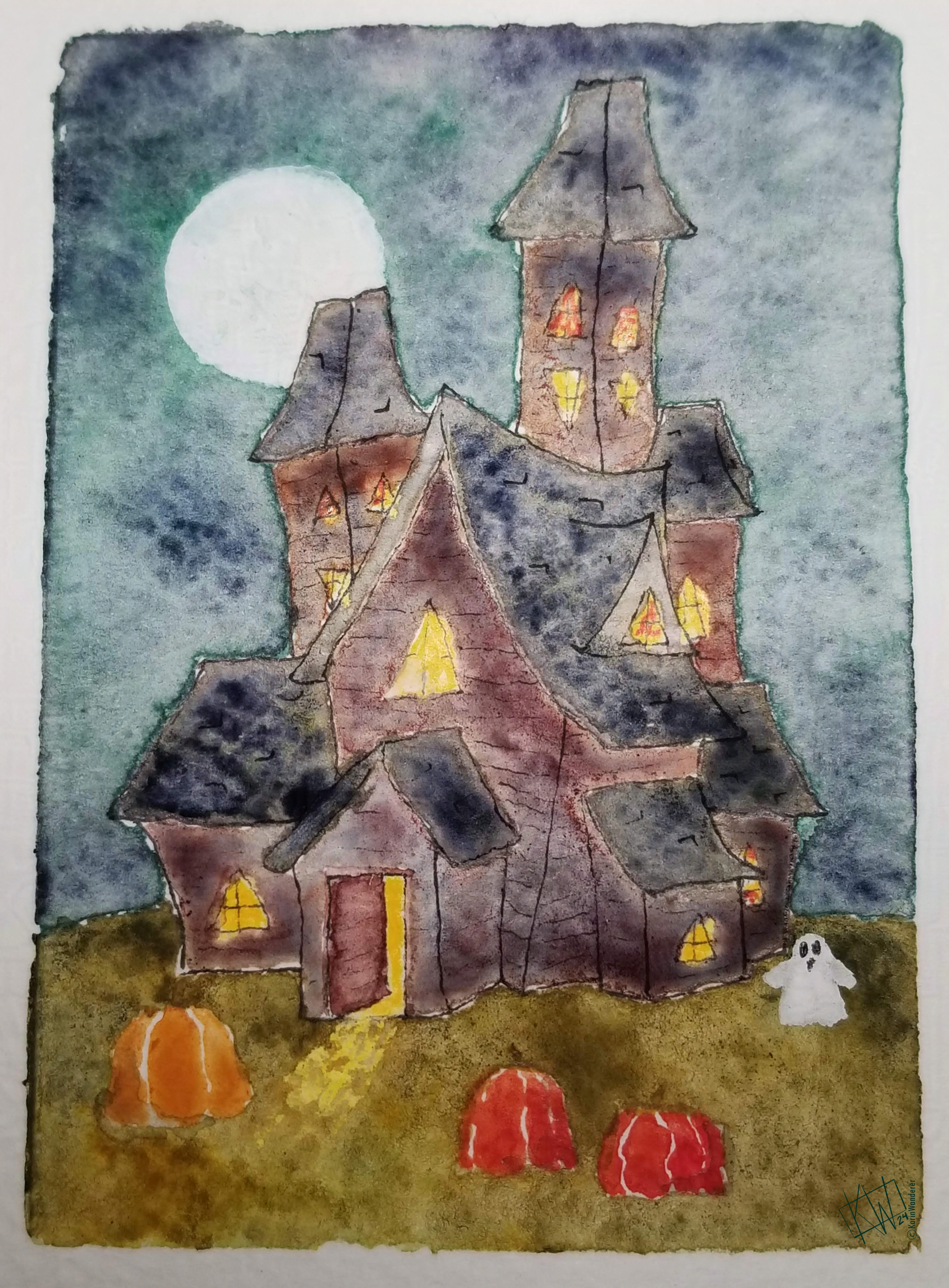
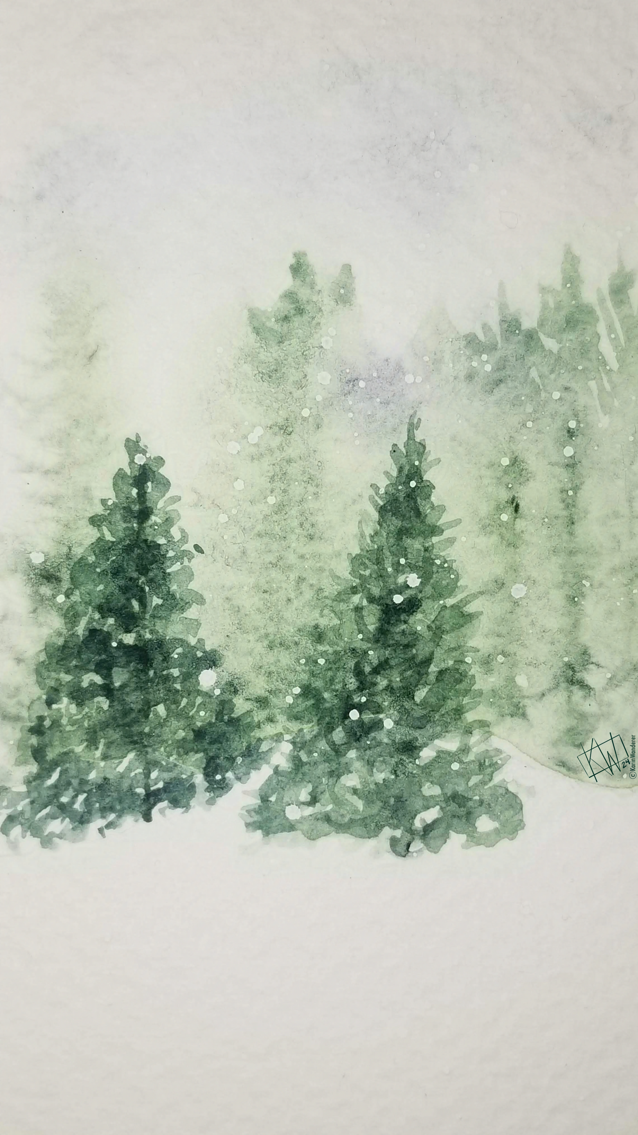
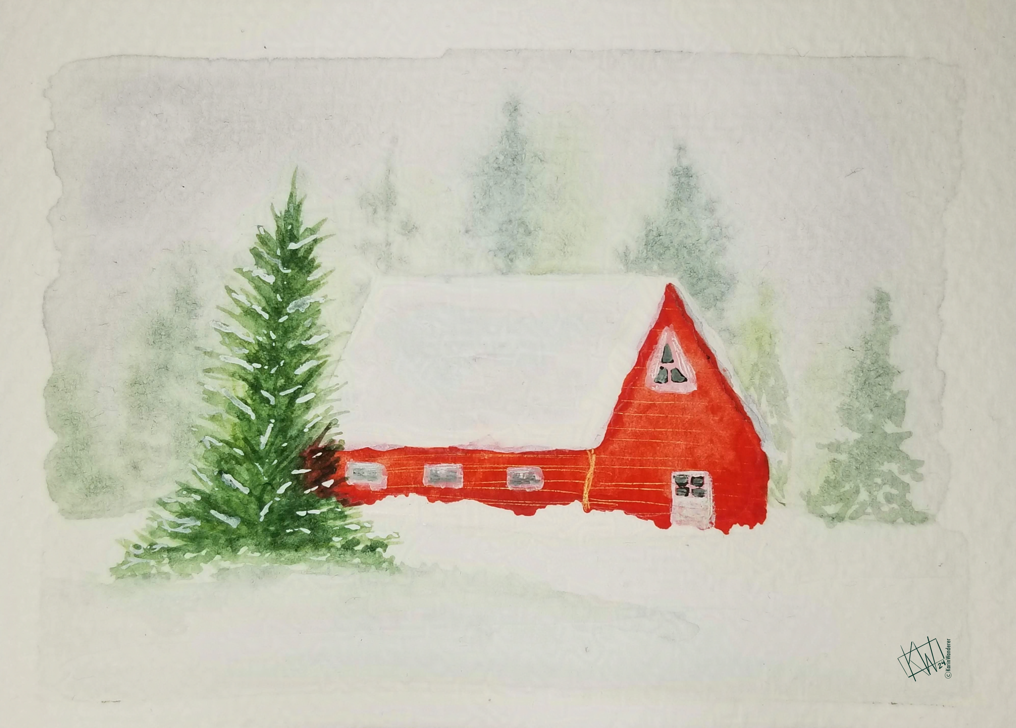
Walking In A Winter Wonderland
Every 2 weeks I post a new art challenge prompt The #KWPrompts is #WinterTime for another week!
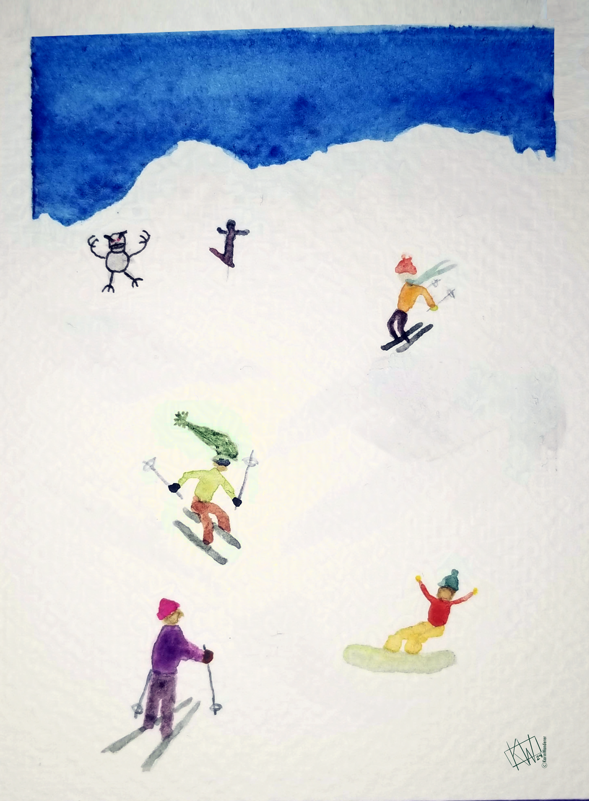 For reading all the way to the end, you get a SkiFree reference
Get my art on mugs & vinyl stickers in my Shop!
Donate to support my works & get cool perks on Ko-Fi
Join us for #ArtABCs, the best art challenge on the internet!
- All pictures posted are my own work.
- All reviews are my own unpaid & unsolicited opinions.
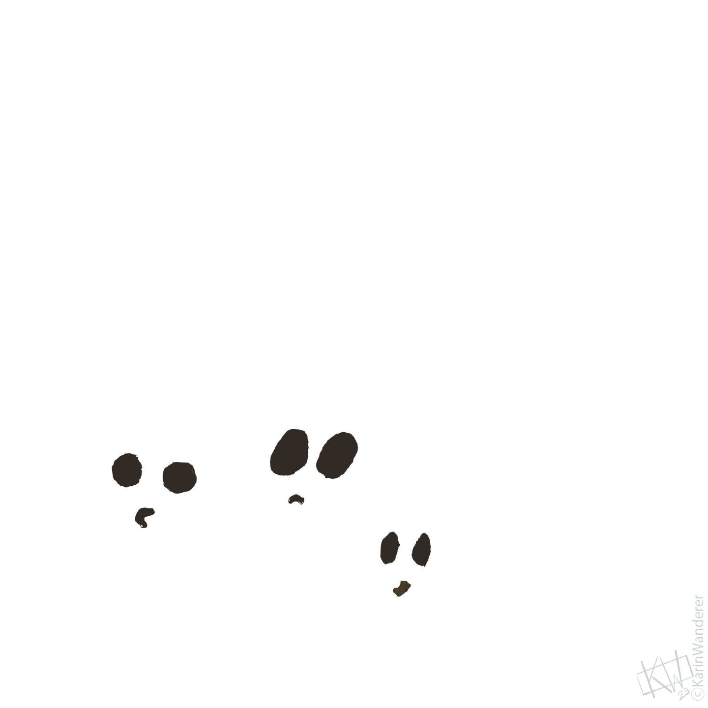 3 ghosts eating marshmallows during a blizzard
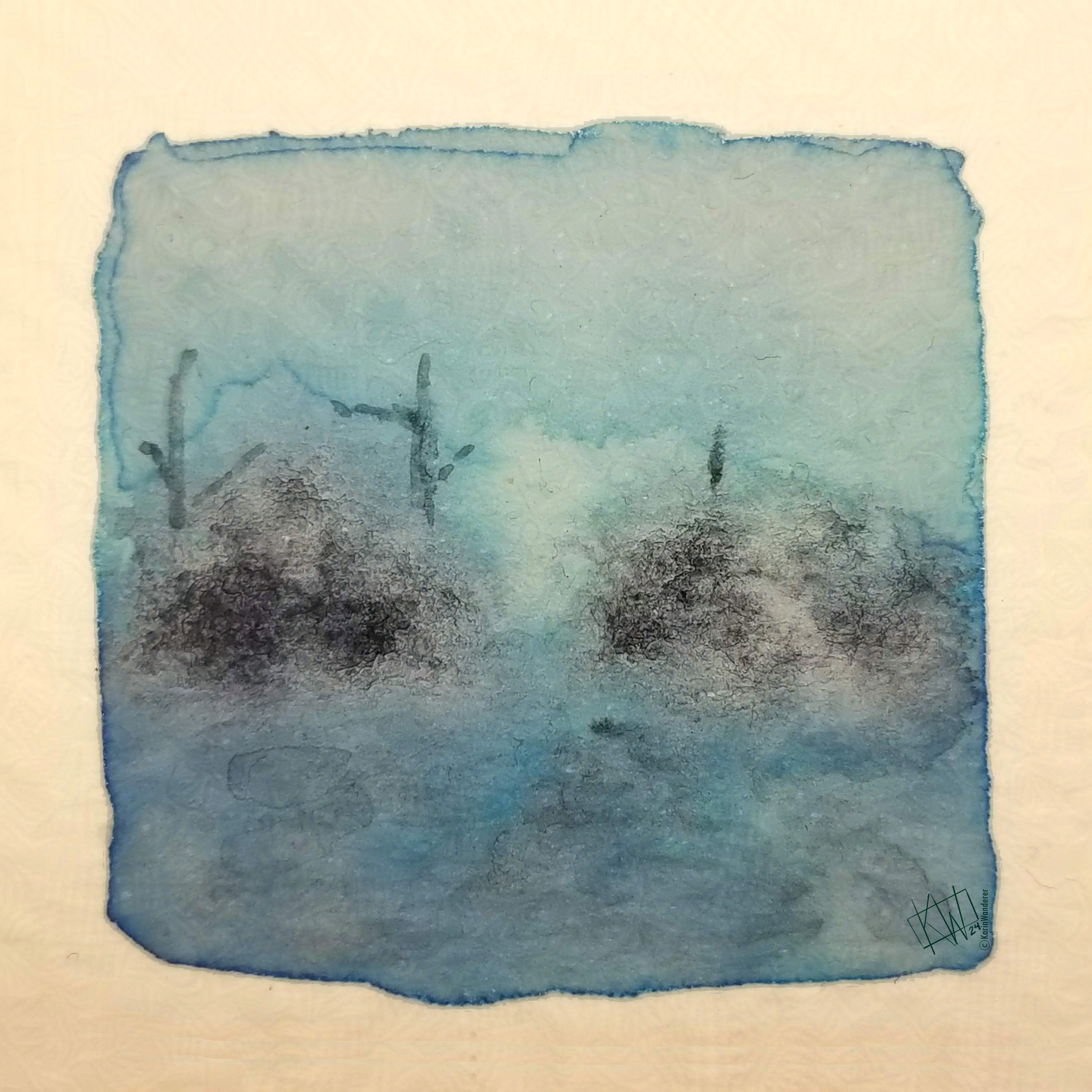
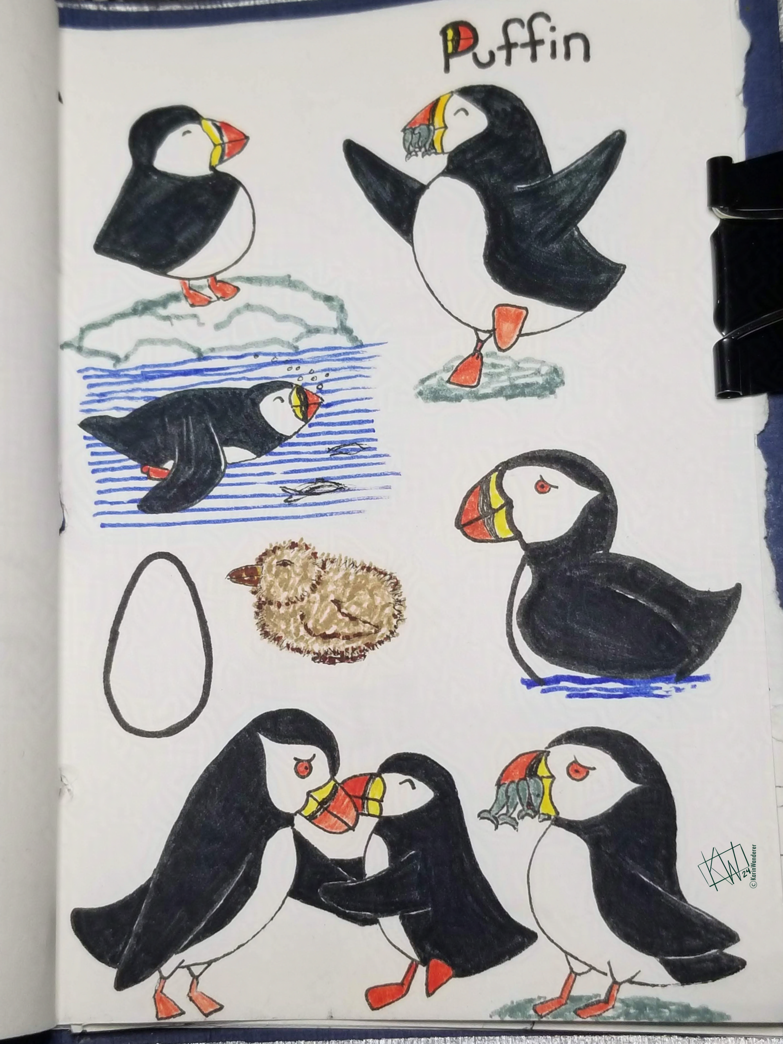
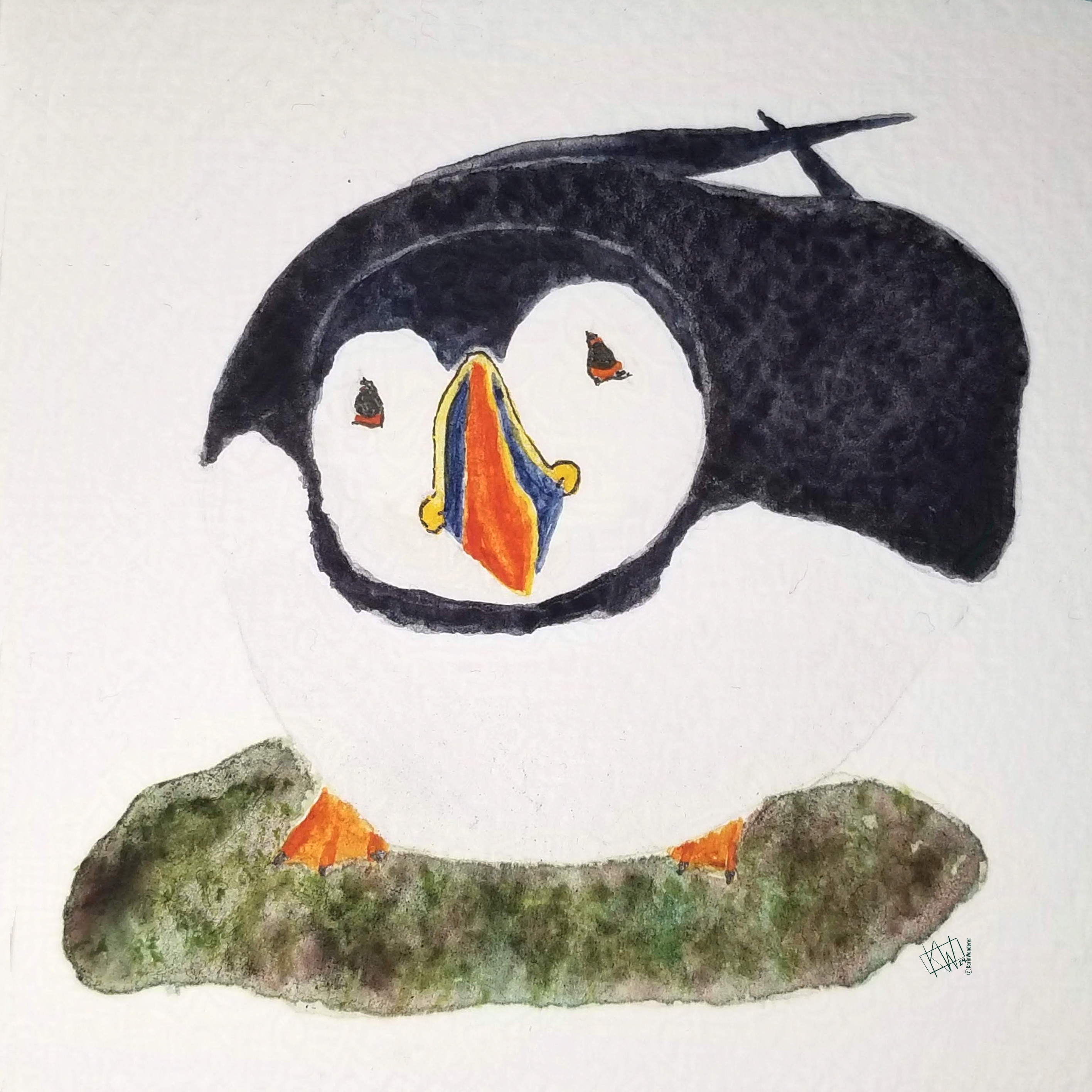
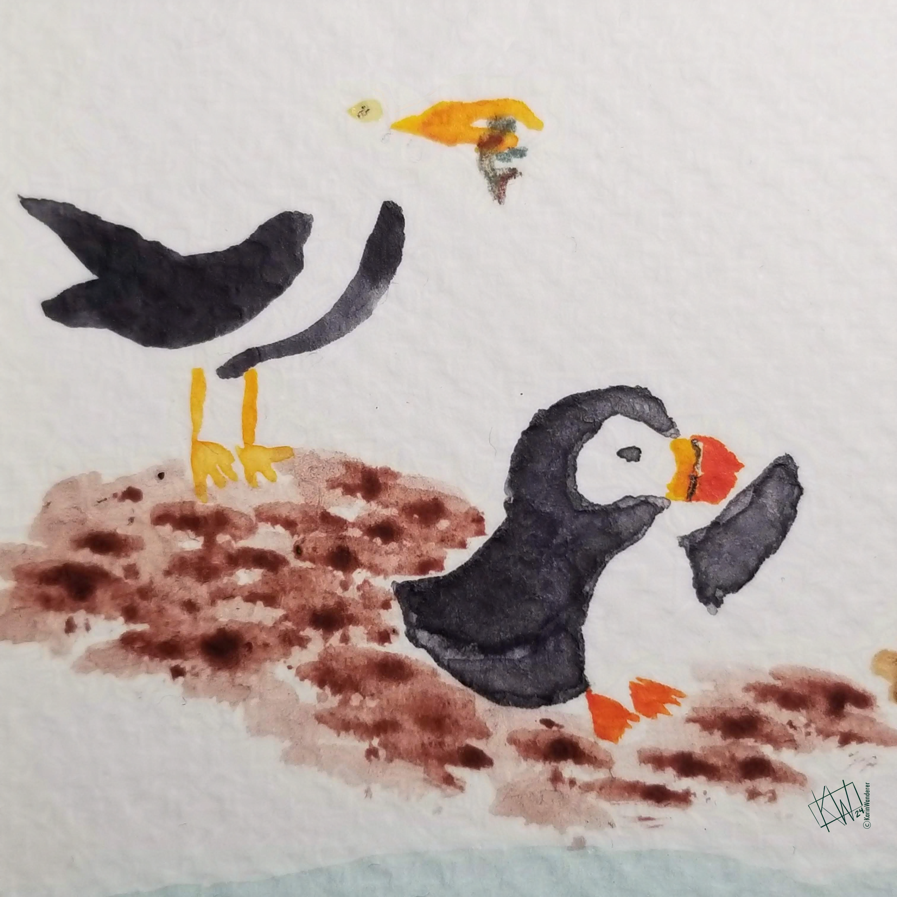
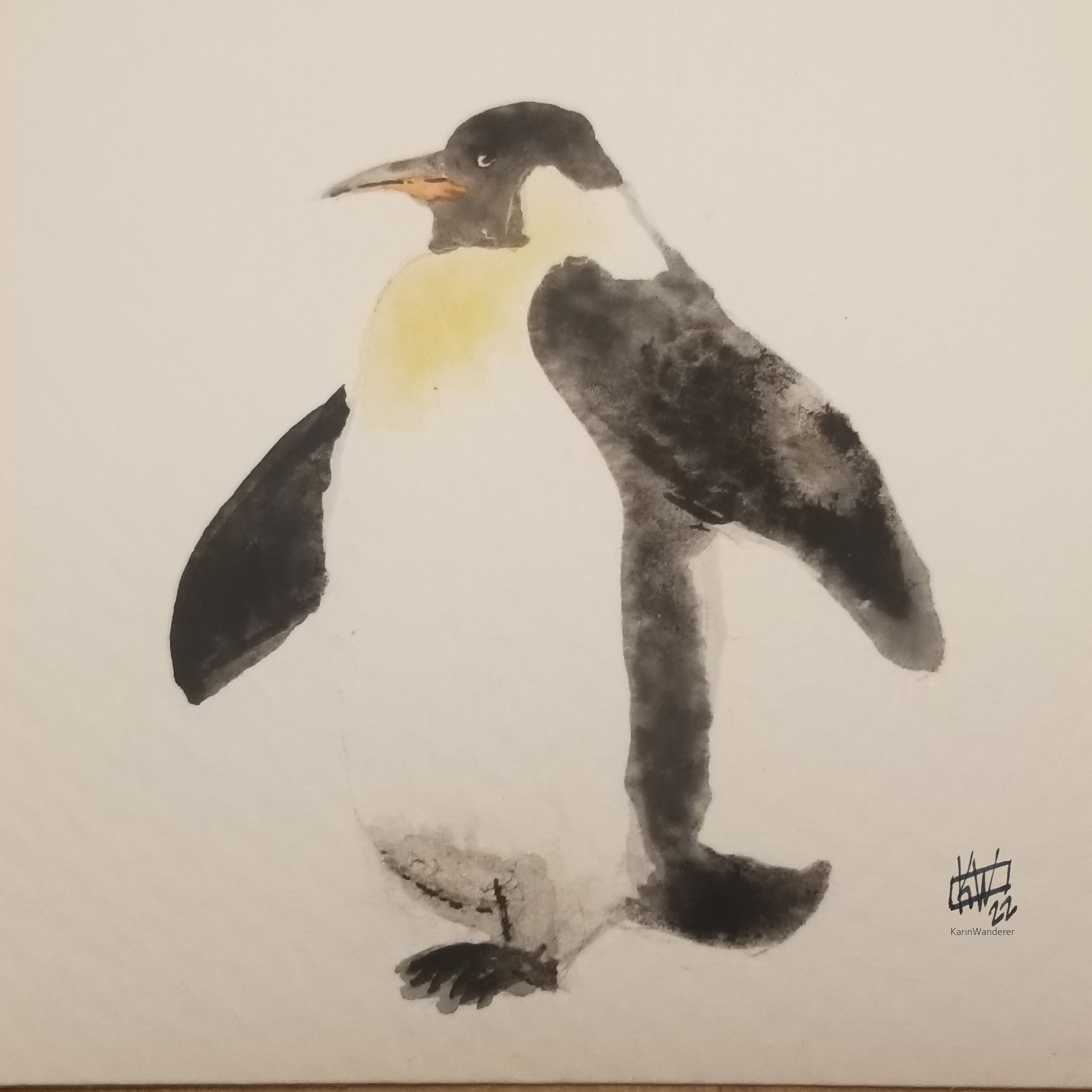 “Seabirds” are technically only one subset of marine birds, but all marine birds are welcome for this art challenge! Bring on your best penguins, albatross, petrels, gulls, pelicans, terns, puffins... Ever notice how many ocean birds begin with the letter P?
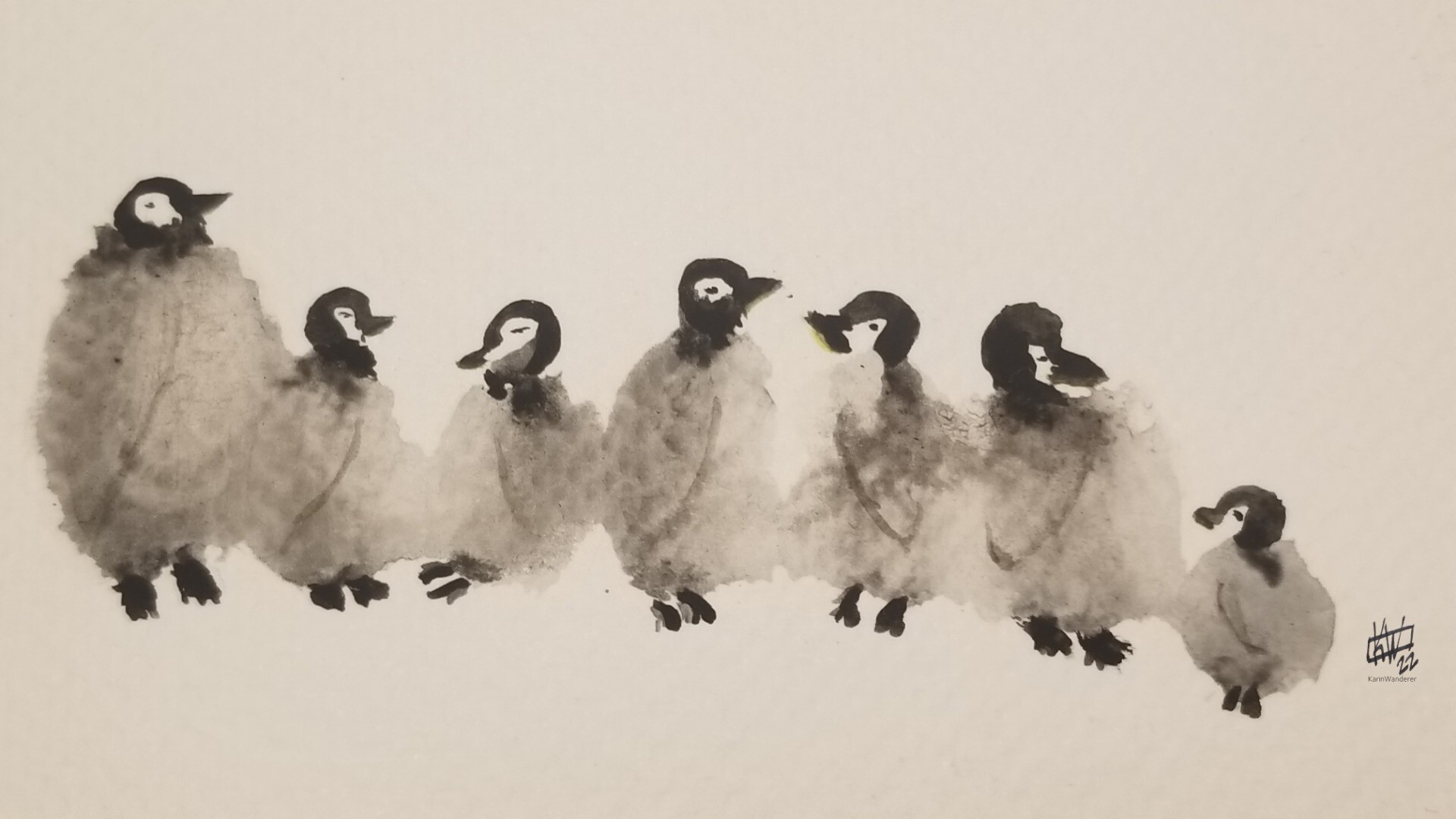
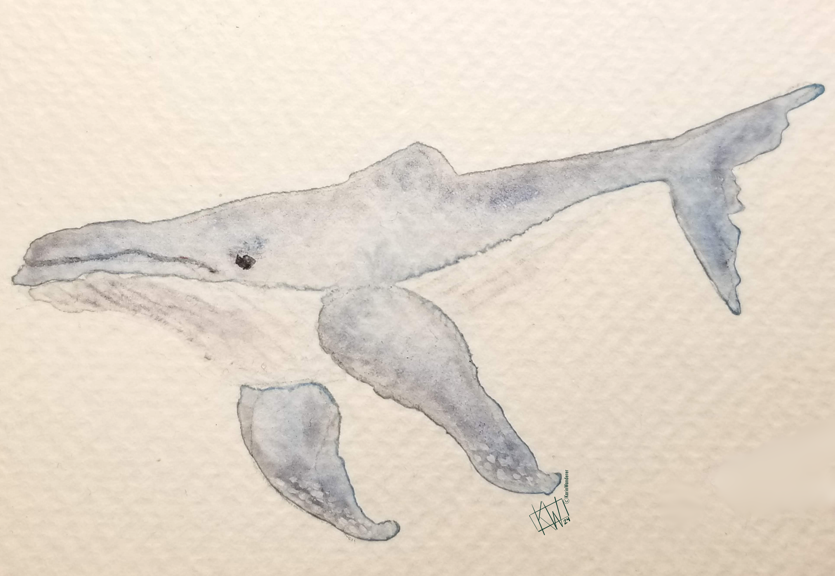
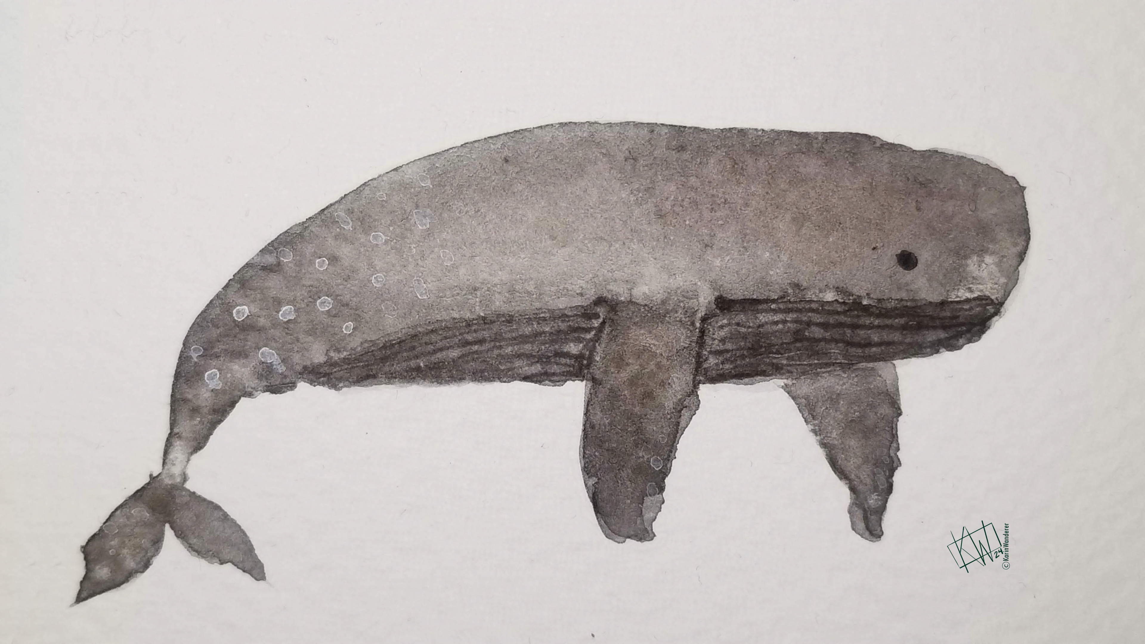 Gray whales have no dorsal fin
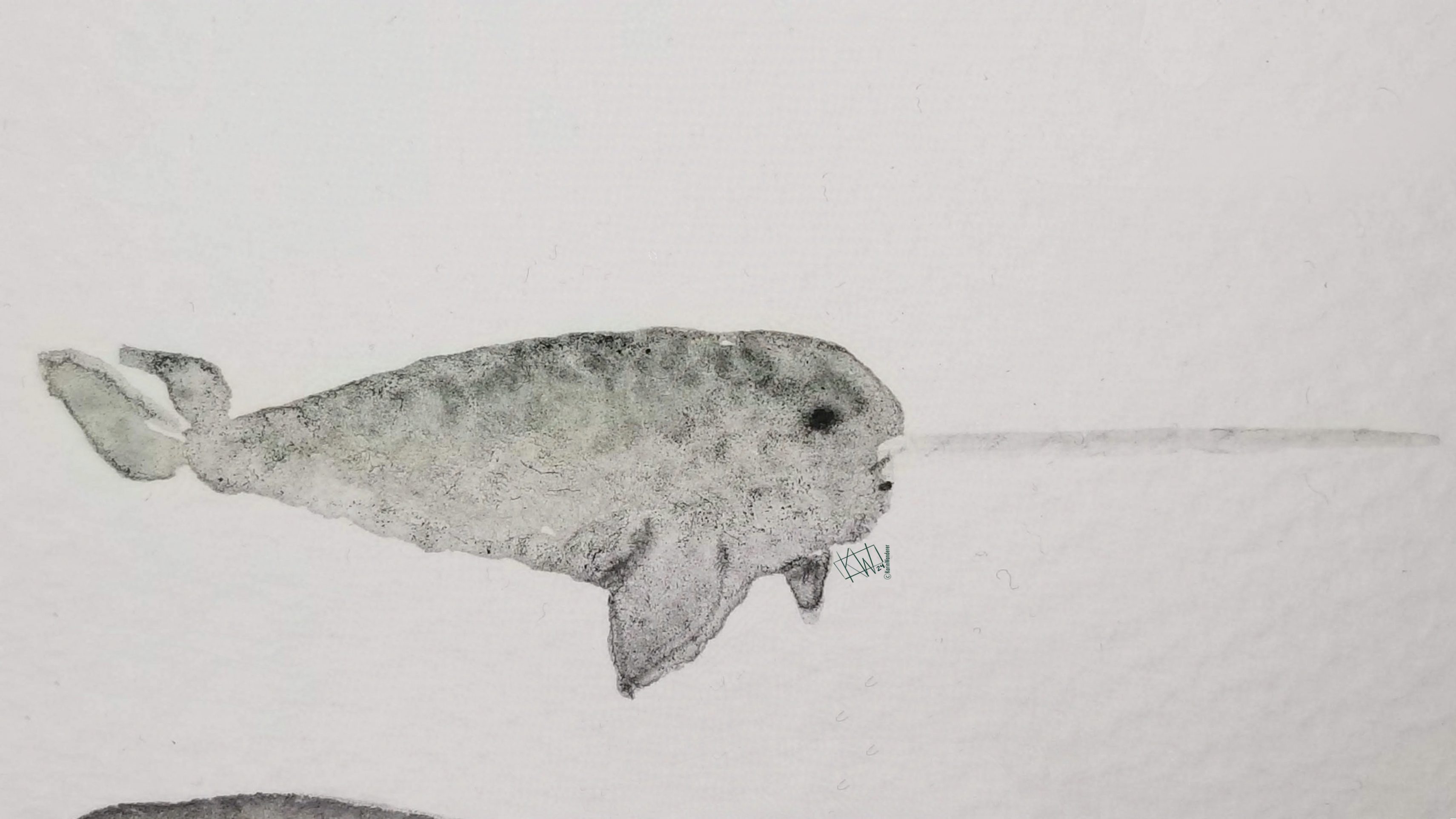 Narwhals change color as they age, from greyish to blackish to white.
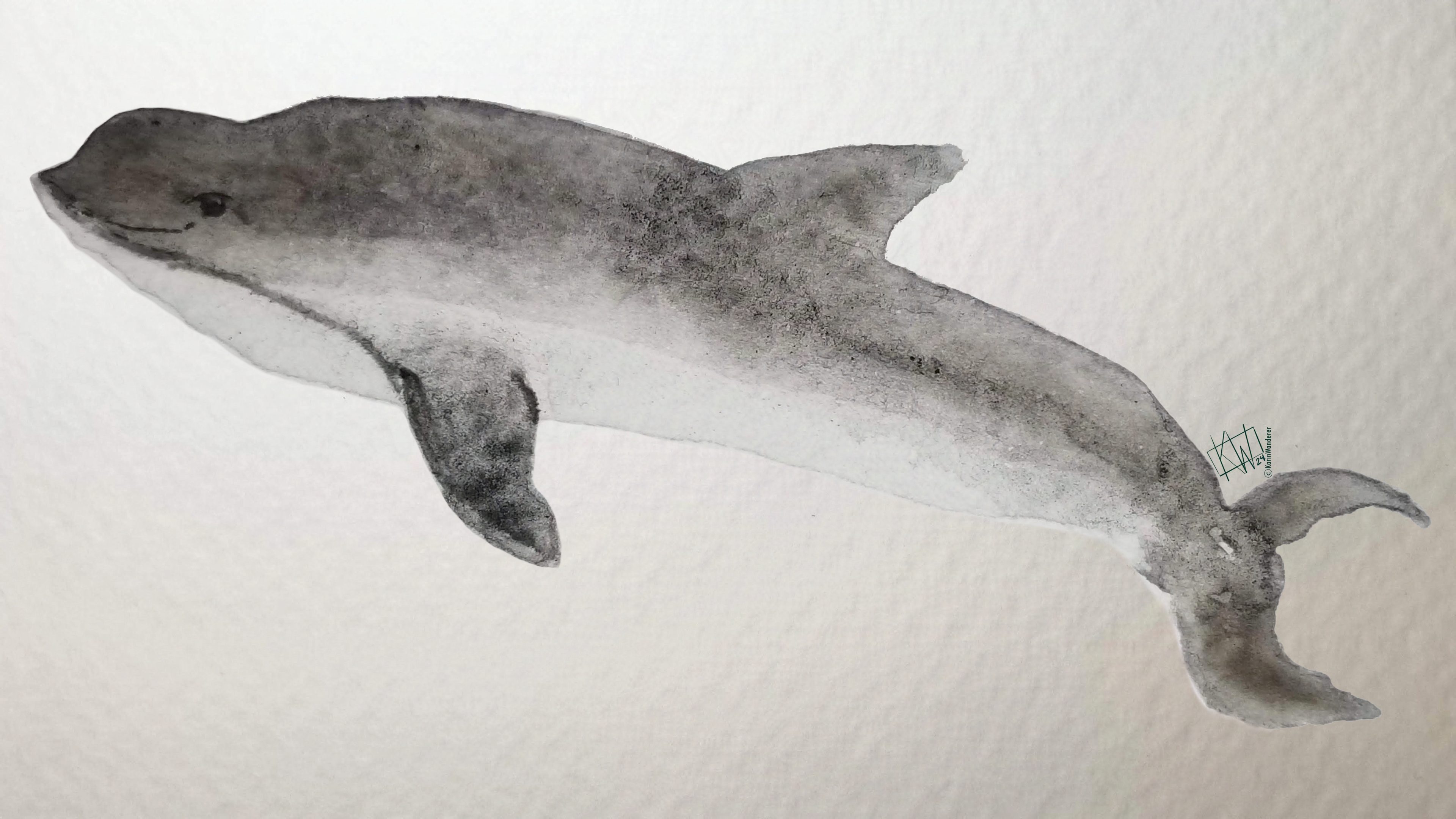 Porpoises always look like half-made dolphins.
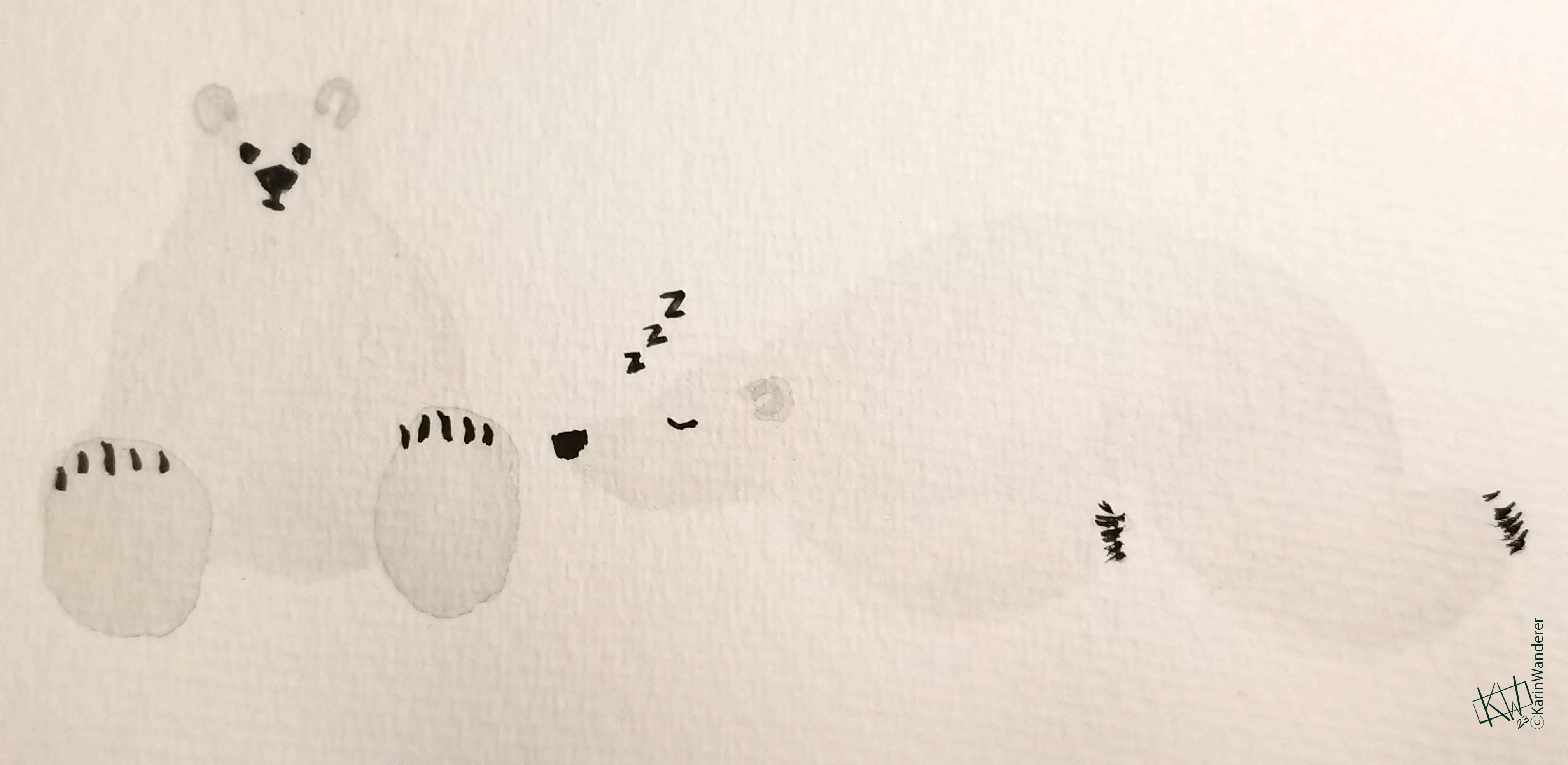
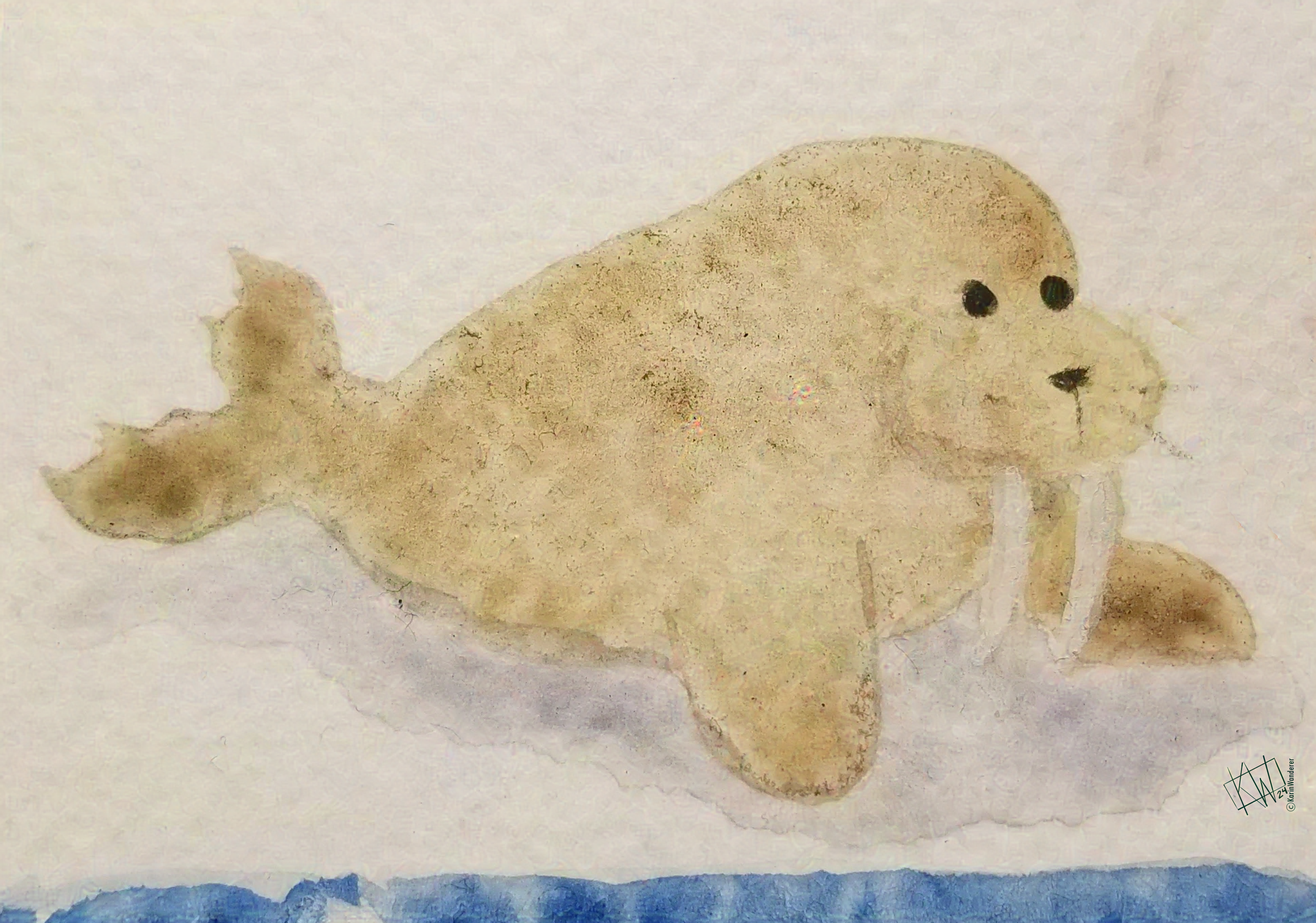 Marine Mammals live in saltwater ecosystems but can't breathe underwater. They are a diverse group! There are aquatic animals, such as whales, dolphins, porpoises, manatees & dugongs. There are also semi-aquatic animals, such as sea otters, walruses, seals & sea lions. Polar bears are technically
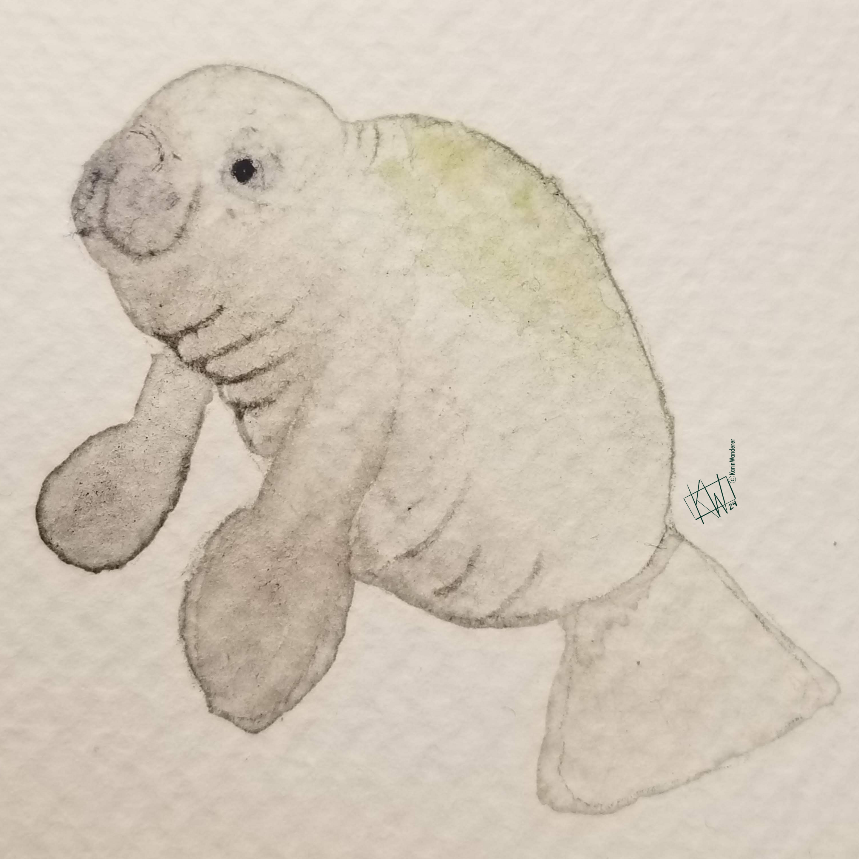
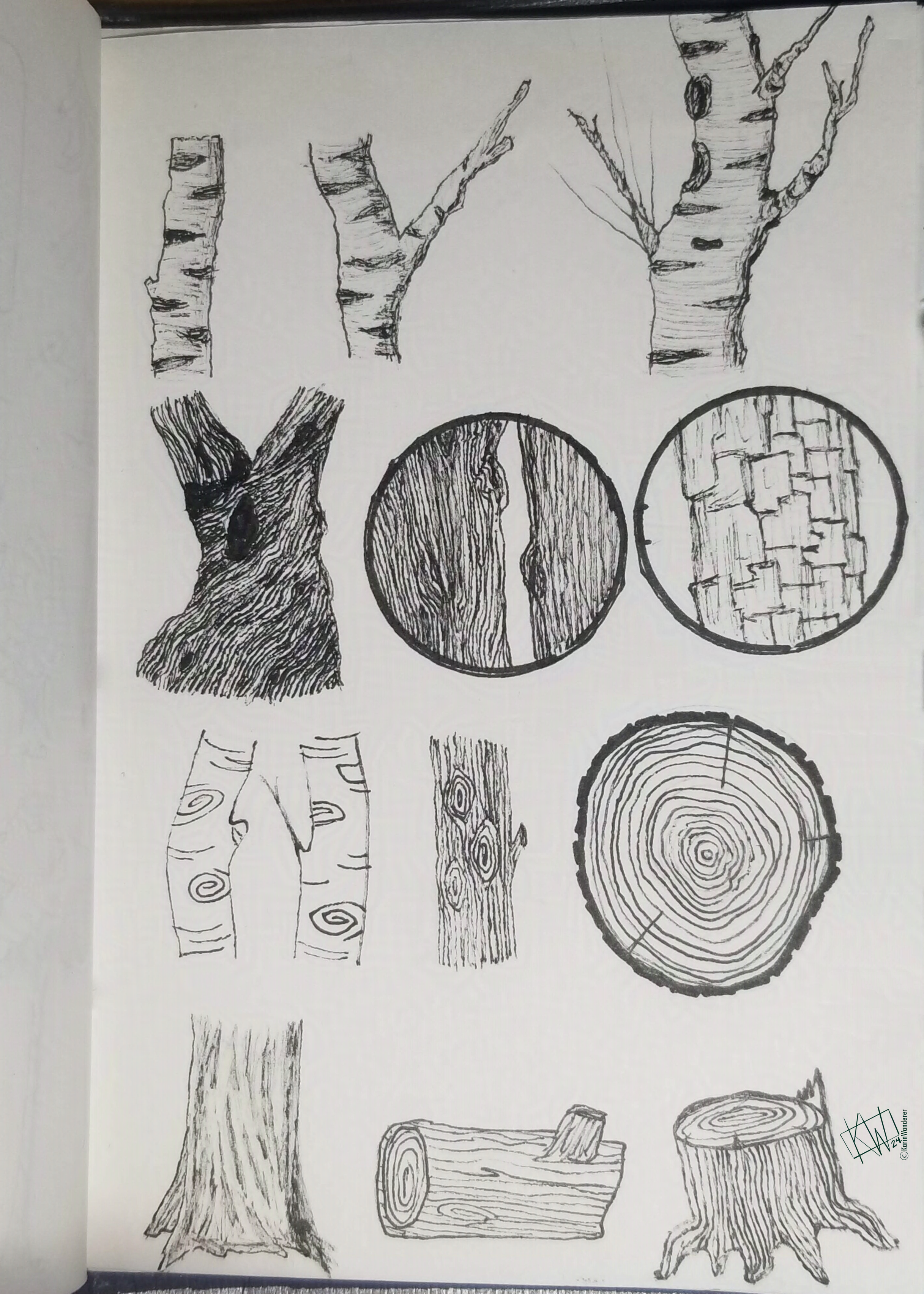
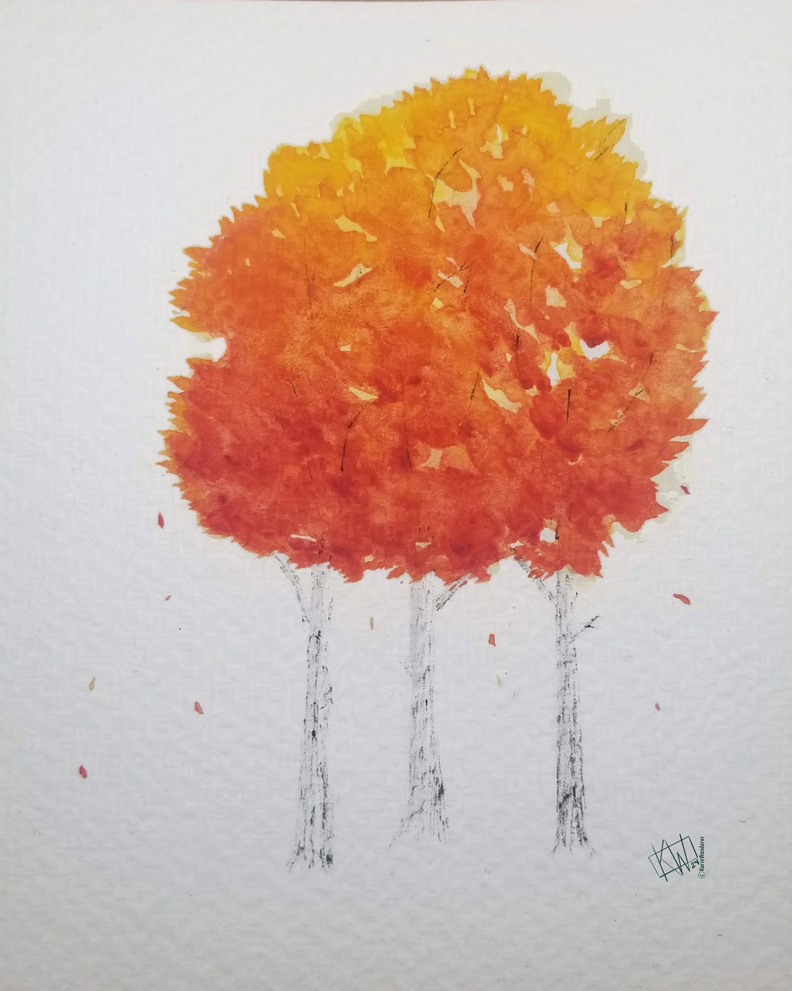
 Did you know that most tree species are only endemic to a single country, so you have to look really hard to find new ones? Did you know there are at least 70,000 species of tree on Earth, but I can't give you a more specific number because we keep discovering more & more new trees? Every time I turn around it feels like I'm hearing about a