Armorial College of Pride

Ancienne fierté rendue égalitaire

This post is a supplement to the Mastodon post.

A Pride Shield for two groups simultaneously; transgender people who work in medicine and people who provide gender affirming, medical care and services!

Argent an Asklepian its staff Sable and its snake lozengy Rose and Bleu Celeste.

A nice simple design, using the Asklepian symbol, or Rod of Asclepius, an ancient symbol for medicine. I’ve loosely based the snake on the Aesculapian snake (Zamenis longissimus), which is why it has that little smiley face.

I want to be very clear about this: This shield is NOT a transmed shield, it is a shield for;

Transgender people in the medical field; People who provide gender affirming care and other medical services for transgender people; Anyone who falls into both categories.

My understanding of the term “transmed” is that it is exclusionist which, as previously mentioned, is not what the ACP is for.

This post is a supplement to the Mastodon Post.

On a field per bend sinister Gules and Sable a letter capital A circumscribed by an annulet issuing therefrom disjointed stems of all genders Argent.

Quite a brief blazon for what is otherwise a deceptively complicated design. I will try to explain it below.

The shield is divided diagonally red and black (Gules and Sable) as the flag or banner of anarchism. Over both and largely filling the shield is a complex glyph thus: At its centre the often used symbol for anarchism, a capital A circumscribed by a circle (sometimes described as an O). The circle also acts as that used in many symbols of gender identities, the stems of those symbols being also present and disjointed to achieve plural meanings.

Going clockwise around the glyph: At 12 o'clock a line indicating neutral genders. This is often pendant but here is to chief for clarity. It is framed by the semi-circle of gender fluidity, drawn from the symbol for the planet Mercury or the liquid metal of the same name, aka quicksilver.

At 2 o'clock the customary male arrow, disjointed to include demi-boys. At 4 o'clock the intergender stem unmodified. At 6 o'clock the female cross disjointed for demi-girls, in the same fashion as its male counterpart. At 8 o'clock a circle upon a stem, which I have seen cited as a symbol for other or indeterminate gender identities. Finally at 10 o'clock the stem symbolising transgender identities.

Use here of the term “disjointed” is something of a liberty. The style of rendition indicated is usually associated with heraldic beasts (notably lions) and blazoned dismembered but I did not care for the associations of that word applied to people and also consider it unfitting for an inanimate charge. Disjointed seems an appropriate substitute.

This is a supplement to the Mastodon post.

An heraldic shield pink at the top and pale blue at the bottom, the middle transitioning between the two in a chequered pattern. A white stripe passes from top to bottom through the centre of the shield.

Party per fesse Rose and Bleu celeste, countercharged a fesse chequy. Over all a palet Argent.

This is my interpretation into heraldic form of the message that I understand from the transgender pride flag. It employs a diminutive of an honourable ordinary, which is the palet; literally “little pale”. A pale occupies one full third of the shield’s width, while the palet occupies half as much. I used the palet here because I found it more pleasing both on its own æsthetic merits and as an echo of the proportions of the flag.

Technically the chequy ferre is improper on two counts. Trivially it should, due to being countercharged over a field divided per fesse, have a rather ugly bit where the cells look twice as tall as the rest. More troublingly it is chequy of two colours which ought not be done, but it just looks right to me so that's how it is now.

Various designs, largely predating this blog and Mastodon, are receiving updates to their blazons due to a change of mind on my part. Early on I had the idea of sort of redeeming the heraldic stains; those tinctures often said (though rarely, if ever, used) to be part of the system of abatements. In fact the supposed purpose is, as has been observed before by learned scholars of heraldic custom and practice, a nonsense or, as one[^1] put it, “...one of those pleasant little insanities...”

The crux of the problem[^2][^3] with that system is that nobody is likely to display their disgrace and neither has it ever been meaningfully attempted[^2]. Since the use of stains is largely theoretical and, when a case can be made for their presence[^2], divorced of prescribed significance, there is little reason to undertake their reclamation!

A more compelling reason to review the idea is that the ACP project has revealed a new use case. Heraldic devices are used here in a fashion somewhat distinct from convention, being that they are intended for non-exclusive† display by any member of the community to whom a design applies. Pride Shields began and persist as devices alike to flags and banners in their messaging and, like those, have a place in protest.

As I've prepared some Protest Shield designs it has become apparent that the fanciful abatements have genuine utility in decrying the deplorable. Stains are central to the symbolism to be drawn upon. Abatements become, in the rolls of the Armorial College of Pride, meaningful and useful.

In order to preserve their traditional role in the new context their earlier employment will be struck from the rolls‡, the blazons rewritten to use other, more suitable terms. Luckily the heralds have, over the last few hundred years, introduced several tinctures not attested in the earlier volumes (including those detailing abatements.)

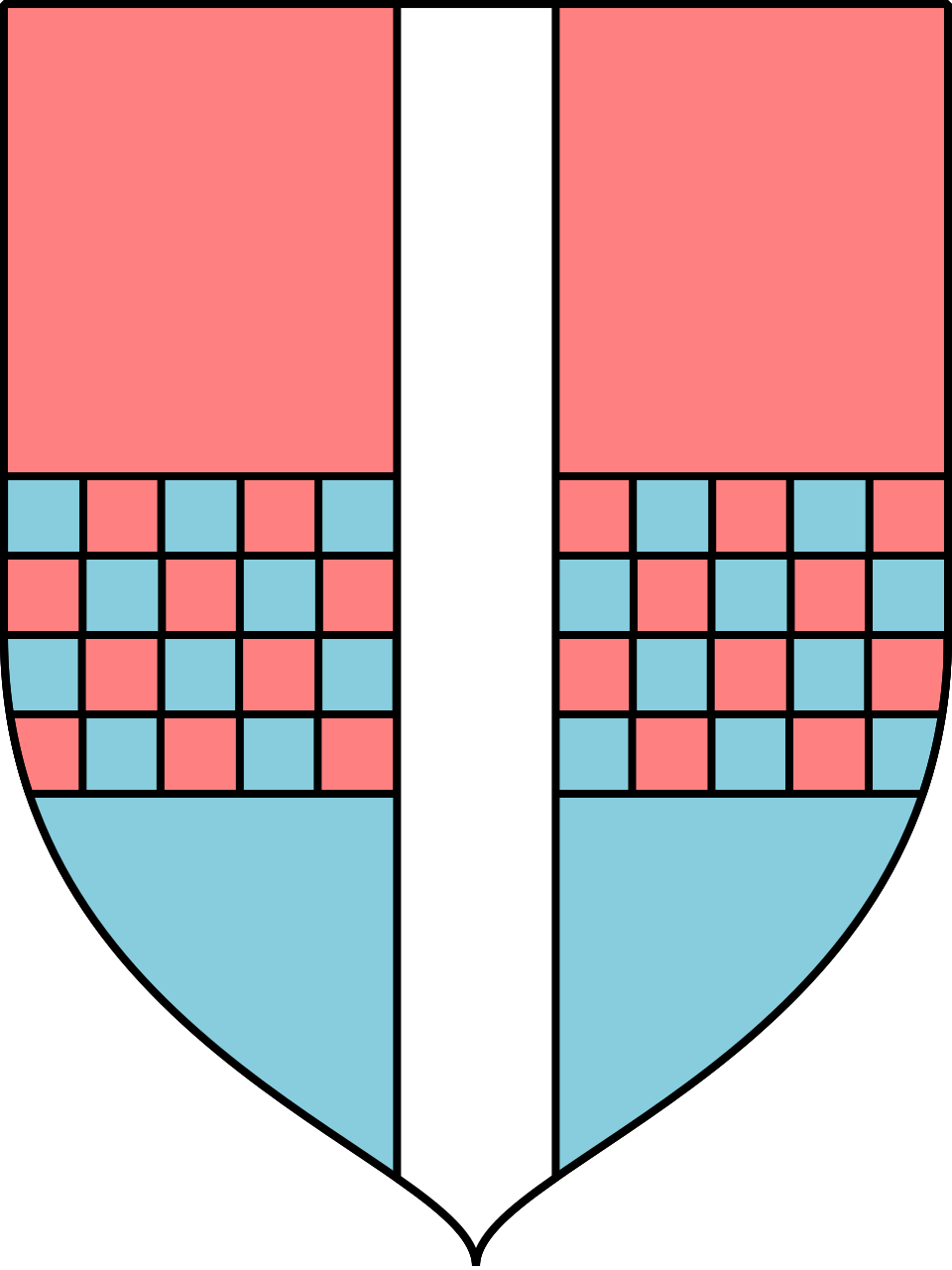
The two stains of particular interest here, and the colours that shall replace them, are tenné and murrey, to be replaced with brunâtre and fuchsia, respectively. Brunâtre[^4] is known in German heraldry but fuchsia[^5] is an invention of the necessity of different shades of true pinks for Pride Shields.

Some metals are also under consideration, because I think diversity of tincture is appropriate to ACP designs. Iron or steel is tempting. But it's a matter of how to convey them digitally as much as anything and I already have concerns about accessibility.

I would be interested in opinions, especially of other lgbtqia+ people with armigerous leanings.


† There may be exceptions in future. ‡ Alright, the posts. But I'm doing heraldry here so might as well use the terminology, right?

[^1] Arthur Charles Fox-Davies, A Complete Guide to Heraldry, T. C. & E. C. JACK, London, 1909, p.72. [^2] Arthur Charles Fox-Davies, A Complete Guide to Heraldry, T. C. & E. C. JACK, London, 1909, p.73. [^3] James Parker, A Glossary of Terms Used in Heraldry, James Parker and Co., Oxford & London, 1894, p.1. [^4] Arthur Charles Fox-Davies, A Complete Guide to Heraldry, T. C. & E. C. JACK, London, 1909, p.72—76. [^5] heraldicpride, A Brief Word on Tinctures, dotart.blog, 2023

This is a supplement to the mastodon post. Follow @heraldicpride@mastodon.art for more.

A field per bend Fuchsia and Azure, on a bend Argent a bendlet Purpure.

The bendlet upon a bend could, to much the same effect, be blazoned a bendlet between two ribbons, but there is a technical distinction that matters a great deal in formal heraldry.

As the blazon above has it, the bendlet is tinctured with a colour and sits upon an ordinary, the bend, which has been tinctured with a metal, which itself rests across two colours of the field. The alternative form would have the colour bendlet resting across the two colours of the field, which violates the rule of tincture, while the ribbons would be correctly tinctured in metal. It would look the same, but be technically incorrect.

Keen observers will notice that I have not always adhered strictly to the rule of tinctures, although I do try to. There are exceptions though, even in the ancient traditions, and sometimes they must be made. As a matter of interest there are also three categories of tincture that are not traditionally subject to the rule; stains, furs, and those charges given “proper” i.e. in naturalistic hues.

This is a supplement to the mastodon post. Follow @heraldicpride@mastodon.art for more.

An heraldic shield depicting, upon a white (silver) background, a pale blue lozenge with many white (silver) stars upon it. The uppermost corner is encircled by a bright pink crown.

Argent a lozenge Bleu Celeste semé of estoile Argent, surmounted by a crown vallary in honour point Fuchsia.

Inspired by the flag which was designed by Drag Queen Veranda L’Ni, reinterpreted through heraldry.

Every feature of this design is a charge, rather than using field divisions, to echo the ornamentation of drag. The lozenge represents a display of femininity, bedecked with glittering stars. The estoile, although they can be confused with flowers or sea urchins, are a traditional heraldic depiction of stars.

The crown is specifically a crown vallary, which has a triple purpose here. As a crown it serves to signify a queen. It's name, a crown vallary, is wordplay; vallary = Valery, a feminine name. But the literal meaning of vallary is “resembling the palisade atop a vallum”, a fortification, for the courage of performers especially in light of recent events.

If the use of fuchsia bothers you, please read my other post; A Brief Word on Tinctures.

It is normal custom and practice in heraldry to use, in blazonry[^1] to employ a limited vocabulary of tinctures[^2] whose precise hues are not specified, instead being broader categories. It is then up to the artist, when emblazoning[^3] the device[^4], to decide specific hues and shading to create the desired visual effect.

Some exceptions have, however, crept in over the centuries. We owe to the French heralds the colour[^5] Bleu Celeste being the blue of a clear sky. Obviously this is still open to some interpretation, but is a far reduced range of shades from the broader Azure being synonymous with the common English word blue. Similarly did they introduce Carnation, which is used there to represent white[^6] skintones.

Yet another tincture of French invention is the colour Rose which is generally taken to represent any shade of pink. It is common in Canadian heraldry to use a particularly vivid shade, while elsewhere the colour is generally lighter. It is the latter which is currently employed in the images posted under the ACP.

Most ACP images use flat colours and do so for two reasons. First is to prevent myself from taking forever over each tiny detail, second is to make it easier for people to take and use these designs. It is also for the latter reason that I have created a single, consistent pallette of colours for the ACP in which each tincture has a single associated hue.

The flip side of that decision is that, in order to accommodate the diversity of Pride-related designs, I have found it necessary to create another shade of pink. I have assigned to this shade the name Fuchsia and prefer that shade known as French fuchsia. I find this clarity very conducive to the process of interpreting existing flag designs for an heraldic framework.

I'm also seriously considering introducing a new tincture which must technically be considered a fur, which would be Flamingo. I haven't used it yet but might rework an existing design with it.

Take pride, everyone.

[^1]: The formal language used to describe the design upon a shield and other elements of a coat of arms. Any such description is a blazon. [^2]: Informally the colours and certain patterns used throughout a blazon. Formally a colour is a subset of tinctures, with others being furs and stains. [^3]: Visually depicting that which the blazon describes. [^4]: Any of a number of discrete heraldic items e.g. a shield, a crest, or a badge. [^5]: In the formal sense. [^6]: Unsurprisingly there's a lot of, frankly, racism in the history of heraldry. That is in part why I speak of degentrification.

ancienne fierté rendue égalitaire

To start this blog I'd like to give everyone some idea of the purpose of the ACP. To that end I present a brief overview of the art's history, along with an explanation of the motto.


Since its very origin the purpose of heraldry has been to declare identity. It was born, as a system of symbols with a grammar of its own, from all those symbols created whole-cloth by generations gone before.

The language of blazonry, a shared vocabulary of forms and strictures, used to describe decorations upon a shield and helm and lend meaning to the same, began to assume its modern form somewhere between tenth century France and fourteenth century England. This is evident from the plethora of Old French terms used even in anglophone blazonry. However the origins of heraldry lie to the east in Persia, with even some Persian vocabulary surviving in modern blazonry. Today heraldry is shared on a global scale, with variations in both blazonry and the underlying symbolic language to fit every culture wherein it is used.

Among the uses of early armorial bearings was group identification; upon the battlefield would every man of a regiment bear some reflection of their commander's identifying emblems. Being wholly pictorial even the illiterate common soldier could identify friend from foe. Yet inevitably, and early on, the splendid clarity of armorial bearings was claimed by the powerful to the exclusion of all others.

Many authoritative voices will attribute to heraldry the conveyance of rank and pedigree. It is certainly true that the various heraldic traditions have developed the means to represent those things, but they are additions to that fundamental purpose which is identification. It is particularly telling that the systems adopted to communicate that pedigree rely on the combination of atomic identities, describing an individual as a collection of elements.

Furthermore it is a fact of modern usage that the same traditions are employed in identifying groups as well as individuals; not only organs of state such as governmental and military divisions but even entire geographic regions and non-state organisations.

So it is that this project will turn the symbolic and essentially universal language of heraldry to the modern and defiant declaration of identity that is Pride. Taking from the oppressor these ancient symbols of pride and using them to uplift the marginalised. That is the very meaning behind the motto: Ancienne fierté rendue égalitaire!

Know yourself, take pride in your identity and shield each other with every display of unity!