The Transgender Pride Shield
This is a supplement to the Mastodon post.
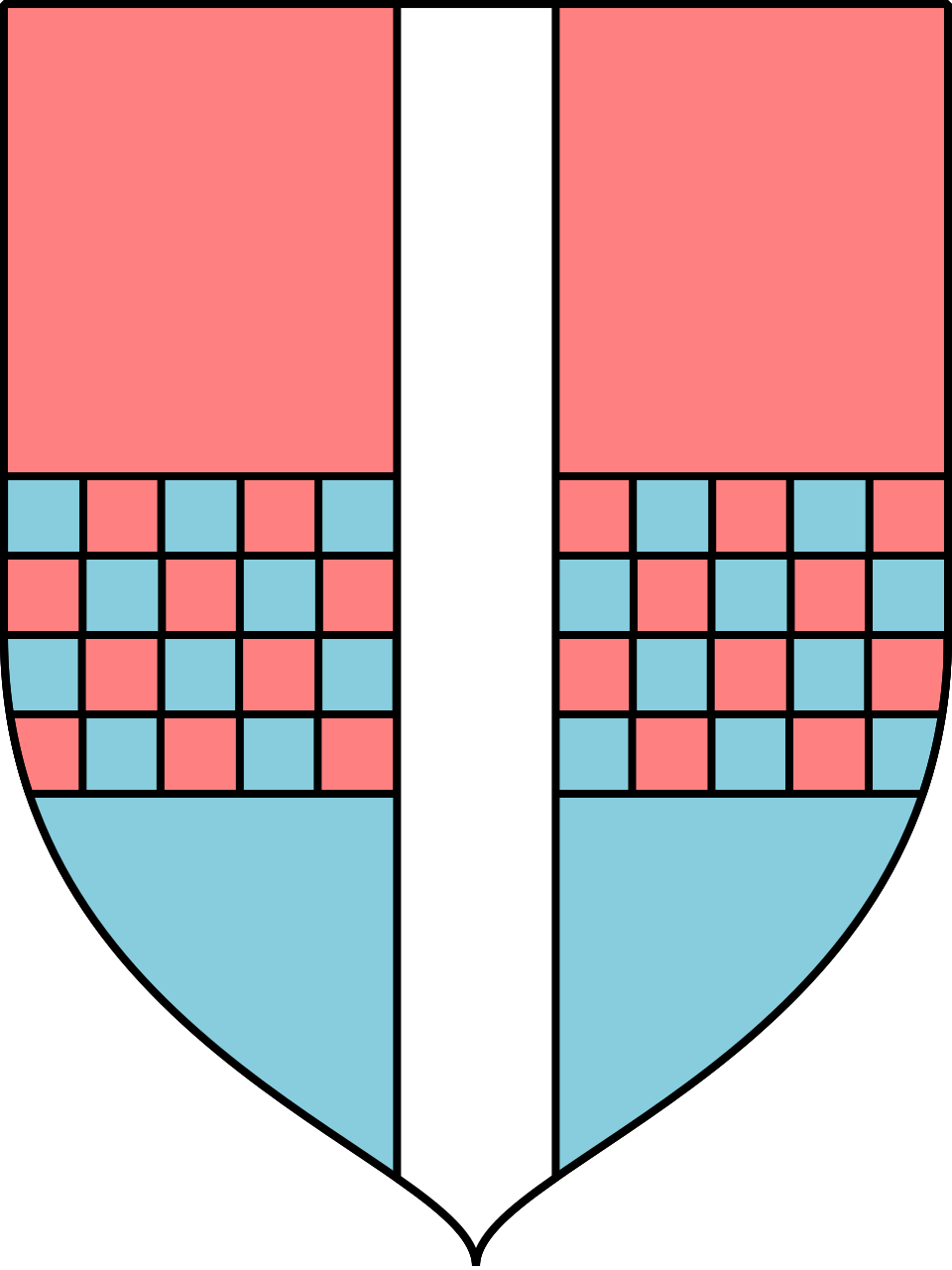
Party per fesse Rose and Bleu celeste, countercharged a fesse chequy. Over all a palet Argent.
This is my interpretation into heraldic form of the message that I understand from the transgender pride flag. It employs a diminutive of an honourable ordinary, which is the palet; literally “little pale”. A pale occupies one full third of the shield’s width, while the palet occupies half as much. I used the palet here because I found it more pleasing both on its own æsthetic merits and as an echo of the proportions of the flag.
Technically the chequy ferre is improper on two counts. Trivially it should, due to being countercharged over a field divided per fesse, have a rather ugly bit where the cells look twice as tall as the rest. More troublingly it is chequy of two colours which ought not be done, but it just looks right to me so that's how it is now.